Getting Started
Quick start - using diagram and toolbar components
The main component in Diagram Studio is the TatDiagram component. The TatDiagram component is the visual control which holds and display the diagram, and allow editing of it.
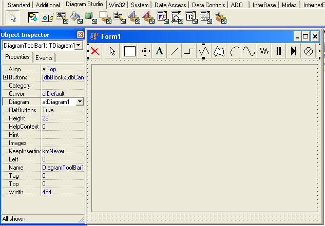
Another helpful component is the TDiagramToolBar. Although TatDiagram component does not require the TDiagramToolBar component to work, the toolbar component is very useful to quickly get started, since it allows easy insertion of blocks diagram without requiring a single line of code.
For Delphi 2005 and higher, there is a new component named TDiagramButtons. It has the same purpose of TDiagramToolbar, however it's inherited from TCategoryButtons and has a more modern look. There is a screenshot of new TDiagramButtons at the end of this topic.
Getting started with Diagram Studio is as quick as dropping both TatDiagram and TDiagramToolBar (or TDiagramButtons) components in a form, and linking the toolbar to the diagram, by setting the Diagram property of the TDiagramToolBar component to make reference to the TatDiagram component.
With this setting, and with no line of code, you will have a running application with already provides diagram capabilities. Just choose an object from the toolbar and click the diagram to insert objects, and you can start editing, resizing, moving and deleting objects.
TDiagramButtons component which provides a toolbar with a more modern look:
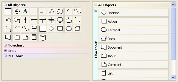
Diagram objects
There are two types of diagram objects: blocks and lines. All blocks descend from TCustomDiagramBlock class, and all lines descend from TCustomDiagramLine block. TDiagramControl class is the ancestor for both classes.
TDiagramControl
→ TCustomDiagramBlock
→ TCustomDiagramLine
Basic objects
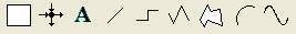
By default, Diagram Studio provides some basic blocks and lines, which descend from both TCustomDiagramBlock and TCustomDiagramLine classes. These basic blocks and lines are the ones displayed in the TDiagramToolBar component:
From the left to right, the basic objects are:
TDiagramBlock: a basic diagram block. Descends from TCustomDiagramBlock and published all of its properties, so this block is full-features, allowing setting of colors, shadows, gradient, pictures, linkpoints, shapes, and so on.
TDiagramLineJoin: a TCustomDiagramBlock descendant which is just a link point container. You can attach lines to this block (you can attach lines to any block also, see "linking blocks").
TTextBlock: a TCustomDiagramBlock descendant which sets itself some properties to look more like a text block (TDiagramBlock also provides text capabilities, as long all diagram obejcts).
TDiagramLine: a TCustomDiagramLine descendant, it's just a single line (one segment).
TDiagramSideLine: a TCustomDiagramLine descendant, it's a line with several perpendicular segments. The number of segments are calculated automatically.
TDiagramPolyLine: a TCustomDiagramLine descendant, it's a line with several segments. The end-user draws the desired segments.
TPolygonBlock: a TCustomDiagramBlock descendant, it's a polygon block with several sides. The end-user draws the desired sides of the polygon.
TDiagramArc: a TCustomDiagramLine descendant, it's a curved line.
TDiagramBezier*: a TCustomDiagramLine descendant, it's a bezier-like line.
Extra objects
Diagram Studio provides extra objects for usage in diagram. These extra objects are included for instant usage, but also as samples on how to extend Diagram Studio by creating more diagram blocks. The extra objects in Diagram Studio are grouped in the following categories:
Flowchart blocks: Provides some basic blocks for flowcharting diagrams, like action, start, end, decision, etc.
Electric blocks: Provides some basic blocks for eletricity diagrams, like resistor, capacitor, voltage source, ground, etc.
Arrow blocks: Provides some arrow-shaped blocks.
All extra objects are available at design-time. To make them available at runtime, just include the respective unit in the uses clause of any unit of your project. For example, if you want to use flowchart blocks, include the FlowChartBlocks.pas unit to your project.
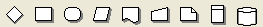
Flowchart blocks
To use flowchart blocks at runtime, include the FlowchartBlocks.pas unit
to your Delphi project. The following blocks are provided:
TFlowDecisionBlock
TFlowActionBlock
TFlowTerminalBlock
TFlowDataBlock
TFlowDocumentBlock
TFlowInputBlock
TFlowCommentBlock
TFlowListBlock
TDatabaseBlock
Electric blocks
To use electric blocks at runtime, include the ElectricBlocks.pas and
the ElectricBlocks2.pas units to your Delphi project. The following
blocks are provided:
In ElectricBlock unit:
TResistorBlock
TCapacitorBlock
TDiodeBlock
TLampBlock
In ElectricBlocks2 unit:
TZenerDiodeBlock
TComparatorBlock
TInductorBlock
TNonLinearInductorBlock
TGroundBlock
TNPNTransistorBlock
TPNPTransistorBlock
TPTIGBTBlock
TNPTIGBTBlock
TPINBlock
TThyristorBlock
TMosfetBlock
TSwitchBlock
TDuoCoilXFormBlock
TTriCoilXFormBlock
TDCVoltageSourceBlock
TDCCurrentSourceBlock
Arrow blocks
To use arrow blocks at runtime, include the ArrowBlocks.pas unit to your
Delphi project. The following blocks are provided:
TStandardArrowBlock
TDoubleArrowBlock
TQuadArrowBlock
TTripleArrowBlock
TChevronArrowBlock
TBlockSingleArrowBlock
TBlockDoubleArrowBlock
TCornerSingleArrowBlock
TCornerDoubleArrowBlock
Using predefined diagram actions
Although TatDiagram component is full-featured and very easy to use, it's still hard to build an IDE for editing the diagram. You must provide visual interfaces in your application for many diagram actions, like saving/opening, printing, clipboard operations, inserting, deleting, setting block properties, and so on.
In order to turn this task less difficult to you, Diagram Studio provides some actions (TAction descendants) for some common operations, like clipboard operations for example.
They work similar to any other action descendant available in the Delphi interface: just create a new action at design-time, based on a standard action, then attach that action to a visual control that support actions, commonly buttons or menu items.
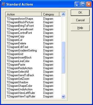
The available actions in Diagram Studio are:
TDiagramDelete: Deletes the selected objects in diagram.
TDiagramSelectAll: Selects all objects in diagram.
TDiagramInsertBlock: Put diagram in inserting mode (see Controlling visual editing of diagram). The control to be inserted is defined in the DControlID property, and the KeepInsertingMode defines if the object must be inserted multiple times, only once, or depending on the Shift key (if pressed, multiple times, if not pressed, once).
TDiagramCancelInsert: Cancel inserting objects and bring diagram back to browsing mode.
TDiagramEditText: Start inplace editing of the text of a diagram object.
TDiagramCopy: Copy selected objects to clipboard.
TDiagramCut: Cut selected objects to clipboard.
TDiagramPaste: Paste selected objects from clipboard.
TDiagramViewLeftRuler: Toggle left ruler visible/invisible.
TDiagramViewTopRuler: Toggle top ruler visible/invisible.
TDiagramSetZoom: Set the diagram zoom to the zoom specified by Zoom property.
TDiagramGrid: Toggle snap grid visible/invisible.
TDiagramShapeColor: Opens a color dialog to choose background color of selected blocks.
TDiagramLineColor: Opens a color dialog to choose line color of selected objects.
TDiagramBlockPicture: Opens a dialog to choose a background image/picture for the selected blocks.
TDiagramArrowShape: Sets the arrow shape of the selected lines. The arrow shape to be set is defined in the Shape property. The Source property defines if the arrow to be changed is the source arrow (true) or the target arrow (false).
TDiagramSendToBack: Send selected objects to back.
TDiagramBringToFront: Bring selected objects to front.
TDiagramControlFont: Opens a font dialog for editing the font of selected blocks.
TDiagramGradientSetting: Opens a dialog for editing gradient settings of selected blocks.
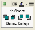
TDiagramShadow: Opens a dialog for editing shadow settings of selected blocks.
TDiagramUndoAction: Undo last operation performed in diagram.
TDiagramRedoAction: Redo last operation undoed in diagram.
TDiagramAlign: Perform alignment operations in two or more blocks (align left, align tops, same size, etc.).
Using special selector components for diagram editing
The selector components are another collection of tools to make it easy for the programmer to build a diagram IDE, along with the predefined actions (see Using predefined diagram actions).
The selector components are graphic controls which allow editing some properties of diagram, blocks and lines, just by dropping the control in the form and assigning the Diagram property to make reference for the diagram component.
For example, to use the pen style selector, just drop the TDgrPenStyleSelector component in the form, set the Diagram property of the component, and there it is. You can now choose a pen style visually in the control, and all selected objects in diagram will automatically have its pen style set for the one you choose.
The available selectors are:
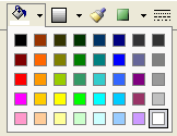
- TDgrColorSelector: Allows selection of background color of selected blocks.
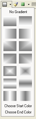
- TDgrGradientDirectionSelector: Allows setting the gradient of selected blocks.
- TDgrBrushStyleSelector: Allows setting the brush style of selected blocks.
- TDgrShadowSelector: Allows setting the shadow of selected blocks.
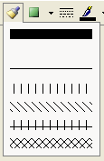
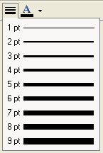
- TDgrPenStyleSelector: Allows setting the pen style of selected objects.
- TDgrPenWidthSelector: Allows setting the pen width of selected objects.
TDgrPenColorSelector: Allows selection of pen color of selected objects.
TDgrTextColorSelector: Allows selection of text color of selected objects.
TDiagramNavigator control
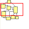
You can use TDiagramNavigator visual control to provide a "navigator" to the main diagram. The TDiagramNavigator must be attached to a TatDiagram component through the Diagram property. When this is done, the navigator will display a minimized representation of the whole TatDiagram component, indicating with a rectangle the current area in TatDiagram that is being displayed.
User can move the rectangle to navigate through the main diagram, or can resize the rectangle to zoom in/zoom out. The two controls are always in sync. If the user moves the cursor in the navigator, the diagram will scroll accordingly. If the user changes the diagram by scrolling or editing, the navigator will automatically reflect the changes.
There are several properties in TDiagramNavigator that you can use to change its look and behavior. Some of those properties are:
BackgroundColor: TColor
Specifies the color of the area representing the diagram.
Color: TColor
Specifies the background color of the control (area which does not
represent the diagram).
BlockShape: TDiagramNavigatorBlockShape
Specifies how the blocks will be painted in the navigator. Options are:
- nbsOriginal: the block will be painted with the original shape (default);
- nbsRectangle: any block will be painted as a rectangle.
Diagram: TatDiagram
The associated diagram control which will be represented by the
navigator.
EnableZoom: boolean
If true, user will be able to resize the highlight cursor rectangle to
zoom in/out the diagram. Default is false.
HighlightColor: TColor
The color of the rectangle cursor. Default is red.
HighlightWidth: integer
The width of the rectangle cursor. Default is 2.
MoveCursor: TCursor
The mouse cursor to be displayed when user is about to move the
rectangle cursor.
PaintLines: boolean
If false, lines won't be painted in the navigator. Default is true.
ZoomCursor: TCursor
The mouse cursor to be displayed when user is about to resize the
rectangle cursor.
Diagram:
Navigator:
Controlling visual editing of diagram
The toolbar component makes it easier to allow visual editing of diagram: end-user just click the toolbar to choose a block, and then click the diagram to edit. However, there are several methods in the diagram component that allows you to control visual editing of diagram.
In summary, TatDiagram implements the concept of "state", so depending on the state of the diagram component, the end-user is able to do something with the current diagram.
Diagram states
The diagram component can be in any of these states:
Browsing: end-user is able to select, move, resize, rotate blocks. This is the default state.
Inserting: end-user is able to insert a block in the diagram.
Panning: end-user is panning the diagram (dragging the diagram).
Zooming: end-user is zooming in/out the diagram.
This are the basic four states. They define what end-user actions do in the diagram, in terms of visual editing.
For example, what happens if the end-user left-clicks the diagram, keeps the left button of the mouse pressed, moves the mouse some pixels and then release the button? It depends on the state of the diagram. If the state is "browsing", then the end-user action will select some diagram objects. If state is inserting, it will insert a control in the diagram. If state is panning, it will move the diagram some pixels in the mouse direction. If state is zooming, it will zoom the diagram.
The default state is browsing. So, to put the diagram in the other three states, you can use some key methods.
Inserting blocks - diagram in insert mode (state)
Call StartInsertingControl method to put diagram in insert mode. After calling this method, any mouse operation in diagram like clicking or dragging will insert a new control. The control to be inserted is the first param of StartInsertControl, and it must be identified by its control id. The second param (AKeepInserting) specifies if the diagram should go back to browsing mode after the block is inserted (false), or if the diagram will continue in the inserting mode (true), allowing the same object to be inserted many times.
At any time, the diagram can be put back in the browsing mode by calling CancelInsertingBlock method.
procedure TForm1.NewBlockButtonClick(Sender: TObject);
begin
  atDiagram1.StartInsertingControl('TDiagramBlock'); //Insert the TDiagramBlock object once
end;

procedure TForm1.NewTextButtonClick(Sender: TObject);
begin
  atDiagram1.StartInsertingControl('TTextBlock', true); //Insert the TTextBlock object multiple times
end;

procedure TForm1.CancelInsertButtonClick(Sender: TObject);
begin
  atDiagram1.CancelInsertingBlock;
end;
Panning mode (state)
To put the diagram in panning mode, just call StartPanning method. To bring diagram back to browsing state, call CancelPanning.
procedure TForm1.StartPanningButtonClick(Sender: TObject);
begin
  atDiagram1.StartPanning;
end;

procedure TForm1.CancelPanningButtonClick(Sender: TObject);
begin
  atDiagram1.CancelPanning;
end;
Zooming mode (state)
To put the diagram in zooming mode, call StartZooming. You must inform if the zoom is in (more zoom) or out (less zoom). To bring diagram back to browsing state, call CancelZooming.
procedure TForm1.ZoomInButtonClick(Sender: TObject);
begin
  atDiagram1.StartZooming(zsZoomIn);
end;

procedure TForm1.ZoomOutButtonClick(Sender: TObject);
begin
  atDiagram1.StartZooming(zsZoomOut);
end;

procedure TForm1.CancelZoomButtonClick(Sender: TObject);
begin
  atDiagram1.CancelZooming;
end;
Loading, saving and printing a diagram
Saving and loading diagram is a very common task, and you can do that just by using the methods SaveToFile and LoadFromFile.
atDiagram1.SaveToFile('mydiagram1.dgr');
atDiagram1.LoadFromFile('mydiagram2.dgr');
As an option, you can load/save from/to stream. This can be useful for saving diagrams in different storages, like databases for example:
atDiagram1.LoadFromStream(AStream);
atDiagram1.SaveToStream(AStream);
You can also print the diagram, directly to printer, or ask for a print preview on screen. Use the following methods to do that:
atDiagram1.Preview; // preview on screen
atDiagram1.Print; // print the diagram in the printer with current printer settings
Design-time diagram editing
Diagram Studio provides design-time editing of diagram. To do that, right-click the TatDiagram component at design-time, and choose option "Design diagram...". A new window with a toolbar will be displayed and you will be able to use that toolbar to insert and delete objects to/from the diagram.
Full-feature runtime editor
If you want to provide a full-featured runtime diagram editor for your end-user with minimum effort, you can use TDiagramEditor component. Just drop a TDiagramEditor component in a form, call its Execute method, and a diagram editor form will be opened with lots of options for diagram editing (menu and toolbars with options for clipboard operations, alignment, formatting, etc.).
The diagram editor uses a TDiagramToolbar (for Delphi 7 and previous versions) or a TDiagramButtons (for Delphi 2005 and higher versions) depending on the Delphi version you're using.