Items, Appearance, and Editing
TTMSFNCListEditor presents editable values as individual items. Use it for address lists, tags, roles, filters, and other compact collections where users add, select, update, or remove short text values.
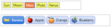
Populate Items
Add values through Items. Each item stores display Text, an optional Value, optional left and right images, and a Tag for application data.
procedure TForm1.ConfigureListEditor;
var
  itm: TTMSFNCCustomListEditorItem;
begin
  TMSFNCListEditor1.Items.Clear;

  itm := TMSFNCListEditor1.Items.Add;
  itm.Text := 'alice@example.com';
  itm.Value := 'alice';

  itm := TMSFNCListEditor1.Items.Add;
  itm.Text := 'bob@example.com';
  itm.Value := 'bob';
end;
Style Item States
ItemAppearance controls normal and selected fill, stroke, font color, rounding, and spacing. Use the default image properties when most items share the same icon.
procedure TForm1.ConfigureListEditorAppearance;
begin
  TMSFNCListEditor1.ItemAppearance.HorizontalSpacing := 6;
  TMSFNCListEditor1.ItemAppearance.VerticalSpacing := 6;
  TMSFNCListEditor1.ItemAppearance.RoundingNormal := 4;
  TMSFNCListEditor1.ItemAppearance.RoundingSelected := 4;
  TMSFNCListEditor1.ItemAppearance.FillSelected.Color := gcSteelblue;
  TMSFNCListEditor1.ItemAppearance.FontColorSelected := gcWhite;
end;
Item Images
Assign BitmapContainer before setting image names. Use per-item LeftImageName and RightImageName for item-specific visuals, or DefaultLeftImageName and DefaultRightImageName for shared defaults.
procedure TForm1.ConfigureListEditorImages;
begin
  TMSFNCListEditor1.BitmapContainer := TMSFNCBitmapContainer1;
  TMSFNCListEditor1.ItemAppearance.DefaultLeftImageName := 'person';
  TMSFNCListEditor1.ItemAppearance.DefaultRightImageName := 'remove';

  TMSFNCListEditor1.Items[0].RightImageName := 'favorite';
end;
Editing Events
Use item events to validate or react to changes. OnItemCanDelete can prevent deletion, OnItemUpdate can normalize text, and OnItemInsert / OnItemDelete can sync external state.
procedure TForm1.ConfigureListEditorEvents;
begin
  TMSFNCListEditor1.OnItemCanDelete := TMSFNCListEditor1ItemCanDelete;
  TMSFNCListEditor1.OnItemUpdate := TMSFNCListEditor1ItemUpdate;
end;

procedure TForm1.TMSFNCListEditor1ItemCanDelete(Sender: TObject;
  AItemIndex: Integer; var ACanDelete: Boolean);
begin
  ACanDelete := TMSFNCListEditor1.Items[AItemIndex].Value <> 'required';
end;

procedure TForm1.TMSFNCListEditor1ItemUpdate(Sender: TObject;
  AItemIndex: Integer; var AText: string);
begin
  AText := Trim(AText);
end;
Custom Editor Behavior
The editor lifecycle events let you adjust editor size, provide editor text, or replace the editor class. Keep these handlers small and deterministic because they are called while the control recalculates item layout.
Use as a Control Picker Source
TTMSFNCCustomListEditor implements ITMSFNCControlPickerItems, so a TTMSFNCListEditor can act as the embedded drop-down content of a TMS FNC Control Picker. This is useful when you want the compact chip-based editing experience of the list editor to appear inside a drop-down that opens from a text field, rather than staying always visible on the form. Assign the list editor instance to the picker's Control property; the picker then reads the item count, item size, and selection through the interface to size and drive its drop-down.
procedure TForm1.ConfigureListEditorAsControlPickerSource;
var
  itm: TTMSFNCCustomListEditorItem;
begin
  TMSFNCListEditor1.Items.Clear;

  itm := TMSFNCListEditor1.Items.Add;
  itm.Text := 'Admin';

  itm := TMSFNCListEditor1.Items.Add;
  itm.Text := 'Editor';

  itm := TMSFNCListEditor1.Items.Add;
  itm.Text := 'Viewer';

  TMSFNCControlPicker1.Control := TMSFNCListEditor1;
end;
Combining items, images, appearance, and editing events
The following example builds a tag-editor for user roles, applies a green appearance for confirmed roles, and prevents deletion of the last remaining item:
procedure TForm1.FormCreate(Sender: TObject);
var
  item: TTMSFNCListEditorItem;
begin
  TMSFNCListEditor1.BitmapContainer := BitmapContainer1;

  // Seed with existing roles
  for var role in ['Admin', 'Editor', 'Viewer'] do
  begin
    item := TMSFNCListEditor1.Items.Add;
    item.Text            := role;
    item.LeftImageName   := 'role-' + LowerCase(role);
  end;

  // Style confirmed items differently
  TMSFNCListEditor1.ItemAppearance.Fill.Color := gcHoneyDew;
  TMSFNCListEditor1.ItemAppearance.Stroke.Color := gcSeaGreen;
end;

procedure TForm1.TMSFNCListEditor1ItemCanDelete(Sender: TObject;
  AItem: TTMSFNCListEditorItem; var ACanDelete: Boolean);
begin
  ACanDelete := TMSFNCListEditor1.Items.Count > 1; // keep at least one role
end;

procedure TForm1.TMSFNCListEditor1ItemInsert(Sender: TObject;
  AItem: TTMSFNCListEditorItem);
begin
  AItem.LeftImageName := 'role-custom';
  LogChange('Role added: ' + AItem.Text);
end;