Appearance and rendering
The visual style of TTMSFNCRangeSlider is driven by its Appearance property, a settings object shared with the TMS FNC track-bar family. It controls the orientation of the track, the colour of each track zone, the shape and size of the two thumbs, and the tick marks and labels printed along the track. When the built-in styling is not enough — for example to brand the thumbs or draw a value bubble — the slider also raises before/after draw events that let you take over rendering completely. This guide covers each appearance area in turn and then shows how to combine them. For the value model and events, see Values, events, and interaction.
Orientation
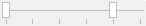
Appearance.Orientation lays the track out horizontally (tboHorizontal, the default) or vertically (tboVertical). A vertical slider is convenient for height, volume, or temperature ranges where an up/down metaphor reads more naturally than left/right. Orientation only changes layout and hit-testing; the value model, thumb ordering, and events are identical in both directions.
TMSFNCRangeSlider1.Appearance.Orientation := tboVertical;
Colouring the three track zones
The two thumbs divide the track into three segments, each with its own fill and stroke so you can make the selected range stand out:
| Zone | Fill | Stroke | Covers |
|---|---|---|---|
| Left | Appearance.LineFill |
Appearance.LineStroke |
From Min up to the left thumb. |
| Middle | Appearance.LineMiddleFill |
Appearance.LineMiddleStroke |
Between the two thumbs — the selected range. |
| Right | Appearance.LineRightFill |
Appearance.LineRightStroke |
From the right thumb up to Max. |
Each fill is a TTMSFNCGraphicsFill, so set both its Kind (for example gfkSolid) and Color. Highlighting the middle zone is the most common choice because it visually answers "what did I select?".
{ Emphasise the selected range and mute the outer zones: }
TMSFNCRangeSlider1.Appearance.LineMiddleFill.Kind  := gfkSolid;
TMSFNCRangeSlider1.Appearance.LineMiddleFill.Color := $FF00AAFF;
TMSFNCRangeSlider1.Appearance.LineFill.Color       := gcGainsboro;
TMSFNCRangeSlider1.Appearance.LineRightFill.Color  := gcGainsboro;
Note
LineMiddleFill, LineMiddleStroke, LineRightFill, and LineRightStroke were added in version 1.0.2.0. Earlier builds expose only a single track fill.
Thumbs
Each thumb is styled independently so the lower and upper handles can differ. ThumbFill, ThumbStroke, ThumbShape, ThumbWidth, and ThumbHeight style the left thumb; the matching ThumbRightFill, ThumbRightStroke, ThumbRightWidth, and ThumbRightHeight style the right one. The *Down* variants (ThumbDownFill, ThumbRightDownFill, …) apply while a thumb is pressed, and ThumbBitmap/ThumbRightBitmap replace the drawn thumb with an image.
TMSFNCRangeSlider1.Appearance.ThumbWidth      := 18;
TMSFNCRangeSlider1.Appearance.ThumbRightWidth := 18;
TMSFNCRangeSlider1.Appearance.ThumbFill.Color      := gcDodgerblue;
TMSFNCRangeSlider1.Appearance.ThumbRightFill.Color := gcTomato;
Tick marks and value labels
Tick marks orient the user along the track. TickMarkPosition chooses which side(s) of the track they appear on, TickMarkDivision sets the value interval between ticks, and TickMarkSize/TickMarkStroke control their look. Set TickMarkLabel := True to print the value beside each tick, formatted with TickMarkLabelFormat (a standard Format string such as '%.0f') and rendered in TickMarkLabelFont.
TMSFNCRangeSlider1.Appearance.TickMarkDivision   := 10;
TMSFNCRangeSlider1.Appearance.TickMarkLabel      := True;
TMSFNCRangeSlider1.Appearance.TickMarkLabelFormat := '%.0f';
Separately, TrackLabelPosition, TrackLabelFormat, and TrackLabelFont print the current value of each thumb that follows the thumb as it moves, which is useful when exact readouts matter more than fixed reference ticks.
Custom thumb rendering
When the appearance properties are not enough, handle OnBeforeDrawThumb to draw the thumb yourself. Set ADefaultDraw := False to replace the built-in thumb while keeping the event active, or AAllow := False to skip the thumb entirely. The ALeft parameter lets you give the two thumbs different custom looks; OnAfterDrawThumb runs after the default drawing if you only want to overlay a decoration.
{ Assign in the Object Inspector or in code: }
procedure TForm1.FormCreate(Sender: TObject);
begin
  TMSFNCRangeSlider1.OnBeforeDrawThumb := RangeSliderBeforeDrawThumb;
end;

// ALeft tells you which thumb is being drawn; set ADefaultDraw := False to replace
// the built-in thumb, or AAllow := False to skip drawing the thumb entirely.
procedure TForm1.RangeSliderBeforeDrawThumb(Sender: TObject;
  AGraphics: TTMSFNCGraphics; ARect: TRectF; AValue: Single; ALeft: Boolean;
  var AAllow: Boolean; var ADefaultDraw: Boolean);
begin
  ADefaultDraw := False;

  if ALeft then
    AGraphics.Fill.Color := gcDodgerblue
  else
    AGraphics.Fill.Color := gcTomato;

  AGraphics.Fill.Kind   := gfkSolid;
  AGraphics.Stroke.Kind := gskSolid;
  AGraphics.DrawEllipse(ARect);
end;
Combining orientation, zones, and labelled ticks
A polished range selector usually combines several appearance settings at once: a vertical track, a highlighted middle zone, and labelled tick marks so the user can read the bounds at a glance. The snippet below sets all three together on a 0–100 slider.
// Vertical orientation with tick marks and coloured fill zones
TMSFNCRangeSlider1.Min := 0;
TMSFNCRangeSlider1.Max := 100;
TMSFNCRangeSlider1.ValueLeft  := 20;
TMSFNCRangeSlider1.ValueRight := 80;

TMSFNCRangeSlider1.Appearance.Orientation := tboVertical;

// Colour the range between the thumbs differently from the outer zones
TMSFNCRangeSlider1.Appearance.LineMiddleFill.Color := $FF00AAFF;  // blue between thumbs
TMSFNCRangeSlider1.Appearance.LineMiddleFill.Kind  := gfkSolid;

// Show tick marks with labels every 10 units
TMSFNCRangeSlider1.Appearance.TickMarkLabel    := True;
TMSFNCRangeSlider1.Appearance.TickMarkDivision := 10;
TMSFNCRangeSlider1.Appearance.TickMarkLabelFormat := '%.0f';
Common pitfalls
- Colouring only the middle zone. If you set
LineMiddleFillbut leave the outer zones at their theme default, the contrast may be weak. SetLineFill/LineRightFillto a muted colour so the selection reads clearly. - Tick labels with no division. Setting
TickMarkLabel := Truewithout a sensibleTickMarkDivisionproduces cluttered or missing labels. Pick a division that yields a readable number of ticks across the range. - Forgetting
ADefaultDraw := False. InOnBeforeDrawThumb, your custom drawing is layered on top of the default thumb unless you suppress it; setADefaultDraw := Falseto fully replace it.
See also
- Values, events, and interaction — value model, the three change events, and data binding.
- Get started
TTMSFNCRangeSliderAPI reference- Range Slider release notes