Switch Guide
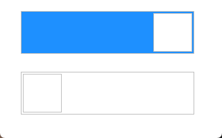
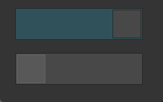
TTMSFNCSwitch is a toggle control that alternates between an on (ssOn) and off (ssOff) state. It supports an animated sliding thumb, horizontal and vertical orientations, rounded corners, and two layout modes. In sloExtended layout the on/off text labels are visible alongside the thumb.
Basic usage
Set the initial State and handle OnStateChange to respond to user interaction.
// Basic on/off switch; read state with Checked or State
TMSFNCSwitch1.State := ssOff;

// React to the user toggling the switch
procedure TForm1.TMSFNCSwitch1StateChange(Sender: TObject;
  ASwitchState: TTMSFNCCustomSwitchState);
begin
  if ASwitchState = ssOn then
    EnableFeature
  else
    DisableFeature;
end;
void __fastcall TForm1::ConfigureSwitch()
{
  // Basic on/off switch; read state with Checked or State
  TMSFNCSwitch1->State = ssOff;
}

// React to the user toggling the switch
void __fastcall TForm1::TMSFNCSwitch1StateChange(TObject *Sender,
  TTMSFNCCustomSwitchState ASwitchState)
{
  if (ASwitchState == ssOn)
    EnableFeature();
  else
    DisableFeature();
}
Checked is a public Boolean alias for State: True maps to ssOn, False to ssOff. Use either depending on context.
Appearance customisation
The AppearanceOn and AppearanceOff sub-objects style the track background in each state. ButtonAppearance styles the sliding thumb. Enable sloExtended to show on/off text.
// Extended layout with On/Off text labels and custom colours
TMSFNCSwitch1.Layout  := sloExtended;
TMSFNCSwitch1.Rounded := True;

TMSFNCSwitch1.AppearanceOn.Text := 'ON';
TMSFNCSwitch1.AppearanceOn.Fill.Color := $FF00AA44;
TMSFNCSwitch1.AppearanceOn.Fill.Kind  := gfkSolid;

TMSFNCSwitch1.AppearanceOff.Text := 'OFF';
TMSFNCSwitch1.AppearanceOff.Fill.Color := $FFB0B0B0;
TMSFNCSwitch1.AppearanceOff.Fill.Kind  := gfkSolid;

// Thumb button margin and fill
TMSFNCSwitch1.ButtonAppearance.Margin := 2;
TMSFNCSwitch1.ButtonAppearance.Fill.Color := gcWhite;
// Extended layout with On/Off text labels and custom colours
TMSFNCSwitch1->Layout = sloExtended;
TMSFNCSwitch1->Rounded = true;

TMSFNCSwitch1->AppearanceOn->Text = "ON";
TMSFNCSwitch1->AppearanceOn->Fill->Color = static_cast<TTMSFNCGraphicsColor>(0xFF00AA44);
TMSFNCSwitch1->AppearanceOn->Fill->Kind = gfkSolid;

TMSFNCSwitch1->AppearanceOff->Text = "OFF";
TMSFNCSwitch1->AppearanceOff->Fill->Color = static_cast<TTMSFNCGraphicsColor>(0xFFB0B0B0);
TMSFNCSwitch1->AppearanceOff->Fill->Kind = gfkSolid;

// Thumb button margin and fill
TMSFNCSwitch1->ButtonAppearance->Margin = 2;
TMSFNCSwitch1->ButtonAppearance->Fill->Color = gcWhite;
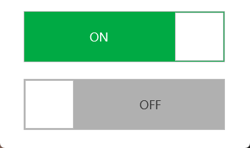
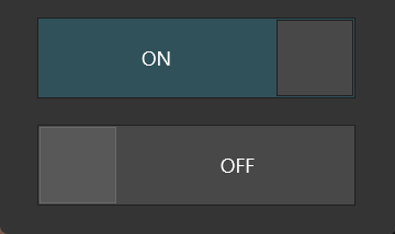
Both states are shown together because a single switch renders only one of
them. Give each state's Font.Color an explicit value: the label sits on a
saturated track, where the inherited font colour is often unreadable.
AnimationFactor (default 15) controls how quickly the thumb slides; lower values produce a faster animation.
Combining orientation, state persistence, and theme switching
The switch fits naturally in settings screens where the state should be saved and restored across sessions.
// Vertical switch used as a feature toggle that also updates a label
// and saves the preference when changed
TMSFNCSwitch1.Orientation := soVertical;
TMSFNCSwitch1.Layout      := sloSimple;
TMSFNCSwitch1.Rounded     := True;

// Restore persisted state on startup
TMSFNCSwitch1.State := TTMSFNCCustomSwitchState(AppSettings.DarkModeEnabled);

procedure TForm1.TMSFNCSwitch1StateChange(Sender: TObject;
  ASwitchState: TTMSFNCCustomSwitchState);
begin
  LabelMode.Caption := IfThen(ASwitchState = ssOn, 'Dark mode', 'Light mode');
  AppSettings.DarkModeEnabled := (ASwitchState = ssOn);
  ApplyTheme(ASwitchState = ssOn);
end;
void __fastcall TForm1::ConfigureThemeSwitch()
{
  // Vertical switch used as a feature toggle that also updates a label
  // and saves the preference when changed
  TMSFNCSwitch1->Orientation = soVertical;
  TMSFNCSwitch1->Layout = sloSimple;
  TMSFNCSwitch1->Rounded = true;

  // Restore persisted state on startup
  TMSFNCSwitch1->State = static_cast<TTMSFNCCustomSwitchState>(AppSettings.DarkModeEnabled);
}

void __fastcall TForm1::TMSFNCSwitch1StateChange(TObject *Sender,
  TTMSFNCCustomSwitchState ASwitchState)
{
  LabelMode->Text = (ASwitchState == ssOn) ? "Dark mode" : "Light mode";
  AppSettings.DarkModeEnabled = (ASwitchState == ssOn);
  ApplyTheme(ASwitchState == ssOn);
}
Global font
Use GlobalFont instead of styling AppearanceOn.Font and AppearanceOff.Font separately when the on and off labels should always share one font. Setting GlobalFont.Name, .Size, .Scale, .Style, or .Color cascades that attribute to both labels' fonts in a single assignment, which keeps the two states from drifting apart as the switch is restyled.
TMSFNCSwitch1.Layout := sloExtended;
TMSFNCSwitch1.AppearanceOn.Text := 'ON';
TMSFNCSwitch1.AppearanceOff.Text := 'OFF';

// Applies to AppearanceOn.Font and AppearanceOff.Font in one step
TMSFNCSwitch1.GlobalFont.Name := 'Segoe UI';
TMSFNCSwitch1.GlobalFont.Size := 12;
TMSFNCSwitch1.GlobalFont.Style := [TFontStyle.fsBold];
TMSFNCSwitch1->Layout = sloExtended;
TMSFNCSwitch1->AppearanceOn->Text = "ON";
TMSFNCSwitch1->AppearanceOff->Text = "OFF";

// Applies to AppearanceOn.Font and AppearanceOff.Font in one step
TMSFNCSwitch1->GlobalFont->Name = "Segoe UI";
TMSFNCSwitch1->GlobalFont->Size = 12;
TMSFNCSwitch1->GlobalFont->Style = TFontStyles() << TFontStyle::fsBold;
High-DPI metrics
The switch draws its whole surface itself, so there is no bitmap to re-author
for a dense display. What it does own is a DPI pass: when the display scale
changes the switch rescales AppearanceOn.Font and AppearanceOff.Font, and
nothing else. Two consequences follow. A label size assigned in code after
that pass has run is left exactly as written, so keep all metric assignments in
a single routine that runs before the first paint. And ButtonAppearance.Margin
and the stroke widths are never rescaled — they are small offsets in the
control's own coordinate space and should stay at their design values rather
than be multiplied by the scale.
uses
  System.SysUtils, FMX.TMSFNCUtils, FMX.TMSFNCGraphicsTypes, FMX.TMSFNCSwitch;

procedure TForm1.ApplySwitchMetrics;
begin
  TMSFNCSwitch1.BeginUpdate;
  try
    TMSFNCSwitch1.Layout := sloExtended;
    TMSFNCSwitch1.AppearanceOn.Text := 'ON';
    TMSFNCSwitch1.AppearanceOff.Text := 'OFF';

    { The switch rescales AppearanceOn.Font and AppearanceOff.Font when the
      display scale changes, so both label sizes are design values. Assigning
      them here - from one routine, before the first paint - keeps them in the
      same coordinate space the DPI pass expects. }
    TMSFNCSwitch1.AppearanceOn.Font.Size := 10;
    TMSFNCSwitch1.AppearanceOff.Font.Size := 10;

    { GlobalFont.Scale is the one relative lever: 1.0 leaves the label sizes
      above untouched, larger values enlarge both at once. Use it when the
      labels should read a little heavier on a dense display than a pure DPI
      multiple gives. }
    if TMSFNCSwitch1.ResourceScaleFactor >= 1.5 then
      TMSFNCSwitch1.GlobalFont.Scale := 1.1
    else
      TMSFNCSwitch1.GlobalFont.Scale := 1.0;

    { The thumb margin and the outlines are not part of the DPI pass, so they
      stay at their small design values instead of being computed. }
    TMSFNCSwitch1.ButtonAppearance.Margin := 2;
    TMSFNCSwitch1.ButtonAppearance.Stroke.Width := 1;
    TMSFNCSwitch1.Rounded := True;
  finally
    TMSFNCSwitch1.EndUpdate;
  end;

  if TTMSFNCUtils.IsHighDPIScale(Self) then
    StatusLabel.Text := Format('Switch laid out at %.2fx',
      [TTMSFNCUtils.GetDPIScale(Self)]);
end;
void __fastcall TForm1::ApplySwitchMetrics()
{
  TMSFNCSwitch1->BeginUpdate();
  try
  {
    TMSFNCSwitch1->Layout = sloExtended;
    TMSFNCSwitch1->AppearanceOn->Text = "ON";
    TMSFNCSwitch1->AppearanceOff->Text = "OFF";

    // The switch rescales AppearanceOn.Font and AppearanceOff.Font when the
    // display scale changes, so both label sizes are design values. Assigning
    // them here - from one routine, before the first paint - keeps them in the
    // same coordinate space the DPI pass expects.
    TMSFNCSwitch1->AppearanceOn->Font->Size = 10;
    TMSFNCSwitch1->AppearanceOff->Font->Size = 10;

    // GlobalFont.Scale is the one relative lever: 1.0 leaves the label sizes
    // above untouched, larger values enlarge both at once. Use it when the
    // labels should read a little heavier on a dense display than a pure DPI
    // multiple gives.
    if (TMSFNCSwitch1->ResourceScaleFactor >= 1.5)
      TMSFNCSwitch1->GlobalFont->Scale = 1.1;
    else
      TMSFNCSwitch1->GlobalFont->Scale = 1.0;

    // The thumb margin and the outlines are not part of the DPI pass, so they
    // stay at their small design values instead of being computed.
    TMSFNCSwitch1->ButtonAppearance->Margin = 2;
    TMSFNCSwitch1->ButtonAppearance->Stroke->Width = 1;
    TMSFNCSwitch1->Rounded = true;
  }
  __finally
  {
    TMSFNCSwitch1->EndUpdate();
  }

  if (TTMSFNCUtils::IsHighDPIScale(this))
    StatusLabel->Text = Format("Switch laid out at %.2fx",
      ARRAYOFCONST(((Extended)TTMSFNCUtils::GetDPIScale(this))));
}
GlobalFont.Scale is the one relative lever available on top of the DPI pass:
1.0 leaves the two label sizes untouched, and a larger value enlarges both in
step. ResourceScaleFactor reports the display scale the control resolves
against, which is what makes the branch above possible.