Tiles, Layout, and Navigation
TTMSFNCTileList displays items as a grid of tiles with configurable rows, columns, orientation, and navigation modes.
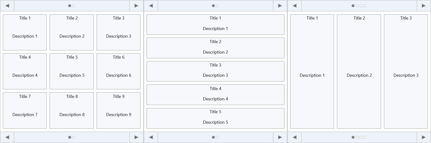
Grid layout
TMSFNCTileList1.Rows    := 2;
TMSFNCTileList1.Columns := 4;
Default is 3×3. Single-row or single-column layouts are also supported.
Adding tiles
Tiles are TTMSFNCTileListItem objects in the Items collection:
// Basic tile list setup
procedure TForm1.FormCreate(Sender: TObject);
var
  itm: TTMSFNCTileListItem;
  I: Integer;
begin
  TMSFNCTileList1.BeginUpdate;
  TMSFNCTileList1.Items.Clear;
  TMSFNCTileList1.Rows    := 2;
  TMSFNCTileList1.Columns := 4;

  for I := 1 to 8 do
  begin
    itm             := TMSFNCTileList1.Items.Add;
    itm.Title       := 'Tile ' + IntToStr(I);
    itm.Description := 'Description ' + IntToStr(I);
  end;
  TMSFNCTileList1.EndUpdate;
end;

// Selection
TMSFNCTileList1.SelectItem(3);
TMSFNCTileList1.MultiSelect := True;
TMSFNCTileList1.SelectItems([0, 2, 4]);
TMSFNCTileList1.SelectItemsBetween(1, 5);
TMSFNCTileList1.DeselectAllItems;

// Filtering
TMSFNCTileList1.ApplyFilter('Tile 1');
TMSFNCTileList1.ClearFilter;

// React to selection
procedure TForm1.TMSFNCTileList1ItemSelected(Sender: TObject;
  AItemIndex: Integer);
begin
  ShowMessage('Selected: ' + TMSFNCTileList1.Items[AItemIndex].Title);
end;

// Custom background colour per tile
procedure TForm1.TMSFNCTileList1BeforeDrawItemBackground(Sender: TObject;
  AGraphics: TTMSFNCGraphics; ARect: TRectF; AItemIndex: Integer;
  var ADefaultDraw: Boolean);
begin
  case AItemIndex mod 3 of
    0: AGraphics.Fill.Color := gcPowderblue;
    1: AGraphics.Fill.Color := gcSkyblue;
    2: AGraphics.Fill.Color := gcCornflowerblue;
  end;
end;
Each tile item has:
| Property | Description |
|---|---|
Title |
Title text — always top-aligned when set. Height is TitleHeight. |
Description |
Remaining text area. |
Control |
TControl placed inside the tile (position controlled by ControlPosition). |
Image |
Bitmap or image reference. Position/size set via ImagePosition, ImageWidth, ImageHeight. |
RowSpan / ColSpan |
How many rows/columns this tile spans. |
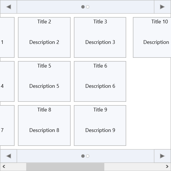
Navigation modes
NavigationMode controls how the tile list paginates:
| Value | Behaviour |
|---|---|
tlnmPage |
One full page visible at a time. Navigation arrows move page by page. |
tlnmScroll |
Continuous scroll bar. |
TMSFNCTileList1.NavigationMode := tlnmPage;
TMSFNCTileList1.GoToPage(2);
TMSFNCTileList1.NextPage;
TMSFNCTileList1.PreviousPage;
TMSFNCTileList1.FirstPage;
TMSFNCTileList1.LastPage;
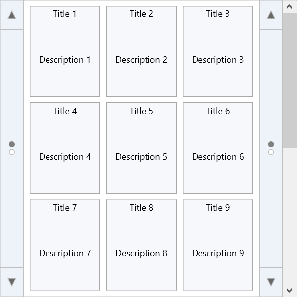
Orientation
Orientation switches between horizontal pages and vertical pages:
TMSFNCTileList1.Orientation := tloVertical; // or tloHorizontal (default)
Tile reordering
Enable drag-to-reorder via ReorderMode:
| Mode | Description |
|---|---|
rmNone |
Dragging disabled (default). |
rmRearrange |
Dragged tile is inserted at the drop position; others shift around. |
rmShift |
Tiles between origin and destination shift toward the origin. |
rmSwap |
Dragged tile swaps with the tile at the drop position. |
TMSFNCTileList1.ReorderMode := rmSwap;
Selection
TMSFNCTileList1.SelectItem(3);
TMSFNCTileList1.MultiSelect := True;
TMSFNCTileList1.SelectItems([0, 2, 4]);
TMSFNCTileList1.SelectItemsBetween(0, 5);
TMSFNCTileList1.DeselectAllItems;
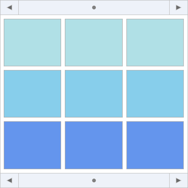
Custom drawing
Override per-tile background or content with draw events:
procedure TForm1.TMSFNCTileList1BeforeDrawItemBackground(Sender: TObject;
  AGraphics: TTMSFNCGraphics; ARect: TRectF; AItemIndex: Integer;
  var ADefaultDraw: Boolean);
begin
  case AItemIndex mod 3 of
    0: AGraphics.Fill.Color := gcPowderblue;
    1: AGraphics.Fill.Color := gcSkyblue;
    2: AGraphics.Fill.Color := gcCornflowerblue;
  end;
end;
For more complex rendering, implement a custom visualizer by subclassing TTMSFNCTileListVisualizer and assigning it to TTMSFNCTileList.Visualizer (all tiles) or TTMSFNCTileListItem.Visualizer (one tile).
Filtering
TMSFNCTileList1.Filtering := tlfAny;       // match anywhere in title
// TMSFNCTileList1.Filtering := tlfStart;  // match start of title
TMSFNCTileList1.ApplyFilter('Tile 1');
TMSFNCTileList1.ClearFilter;