Styling the arrow
TTMSFNCWidgetArrow ties the arrow's color to its value and lets you shape the
arrow itself. This chapter covers the value-based color gradient and the arrow
geometry.

Value-based color
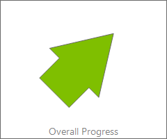
ArrowOptions colors the arrow by value across three stops: ColorFrom at the
low end (-90, red by default), ColorAtZero in the middle (0, yellow), and
ColorTo at the high end (+90, green). The widget interpolates between them, so a
rising value visibly shifts the arrow from red through yellow to green — a
traffic-light trend at a glance. This example sets a value and the full gradient
plus geometry together.
procedure TForm1.StyleArrow;
begin
  FArrow.Value := 45;

  // The arrow color interpolates by value: ColorFrom at the low end (-90),
  // ColorAtZero in the middle (0), and ColorTo at the high end (+90).
  FArrow.ArrowOptions.ColorFrom := gcRed;
  FArrow.ArrowOptions.ColorAtZero := gcYellow;
  FArrow.ArrowOptions.ColorTo := gcGreen;

  // Geometry of the shaft and head.
  FArrow.ArrowOptions.Width := 40;
  FArrow.ArrowOptions.HeadWidth := 80;
  FArrow.ArrowOptions.HeadLength := 70;
end;
Arrow geometry
The same ArrowOptions shapes the arrow: Width is the shaft width, HeadWidth
and HeadLength size the arrowhead, and Margin insets the arrow from the
widget edge. Fill and Border theme the surface behind it. Widen the head for a
bolder indicator, or narrow everything for a subtle one.
Pitfalls
- The three color stops are by value, not position.
ColorFrom/ColorTobind to the -90/+90 ends, so swapping them inverts the good/bad reading. - An oversized head clips in a small widget. Balance
HeadWidth/HeadLengthagainst the control size andMargin. OnBeforeDrawArrow/OnAfterDrawArrowrun every repaint. Keep custom drawing cheap, as the arrow redraws on each value change.
See also
- Showing a trend — point the arrow and label it.
- API reference — full class reference.