Chart types and the value collection
TTMSFNCWidgetDistributionIndicator compares a set of numeric values against
their combined total and draws the result as a donut, pie, bar, or funnel. Use it
on a dashboard when you want to answer "how does this break down?" — sales per
country, traffic per channel, budget per department — rather than plotting a
trend over time. Every presentation is driven by the same Values collection, so
you populate the data once and switch the visual with a single property. This
chapter covers building that collection, colouring each segment, choosing the
chart shape, and deciding whether numbers appear as raw amounts or percentages.
Populating the value collection
Each entry is a TTMSFNCDistributionValue with a numeric Value and an optional
descriptive Text label. The control derives every segment's share from the
combined total of all values, so the units you use are arbitrary — counts,
currency, or anything else. Add items through the Values collection and set the
per-segment Fill.Color to give the chart a readable palette.
Important
Fill and Stroke are graphics objects, not colours. Write
Item.Fill.Color := gcDodgerblue, never Item.Fill := gcDodgerblue — the
latter is a compile error.
procedure TForm1.BuildDistribution;
var
Item: TTMSFNCDistributionValue;
begin
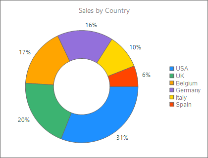
WidgetDistributionIndicator1.Header.Text := 'Sales by Country';
WidgetDistributionIndicator1.Values.Clear;
Item := WidgetDistributionIndicator1.Values.Add;
Item.Text := 'USA';
Item.Value := 3100;
Item.Fill.Color := gcDodgerblue;
Item := WidgetDistributionIndicator1.Values.Add;
Item.Text := 'UK';
Item.Value := 2000;
Item.Fill.Color := gcMediumseagreen;
Item := WidgetDistributionIndicator1.Values.Add;
Item.Text := 'Belgium';
Item.Value := 1700;
Item.Fill.Color := gcOrange;
Item := WidgetDistributionIndicator1.Values.Add;
Item.Text := 'Germany';
Item.Value := 1600;
Item.Fill.Color := gcMediumpurple;
{ Render as a donut and show each segment's share as a percentage. }
WidgetDistributionIndicator1.DistributionType := dtDonut;
WidgetDistributionIndicator1.ValueType := vtPercentage;
WidgetDistributionIndicator1.ValueFormatPercentage := '%.0f%%';
end;
A control dropped at design time is pre-filled with placeholder items so you can
see the shape in the form designer. Clear them with Values.Clear before adding
your own data, as the snippet above does.
Choosing a distribution type
DistributionType selects the visual without touching the data:
| Value | Presentation | Best for |
|---|---|---|
dtDonut |
Ring with a hollow centre | Proportional share, room for a centre caption |
dtPie |
Filled circle | Proportional share, compact |
dtHorizontalBar |
Horizontal bars | Ranked categories with long labels |
dtVerticalBar |
Vertical bars | Ranked categories, column layout |
dtFunnel |
Stacked tapering sections | Conversion or stage-drop data |
dtDonut is the default. The donut ring thickness is controlled by
DonutThickness; the bar presentations honour BarWidth and BarLength. Funnel
geometry has its own options, covered in
Legend, captions, and the funnel.
Displaying absolute values or percentages
ValueType decides what the on-segment text shows:
vtPercentage— each segment's share of the total, formatted withValueFormatPercentage(aFormat-style string, e.g.'%.0f%%').vtAbsolute— the rawValue, formatted withValueFormatAbsolute.
Switch between them at runtime to give users a percentage view and a raw-number view of the same data:
{ Toggle between percentage and absolute presentation: }
if ShowPercent then
  WidgetDistributionIndicator1.ValueType := vtPercentage
else
  WidgetDistributionIndicator1.ValueType := vtAbsolute;
The combined snippet at the top of this page already exercises a combination of
these features — it populates the collection, colours each segment, selects
dtDonut, and applies a percentage format in one pass.
Pitfalls
- Colour assignment.
Fill/Strokeare objects; assign through.Color. The snippet linter does not catch a directFill := gcRedassignment, but the compiler does (E2010 Incompatible types). - Leftover design-time data. A control placed at design time starts with
sample items. Call
Values.Clearbefore adding your own, or you will see both. - Format strings.
ValueFormatPercentage/ValueFormatAbsoluteare passed toFormat; a literal percent sign must be escaped as%%(e.g.'%.0f%%'). - Empty or zero totals. If every
Valueis0the combined total is zero and no segment is drawn — guard data-driven scenarios against an all-zero set.