Styling the marquee
The marquee ring is fully themeable: you control the colour and width of both the
moving arc and the static track behind it, the widget border and background, and
the caption and centred value text. Style the widget to match your dashboard
palette and to make the "busy" arc stand out against its track. This chapter
covers the arc and track through CircleOptions, the border and background fill,
the caption and value text, and the custom-draw events for advanced rendering.

Arc and track with CircleOptions
CircleOptions (a TTMSFNCCircleOptionsMarquee) holds the ring geometry and
colours. The two fills are the heart of it:
CircleOptions.Fill— the moving arc segment.CircleOptions.UnfinishedFill— the static track the arc travels over.
Both are graphics objects, so set their .Color and .Kind sub-properties —
writing Fill := gcDodgerblue is a type error. Thickness sets the arc width in
pixels (default 40) and Margin is the spacing reserved around the ring inside
the control bounds. Keep both fills gfkSolid so the rotation stays visible.
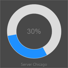
procedure TForm1.StyleMarquee;
begin
  // CircleOptions.Fill is the moving arc; UnfinishedFill is the static track.
  // These are graphics OBJECTS, so set the .Color sub-property, not the object.
  // Animation only works with a solid fill kind.
  FMarquee.CircleOptions.Fill.Kind := gfkSolid;
  FMarquee.CircleOptions.Fill.Color := gcDodgerblue;
  FMarquee.CircleOptions.UnfinishedFill.Kind := gfkSolid;
  FMarquee.CircleOptions.UnfinishedFill.Color := gcGainsboro;
  FMarquee.CircleOptions.Thickness := 30; // arc width in pixels
  FMarquee.CircleOptions.Margin := 16;    // gap between the bounds and the ring

  // Widget background fill and border (both graphics objects).
  FMarquee.Fill.Kind := gfkSolid;
  FMarquee.Fill.Color := gcWhite;
  FMarquee.Border.Kind := gskSolid;
  FMarquee.Border.Color := gcSilver;

  // Caption below the ring, and the centered value text.
  FMarquee.CaptionOptions.Text := 'Backup';
  FMarquee.CaptionOptions.Position := cpBottom;
  FMarquee.ValueFormat := '%g%%';
end;
Border, background, caption, and value text
Beyond the ring, the widget exposes the surface and text members it inherits from the progress base control:
Fill— the widget background fill (a graphics object; set.Color/.Kind).Border— the widget border stroke (a graphics object; set.Color/.Kind).CaptionOptions.Textlabels the widget, andCaptionOptions.Position(cpTop,cpBottom, orcpNone) places the label above or below the ring.ValueFontstyles the centred value text andValueFormatformats it — the default%g%%prints the value followed by a percent sign.
These let the marquee carry a title (for example the task or server name) and a readout in one compact control.
Custom drawing the arc
For full control over the arc rendering, handle the two draw events the widget raises around its arc:
OnBeforeDrawProgressArcfires before the arc is painted. Its handler receives the graphics surface, the circle rectangle, theCircleOptions, the percentage, and the start/sweep angles, plus twovarflags: setAAllow := Falseto skip the arc (and its after-draw) entirely, orADefaultDraw := Falseto suppress the built-in rendering and draw the arc yourself.OnAfterDrawProgressArcfires after the arc is painted, so you can overlay extra content (a glyph, a label, a second ring) on top of the default drawing.
Use the before event to replace the arc with a custom shape, and the after event to decorate the standard one.
Pitfalls
- Colour properties are objects. Set
CircleOptions.Fill.Color := gcDodgerblue, neverCircleOptions.Fill := gcDodgerblue— the latter does not compile. - Use solid fills for animated arcs. A gradient or non-solid
Fill.Kindcan make the rotating arc hard to read or invisible; the control's own setup forcesgfkSolidfor this reason. - Track and arc should contrast. Give
UnfinishedFilla muted colour andFilla saturated one so the moving segment is clearly visible against the track. ADefaultDraw := Falsemeans you draw everything. When you suppress the built-in arc inOnBeforeDrawProgressArc, the widget paints nothing for the arc — your handler is responsible for the full rendering.
See also
- Animating the marquee — start/stop, speed, and arc length.
- API reference — full class reference.