Display and appearance
TTMSFNCWidgetMatrixLabel renders text as a grid of LED-style cells, reproducing
the look of a physical dot-matrix display board. Reach for it when a dashboard
needs a retro digital-signage element — a status word, a short headline, or a
numeric readout — that should read as a lit LED panel rather than as ordinary
label text. This chapter covers the static side of the widget: how to put text on
the grid, choose the cell size, color the lit and unlit dots, and place the text
within the panel. Scrolling marquee behavior is covered in the
Scrolling and events chapter.
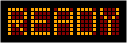
Quick start
Drop a TTMSFNCWidgetMatrixLabel on a form (or create it in code), assign Text,
and the control draws immediately. The widget owns a black background Fill and a
hidden border Stroke by default, so it looks like an LED panel out of the box.
The snippet below builds an 8-cell amber panel showing the word READY, batching
the property changes between BeginUpdate/EndUpdate so the control lays out and
repaints once.
procedure TForm1.FormCreate(Sender: TObject);
var
  Matrix: TTMSFNCWidgetMatrixLabel;
begin
  Matrix := TTMSFNCWidgetMatrixLabel.Create(Self);
  Matrix.Parent := Self;
  Matrix.Position.X := 20;
  Matrix.Position.Y := 20;

  Matrix.BeginUpdate;
  try
    // Number of character cells along the primary axis.
    Matrix.Leds := 8;
    Matrix.Orientation := mloHorizontal;

    // Larger cell grid for a crisper, more readable panel.
    Matrix.Appearance.LedStyle := mls19x27;

    // Lit and unlit dot colors recreate a classic amber LED board.
    Matrix.Appearance.High := gcOrange;
    Matrix.Appearance.Low := gcMaroon;
    Matrix.Appearance.LedsVisible := True;

    // Static text is positioned with the alignment setting.
    Matrix.Appearance.TextStyle := mtsUpperCase;
    Matrix.Appearance.Alignment := mlaCenter;

    // The control auto-sizes to the cells, spacing, and margin.
    Matrix.Appearance.AutoSize := True;
    Matrix.Appearance.Spacing := 3;
    Matrix.Appearance.Margin := 12;

    Matrix.Text := 'READY';
  finally
    Matrix.EndUpdate;
  end;
end;
Text and casing
Text is the string drawn on the grid. The Appearance.TextStyle setting decides
how the characters are cased before rendering: mtsUpperCase (the default, which
suits LED boards), mtsLowerCase, mtsProperCase (capitalizes each word), or
mtsAsIs to draw the string verbatim. The widget renders a built-in HP-style
LED font that includes ASCII plus accented Latin characters, so most short
messages display without extra setup.
Cell count and LED style
Two settings control the size of the panel. Leds is the number of character
cells along the primary axis (default 15). Appearance.LedStyle selects the
pixel size of each cell: mls9x13, mls14x20 (default), or mls19x27 — the
larger styles produce bigger, more legible dots. With Appearance.AutoSize left
at its default True, the control resizes itself to fit Leds cells at the
chosen LedStyle plus the Spacing and Margin; set it to False to keep an
explicit width and height.
Dot colors and visibility
The lit dots use Appearance.High and the unlit dots use Appearance.Low. Both
are plain TTMSFNCGraphicsColor values, so assign a color directly
(Appearance.High := gcOrange) — there is no nested .Color sub-property on these
two members. The defaults are gcLime on gcGreen, the classic green LED look.
Appearance.LedsVisible toggles whether the unlit background dots are drawn: when
True the full grid is visible (lit and unlit), when False only the lit dots
appear over the control's Fill.
Spacing, margin, and orientation
Appearance.Spacing is the gap in pixels between adjacent character cells, and
Appearance.Margin is the extra space around the grid when the control auto-sizes.
Orientation lays the cells out horizontally (mloHorizontal, the default) or
stacks them vertically (mloVertical) for narrow sidebar mounts.
Alignment
When scrolling is disabled, Appearance.Alignment positions the static text inside
the available cells: mlaLeftJustify (default), mlaCenter, or mlaRightJustify.
If the text is longer than Leds cells, the extra characters are clipped — widen
Leds or enable scrolling to show the whole message.
Per-character colors
Text understands inline color codes: a % followed by a hex digit 0–9 or a
letter A–G switches the lit color for the characters that follow (for example
%A red, %B lime). A literal percent sign is written as %%. This works for
static and scrolling text alike and is demonstrated in the
Scrolling and events chapter.
Pitfalls
High/Loware direct colors, not objects. WriteAppearance.High := gcRed, notAppearance.High.Color := gcRed— these two members areTTMSFNCGraphicsColorvalues. (Several other dashboard widgets expose stroke or brush objects; this widget does not for the LED colors.)- Alignment only applies to static text.
Appearance.Alignmentis ignored onceScroll.EnabledisTrue; the text then moves continuously instead. - Text longer than
Ledsis clipped when static. IncreaseLedsor enable scrolling so the full message is visible. - A literal
%must be doubled. A single%is read as the start of a color code; use%%to draw a percent sign.