Getting started with TMS FNC Widget Multi Progress
TTMSFNCWidgetMultiProgress draws several independent progress values as
concentric rings inside one compact control. Reach for it when you want to
compare related percentages at a glance — regional sales, per-stage project
completion, per-team KPIs — without dropping one progress control per metric.
Each ring is a TTMSFNCCircleItem with its own caption and value, and an
optional legend maps each ring colour to its label. This chapter gets a working
widget on screen at runtime; the
Appearance and legend chapter then covers colours,
ring geometry, and legend placement.
Prerequisites
- TMS FNC Core installed and the runtime package added to the project.
- TMS FNC Dashboard Pack design-time package registered in the IDE.
Add the control
You can drop TTMSFNCWidgetMultiProgress from the TMS FNC Dashboard palette
page onto a form and populate the CircleItems collection in the Object
Inspector, or build the whole widget in code as shown below.
Populate the rings
The widget owns a CircleItems collection. Call CircleItems.Add once per
metric, then set the item's Caption and Value. Value is a percentage in
the range 0..100 — values outside that range are silently ignored — so there is
no separate minimum/maximum to configure per ring. Wrap a batch of changes in
BeginUpdate/EndUpdate so the widget repaints once instead of after every item.
procedure TForm1.FormCreate(Sender: TObject);
var
  Widget: TTMSFNCWidgetMultiProgress;
  Item: TTMSFNCCircleItem;
begin
  Widget := TTMSFNCWidgetMultiProgress.Create(Self);
  Widget.Parent := Self;
  Widget.SetBounds(20, 20, 360, 300);

  // Title above the rings.
  Widget.CaptionOptions.Text := 'Regional sales completion';
  Widget.CaptionOptions.Position := cpTop;

  // Show one row per ring in a legend in the top-right corner.
  Widget.Legend.Position := lpTopRight;

  // Build the rings. Each ring is an independent TTMSFNCCircleItem with its
  // own caption and a Value expressed as a percentage (0..100).
  Widget.CircleItems.BeginUpdate;
  try
    Widget.CircleItems.Clear;

    Item := Widget.CircleItems.Add;
    Item.Caption := 'North';
    Item.Value := 82;

    Item := Widget.CircleItems.Add;
    Item.Caption := 'South';
    Item.Value := 64;

    Item := Widget.CircleItems.Add;
    Item.Caption := 'East';
    Item.Value := 47;

    Item := Widget.CircleItems.Add;
    Item.Caption := 'West';
    Item.Value := 28;
  finally
    Widget.CircleItems.EndUpdate;
  end;
end;
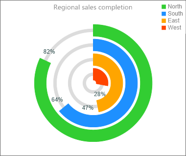
The outermost ring is the first item you add; each subsequent item is drawn
inside the previous one. Set CaptionOptions.Text for a title and
CaptionOptions.Position (cpTop, cpBottom, or cpNone) to place it. The
legend is enabled by giving Legend.Position any value other than lpNone.
Pitfalls
Valueis a percentage, not an absolute count. AValueof12renders as a 12% arc, not "12 units". Convert your raw figures to a 0..100 percentage before assigning, and remember that values below0or above100are ignored rather than clamped.- Ring order is collection order. The first item added is the outermost ring. Add your most important metric first if you want it on the outside.
- Too many rings shrink to nothing. Each inner ring is smaller than the last;
the widget stops drawing rings once they fall below the ring thickness, so keep
the item count and
CircleOptions.Thicknessin balance for the control size.
See also
- Appearance and legend — colours, ring geometry, and legend options.
TTMSFNCWidgetMultiProgress— full class reference.TTMSFNCCircleItem— per-ring settings.