Appearance and legend
Once the rings hold data (see Building and populating rings),
the next job is making the widget readable and on-brand: colour-code each ring so
a metric is identifiable at a glance, tune the ring geometry so the arcs are
thick enough to read, format the inline value labels, and place a legend that
maps colours to captions. Reach for explicit per-ring colours whenever the
default palette does not match your dashboard, or when a ring's colour should
carry meaning (green/amber/red for health, brand colours per region). This
chapter covers per-item fills, the shared CircleOptions geometry, value labels,
and the legend table.
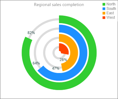
Colour-code each ring
Fill (the completed arc) and UnfinishedFill (the remaining arc) are fill
objects, not colour values, so set the .Color sub-property —
Item.Fill.Color := gcLimegreen. Assigning a colour directly to Item.Fill is a
type error. If you do not set a fill, each ring picks a distinct colour from a
built-in palette based on its index, so colour-coding is only needed when you
want specific colours.
Ring geometry
CircleOptions (a TTMSFNCCircleOptionsMulti) is shared by every ring:
Thickness— thickness of the completed arc (default 30).UnfinishedThickness— thickness of the remaining arc (default 5).Gap— radial spacing between adjacent rings (default 5).StartAngle/EndAngle— the sweep;0/360is a full circle.ValueGap— angular gap left for the inline value label.
Configure the legend and value labels
Legend.Position accepts lpTopLeft, lpTopRight, lpBottomLeft,
lpBottomRight, lpOnCircle, or lpNone (off). The legend has its own Font,
Fill, Border, and Margin. The inline value labels drawn near each arc use
the widget's ValueFormat (a format string such as '%g%%') and ValueFont.
The snippet below ties the per-ring fills, the shared geometry, value formatting, and the legend together in one styling routine:
procedure TForm1.StyleWidget(AWidget: TTMSFNCWidgetMultiProgress);
var
  Item: TTMSFNCCircleItem;
begin
  AWidget.CaptionOptions.Text := 'Project health';
  AWidget.CaptionOptions.Position := cpTop;

  // Ring geometry shared by every item.
  AWidget.CircleOptions.Thickness := 26;            // completed arc thickness
  AWidget.CircleOptions.UnfinishedThickness := 6;   // remaining arc thickness
  AWidget.CircleOptions.Gap := 6;                    // radial space between rings
  AWidget.CircleOptions.StartAngle := 0;            // full circle starts at 0
  AWidget.CircleOptions.EndAngle := 360;

  // Value labels printed inside the widget use ValueFormat / ValueFont.
  AWidget.ValueFormat := '%g%%';
  AWidget.ValueFont.Color := gcDarkslategray;

  AWidget.CircleItems.BeginUpdate;
  try
    AWidget.CircleItems.Clear;

    // Fill and UnfinishedFill are fill OBJECTS, so set the .Color sub-property.
    Item := AWidget.CircleItems.Add;
    Item.Caption := 'Design';
    Item.Value := 90;
    Item.Fill.Color := gcLimegreen;
    Item.UnfinishedFill.Color := gcGainsboro;

    Item := AWidget.CircleItems.Add;
    Item.Caption := 'Build';
    Item.Value := 65;
    Item.Fill.Color := gcDodgerblue;
    Item.UnfinishedFill.Color := gcGainsboro;

    Item := AWidget.CircleItems.Add;
    Item.Caption := 'Test';
    Item.Value := 40;
    Item.Fill.Color := gcOrange;
    Item.UnfinishedFill.Color := gcGainsboro;
  finally
    AWidget.CircleItems.EndUpdate;
  end;

  // Legend table: position, font and surface.
  AWidget.Legend.Position := lpBottomRight;
  AWidget.Legend.Margin := 6;
  AWidget.Legend.Font.Color := gcDarkslategray;
  AWidget.Legend.Fill.Color := gcWhite;
end;
Pitfalls
- Fills are objects. Use
Item.Fill.Color := …, neverItem.Fill := …. The snippet linter does not catch this — only the compiler does. lpOnCircleneedsStartAngle = 0. The on-circle legend layout is only applied for a full circle starting at 0 degrees; with a non-zeroStartAnglethe widget falls back to drawing no legend. Use a corner position (lpTopRight, …) if you change the start angle.- Inline value labels only show off-circle. The per-arc value text is drawn
when the legend is not
lpOnCircleand the ring's value is greater than 0; chooselpOnCircleonly when you want captions and values listed on the rings instead.
See also
- Building and populating rings — the data model and ring order.
TTMSFNCWidgetMultiProgressTTMSFNCWPLegendOptionsTTMSFNCCircleItem