Building and populating rings
TTMSFNCWidgetMultiProgress shows several progress values as concentric rings in
one control, so you can compare related percentages — regional sales, per-stage
completion, per-team KPIs — without one progress control per metric. This chapter
covers the data model: how to create the widget, populate its CircleItems
collection, and control the title and legend. Reach for the multi-progress widget
(rather than several single TTMSFNCWidgetProgress controls) when the metrics
belong together and you want them visually nested and legended as a set. For the
visual treatment — per-ring colours, ring thickness, and legend styling — see the
Appearance and legend chapter.
Core concept: rings are collection items
The widget owns a CircleItems collection of TTMSFNCCircleItem. Each item is
one ring and carries:
Caption— the label shown for the ring in the legend.Value— the progress, as a percentage in the range 0..100. There is no per-ring minimum/maximum; convert raw figures to a percentage yourself. Values outside 0..100 are ignored.Fill/UnfinishedFill— fill objects for the completed and remaining arcs (covered in the next chapter).
The first item added is the outermost ring; each subsequent item is drawn inside the previous one.
Populate the collection
Call CircleItems.Add once per metric and set its Caption and Value. Wrap a
batch in BeginUpdate/EndUpdate so the widget repaints once after the whole
batch rather than after every change, and call Clear first when you are
rebuilding from fresh data.
procedure TForm1.FormCreate(Sender: TObject);
var
  Widget: TTMSFNCWidgetMultiProgress;
  Item: TTMSFNCCircleItem;
begin
  Widget := TTMSFNCWidgetMultiProgress.Create(Self);
  Widget.Parent := Self;
  Widget.SetBounds(20, 20, 360, 300);

  // Title above the rings.
  Widget.CaptionOptions.Text := 'Regional sales completion';
  Widget.CaptionOptions.Position := cpTop;

  // Show one row per ring in a legend in the top-right corner.
  Widget.Legend.Position := lpTopRight;

  // Build the rings. Each ring is an independent TTMSFNCCircleItem with its
  // own caption and a Value expressed as a percentage (0..100).
  Widget.CircleItems.BeginUpdate;
  try
    Widget.CircleItems.Clear;

    Item := Widget.CircleItems.Add;
    Item.Caption := 'North';
    Item.Value := 82;

    Item := Widget.CircleItems.Add;
    Item.Caption := 'South';
    Item.Value := 64;

    Item := Widget.CircleItems.Add;
    Item.Caption := 'East';
    Item.Value := 47;

    Item := Widget.CircleItems.Add;
    Item.Caption := 'West';
    Item.Value := 28;
  finally
    Widget.CircleItems.EndUpdate;
  end;
end;
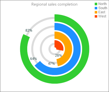
The CaptionOptions.Text / CaptionOptions.Position pair places a title above
(cpTop) or below (cpBottom) the rings, and any Legend.Position other than
lpNone turns on the legend table.
Update values at runtime
Because each ring is a collection item, you can update a value in place and the widget repaints automatically — useful for live dashboards:
{ Inside a timer or data-refresh handler: }
if Widget.CircleItems.Count > 0 then
  Widget.CircleItems.Items[0].Value := 95;  // bump the outer ring to 95%
Pitfalls
Valueis a percentage.Value := 12is a 12% arc, not 12 units. Scale your data to 0..100 first; out-of-range values are dropped, not clamped.- Item order is ring order. Add the metric you want on the outside first.
- Rebuild cleanly. When refreshing from a data source, call
CircleItems.Clearinside theBeginUpdate/EndUpdateblock before re-adding, or you will append rings to the existing set.
See also
- Appearance and legend — colour-coding rings and styling the legend.
TTMSFNCWidgetMultiProgressTTMSFNCCircleItem