Appearance and custom drawing
The set-point widget paints several distinct parts — the ring arc, a current-value indicator, a separate set-point indicator, the strip between them, tick marks, and a caption. Each part has its own appearance object, so you can give the live reading and the target a clear visual identity and still keep the control readable in both light and dark themes. This chapter covers how to style those parts and, when the built-in look is not enough, how to take over the drawing of the indicators yourself through the custom-draw events.
A point worth stating up front, because it is the most common compile error with
these widgets: the color properties are stroke and fill objects, not color
values. Write ValueIndicator.Fill.Color := gcSlateblue, never
ValueIndicator.Fill := gcSlateblue — the latter is a type mismatch the symbol
linter will not catch.
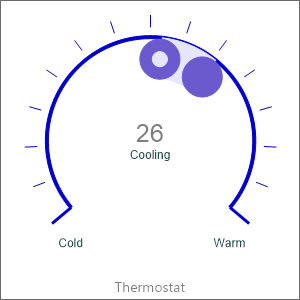
Style the indicators and the strip
ValueIndicator and SetPointIndicator are both TTMSFNCValueIndicatorOptions.
The current-value indicator is a plain dot; the set-point indicator additionally
exposes InnerDotSize / InnerDotFill so the target reads as a ringed marker and
is easy to tell apart from the live value. SetPointStripFill is the fill of the
band drawn between the two markers and is a TTMSFNCWidgetGraphicsFill, so it
supports a solid color or a gradient via its Kind, Color, and ColorTo
sub-properties. The arc itself is configured through the inherited CircleOptions
(StartAngle, EndAngle, Thickness, and Fill).
procedure TForm1.StyleSetPoint(ASetPoint: TTMSFNCWidgetSetPoint);
begin
  { Arc geometry of the ring (inherited CircleOptions). }
  ASetPoint.CircleOptions.StartAngle := 230;
  ASetPoint.CircleOptions.EndAngle := 130;
  ASetPoint.CircleOptions.Thickness := 4;
  ASetPoint.CircleOptions.Fill.Color := gcMediumblue;

  { Current-value indicator (a dot on the ring). Fill is an object: set .Color. }
  ASetPoint.ValueIndicator.Size := 40;
  ASetPoint.ValueIndicator.Fill.Color := gcSlateblue;

  { Set-point indicator with an inner dot to distinguish it from the value. }
  ASetPoint.SetPointIndicator.Size := 40;
  ASetPoint.SetPointIndicator.InnerDotSize := 15;
  ASetPoint.SetPointIndicator.Fill.Color := gcSlateblue;
  ASetPoint.SetPointIndicator.InnerDotFill.Color := gcLavender;

  { Fill of the strip drawn between the value and the set-point. }
  ASetPoint.SetPointStripFill.Kind := gfkSolid;
  ASetPoint.SetPointStripFill.Color := gcLavender;

  { Tick marks and start/end labels around the ring. }
  ASetPoint.Tickmarks.Count := 15;
  ASetPoint.Tickmarks.Size := 12;
  ASetPoint.Tickmarks.StartEndMarkSize := 25;
  ASetPoint.Tickmarks.Stroke.Color := gcMediumblue;
  ASetPoint.Tickmarks.StartText := 'Cold';
  ASetPoint.Tickmarks.EndText := 'Warm';

  { Wire a custom-draw overlay drawn on top of the indicators. }
  ASetPoint.OnAfterDrawProgressSetpoint := SetPointAfterDraw;
end;

procedure TForm1.SetPointAfterDraw(Sender: TObject;
  AGraphics: TTMSFNCGraphics; RectCircle: TRectF;
  SetPoint, APosition, alculatedScaledPosition, CalculatedScaledSetPoint: Single;
  CalculatedPositionPointOnCircle, CalculatedSetpointPointOnCircle: TPointF);
begin
  { Draw a small marker at the computed set-point point on the circle. }
  AGraphics.Stroke.Color := gcRed;
  AGraphics.DrawEllipse(RectF(
    CalculatedSetpointPointOnCircle.X - 3, CalculatedSetpointPointOnCircle.Y - 3,
    CalculatedSetpointPointOnCircle.X + 3, CalculatedSetpointPointOnCircle.Y + 3));
end;
Tick marks and caption
Tickmarks (a TTMSFNCTickmarkOptions) draws the graduation marks around the
ring. Count sets how many marks appear, Size their length, and Stroke.Color
their color. The start/end labels (StartText, EndText) anchor the scale, and
StartEndMarkSize lengthens the marks at the two ends so the limits stand out.
CenterText is drawn under the value in the middle of the ring — handy for a
state word. The CaptionOptions object carries a Text plus its own Font and a
Position (cpTop, cpBottom, or cpNone) that places the caption above or
below the ring. These are all set in the appearance helper above.
Override the indicator drawing
When you need a marker the built-in indicators cannot produce — a custom glyph, an
extra annotation, a different shape for an alarm state — handle the custom-draw
events. OnBeforeDrawProgressSetpoint fires before the value and set-point
indicators are painted; it hands you the graphics surface, the circle rectangle,
the raw and scaled values, and the two computed points on the circle, plus two
var flags: set AAllow := False to cancel the indicator drawing entirely, or
ADefaultDraw := False to suppress only the built-in markers and draw your own.
OnAfterDrawProgressSetpoint fires after the indicators are drawn and is the
place to add an overlay on top. The appearance snippet above wires
OnAfterDrawProgressSetpoint to drop a small red marker at the computed set-point
point on the circle.
Pitfalls
- Color properties are objects.
Foo.Color := gcRedis correct;Foo := gcRedis a type error. This applies toValueIndicator.Fill,SetPointIndicator.Fill,SetPointStripFill,Tickmarks.Stroke, andCircleOptions.Fill. - Match the event signature exactly. The custom-draw handlers carry the
parameter
alculatedScaledPosition(note the missing leadingC, as declared in the source). Copy the signature verbatim or the handler will not attach. - Use the
varflags, do not just draw. To replace the built-in indicators inOnBeforeDrawProgressSetpoint, setADefaultDraw := False; otherwise your drawing is painted under the default markers.
See also
- Current value and set-point — range, value, and target basics.
TTMSFNCWidgetSetPoint— full class reference.TTMSFNCValueIndicatorOptions— indicator appearance.TTMSFNCTickmarkOptions— tick marks and labels.