The trend graph
The small graph on the card turns a single KPI into a trend: it plots a series of recent values as a sparkline or bar chart beside the headline figure. This chapter covers filling the series and choosing how it draws.
Filling the series
Values is a collection of points. Add each with Values.Add and set its Value;
wrap the batch in BeginUpdate/EndUpdate so the card repaints once. Feed it the
recent history of the metric (the last N samples) so the graph shows where the KPI
has been heading. This example fills the series and renders it as bars.
procedure TForm1.FillTrend;
var
  V: TTMSFNCWidgetTrendValue;
  I, Last: Integer;
begin
  FTrend.Value := 24358;
  FTrend.GraphType := gtBar;        // gtLine (default) draws a sparkline; gtBar draws columns
  FTrend.GraphColor.Color := gcDodgerblue; // GraphColor is a stroke object; set its Color

  FTrend.Values.BeginUpdate;
  try
    FTrend.Values.Clear;
    Last := 49;
    for I := 0 to 15 do
    begin
      V := FTrend.Values.Add;
      V.Value := Last + Random(5) - 2; // each point is one step in the series
      Last := V.Value;
    end;
  finally
    FTrend.Values.EndUpdate;
  end;
end;
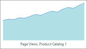
Line or bars
GraphType chooses the rendering: gtLine (the default) draws a sparkline, and
gtBar draws columns with BarGap controlling the spacing between them.
GraphColor sets the line/bar color and GraphFill themes the area beneath a
line. Use a line for a smooth trend and bars for discrete periods.
Pitfalls
- Wrap series edits in
BeginUpdate/EndUpdate. Adding points without it repaints on everyAdd, which flickers. - Cap the number of points. A sparkline is meant to be compact — show a recent window, not the entire history.
BarGaponly applies togtBar. It has no effect on a line graph.
See also
- Showing a KPI — the headline value and description.
- API reference — full class reference.