Appearance and Customization
TTMSFNCChat exposes appearance settings for message bubbles, timestamps, the send button, the attachment button, and the entry box.
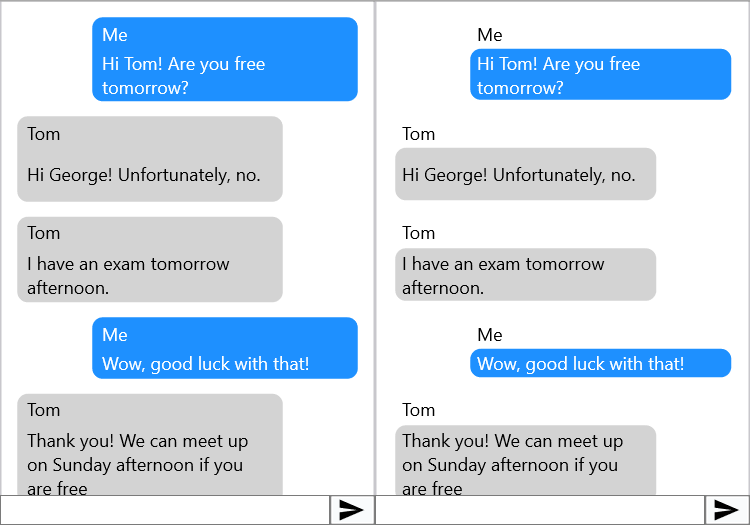
Message style
Appearance.MessageStyle controls how much of the message item the bubble styling covers:
| Value | Description |
|---|---|
cmsAll |
Bubble wraps icon + title + text. |
cmsTextOnly |
Bubble wraps text only. |
TMSFNCChat1.Appearance.MessageStyle := cmsTextOnly;
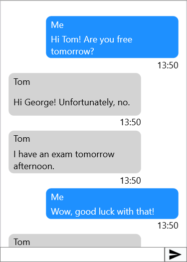
Timestamps
TMSFNCChat1.MessageTimestamp.Show     := True;
TMSFNCChat1.MessageTimestamp.Format   := 'hh:nn';    // time format string
TMSFNCChat1.MessageTimestamp.Position := tspBottom;  // tspTop or tspBottom
Default item appearance
DefaultLeftItem and DefaultRightItem are templates whose settings are copied to new items created via AddMessage:
TMSFNCChat1.DefaultLeftItem.Fill.Color  := gcLightgray;
TMSFNCChat1.DefaultRightItem.Fill.Color := gcLightblue;
Configure spacing between messages and horizontal margins:
TMSFNCChat1.Appearance.Spacing    := 8;
TMSFNCChat1.Appearance.SideMargin := 12;
Send button
The send button is a TTMSFNCToolBarButton accessible via SendButton:
TMSFNCChat1.SendButton.Bitmap.LoadFromFile('C:\Icons\send.png');
TMSFNCChat1.SendButton.ShowHint := True;
TMSFNCChat1.SendButton.Hint     := 'Send message';
For a WhatsApp-style rounded circular button, implement OnGetSendButtonRect:
// Message style — bubble wraps text only vs. title+icon+text
TMSFNCChat1.Appearance.MessageStyle := cmsTextOnly;   // text bubble only
// TMSFNCChat1.Appearance.MessageStyle := cmsAll;     // full bubble

// Timestamps
TMSFNCChat1.MessageTimestamp.Show     := True;
TMSFNCChat1.MessageTimestamp.Format   := 'hh:nn';
TMSFNCChat1.MessageTimestamp.Position := tspBottom;

// Default item settings (applied to new messages from AddMessage)
TMSFNCChat1.DefaultLeftItem.Fill.Color  := gcLightgray;
TMSFNCChat1.DefaultRightItem.Fill.Color := gcLightblue;

// Spacing between messages
TMSFNCChat1.Appearance.Spacing    := 8;
TMSFNCChat1.Appearance.SideMargin := 12;

// --- Send button ---
TMSFNCChat1.ShowMessageField := True;
TMSFNCChat1.SendButton.Bitmap.LoadFromFile('C:\Icons\send.png');
TMSFNCChat1.SendButton.ShowHint := True;
TMSFNCChat1.SendButton.Hint     := 'Send message';

// WhatsApp-style circular send button
TMSFNCChat1.Appearance.MinEntryBoxHeight                := 30;
TMSFNCChat1.SendButton.Appearance.NormalFill.Color      := gcLightgray;
TMSFNCChat1.SendButton.Appearance.Rounding              :=
  TMSFNCChat1.Appearance.MinEntryBoxHeight div 2;
TMSFNCChat1.SendButton.StretchBitmapIfNoText := False;
TMSFNCChat1.SendButton.AutoBitmapSize        := False;
TMSFNCChat1.SendButton.BitmapSize            := 15;
TMSFNCChat1.OnGetSendButtonRect              := HandleGetSendButtonRect;

procedure TForm1.HandleGetSendButtonRect(Sender: TObject; var ARect: TRectF);
var
  t, h: Single;
begin
  t := ARect.Top;
  h := TMSFNCChat1.SendButton.Width;
  ARect.Top    := t + (ARect.Bottom - t - h) / 2;
  ARect.Bottom := ARect.Bottom - (ARect.Bottom - t - h) / 2;
end;

// --- Attachment button ---
TMSFNCChat1.Appearance.ShowAttachmentButton := True;

// --- Reload mechanism ---
TMSFNCChat1.Reload.Enabled := True;

procedure TForm1.TMSFNCChat1StartReload(Sender: TObject);
begin
  // Start a background thread to load older messages, then:
  // TMSFNCChat1.StopReload;
end;
Attachment button
Show an optional attachment button to the left of the entry box:
TMSFNCChat1.Appearance.ShowAttachmentButton := True;
The button is a TTMSFNCToolBarButton accessible via AttachmentButton. Handle OnAttachmentButtonClick to open a file picker or trigger any action.
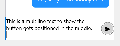
Entry box height
TMSFNCChat1.Appearance.MinEntryBoxHeight := 30;
TMSFNCChat1.Appearance.MaxEntryBoxHeight := 120;
The memo expands as the user types, bounded by these heights.
Header and footer
Both Header and Footer support HTML-formatted text. Handle OnHeaderAnchorClick / OnFooterAnchorClick for link navigation.
Combining timestamps, default appearance, and entry box height
Set a consistent visual baseline by configuring the timestamp format, default bubble colours, and entry box bounds together before showing the control:
TMSFNCChat1.MessageTimestamp.Show     := True;
TMSFNCChat1.MessageTimestamp.Format   := 'hh:nn';
TMSFNCChat1.MessageTimestamp.Position := tspBottom;
TMSFNCChat1.DefaultLeftItem.Fill.Color  := gcLightgray;
TMSFNCChat1.DefaultRightItem.Fill.Color := gcLightblue;
TMSFNCChat1.Appearance.Spacing              := 8;
TMSFNCChat1.Appearance.SideMargin           := 12;
TMSFNCChat1.Appearance.MinEntryBoxHeight    := 30;
TMSFNCChat1.Appearance.MaxEntryBoxHeight    := 120;
TMSFNCChat1.Appearance.ShowAttachmentButton := True;