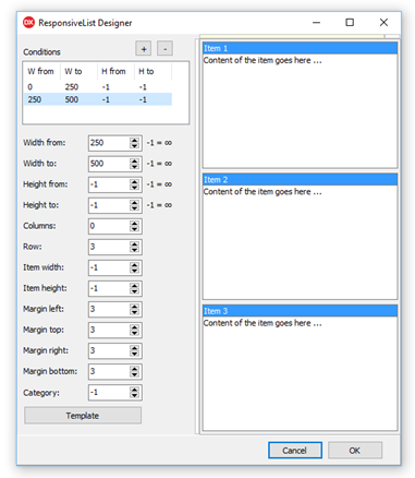
Conditions and Items
Responsive list layout starts with conditions. Each condition defines the client size range where it applies and the row, column, or fixed item size to use in that range. Items then provide the content that is rendered inside those calculated cells.
Width-Based Conditions
Use narrow ranges for compact one-column layouts and wider ranges for multi-column layouts. Keep ItemWidth at -1 when the item width should stretch proportionally with the control.
procedure TForm1.ConfigureResponsiveList;
var
  Condition: TResponsiveCondition;
  Item: TResponsiveListItem;
begin
  TMSFNCResponsiveList1.Conditions.Clear;

  Condition := TMSFNCResponsiveList1.Conditions.Add;
  Condition.WidthFrom := 0;
  Condition.WidthTo := 320;
  Condition.Columns := 1;
  Condition.ItemHeight := 140;

  Condition := TMSFNCResponsiveList1.Conditions.Add;
  Condition.WidthFrom := 321;
  Condition.WidthTo := -1;
  Condition.Columns := 3;
  Condition.ItemHeight := 140;

  TMSFNCResponsiveList1.Items.Clear;

  Item := TMSFNCResponsiveList1.Items.Add;
  Item.HeaderText := 'Support';
  Item.Content := '<b>Open tickets</b><br>12 items need review';
  Item.FooterText := 'Updated today';

  Item := TMSFNCResponsiveList1.Items.Add;
  Item.HeaderText := 'Sales';
  Item.Content := '<b>Pipeline</b><br>4 opportunities closing';
  Item.FooterText := 'This week';
end;
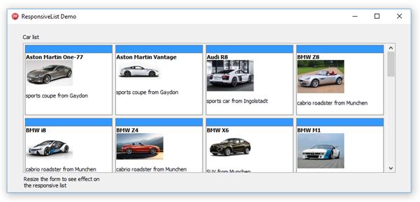
Item Content
Items can combine Content, HeaderText, FooterText, and Values. Use headers and footers for stable labels, and use values when templates need to swap the amount of text shown at different sizes.
Use the item appearance colors for hover and selected states when users need clear feedback while moving through a dense responsive layout.
Responding to Item Double-Clicks
Use OnItemDblClick when a double-click should open a detail view, start an edit action, or otherwise drill into the content behind a card. The event passes the TResponsiveListItem that was double-clicked, so the handler can read its Index, HeaderText, Content, or Values to identify which item triggered it without maintaining a separate lookup.
procedure TForm1.TMSFNCResponsiveList1ItemDblClick(Sender: TObject; AItem: TResponsiveListItem);
begin
  ShowMessage(Format('Double-clicked item %d: %s', [AItem.Index, AItem.HeaderText]));
end;

procedure TForm1.FormCreate(Sender: TObject);
begin
  TMSFNCResponsiveList1.OnItemDblClick := TMSFNCResponsiveList1ItemDblClick;
end;
Combining Conditions, Content, and Double-Click
A typical dashboard combines all three building blocks: width-based conditions control the layout, item content carries the data, and OnItemDblClick reacts to user interaction. The example below sets up conditions and a content-bearing item, then wires a double-click handler that reads the clicked item's header and content to open a detail view.
procedure TForm1.ConfigureResponsiveListWithDoubleClick;
var
  Condition: TResponsiveCondition;
  Item: TResponsiveListItem;
begin
  TMSFNCResponsiveList1.Conditions.Clear;

  Condition := TMSFNCResponsiveList1.Conditions.Add;
  Condition.WidthFrom := 0;
  Condition.WidthTo := 320;
  Condition.Columns := 1;
  Condition.ItemHeight := 140;

  Condition := TMSFNCResponsiveList1.Conditions.Add;
  Condition.WidthFrom := 321;
  Condition.WidthTo := -1;
  Condition.Columns := 3;
  Condition.ItemHeight := 140;

  TMSFNCResponsiveList1.Items.Clear;

  Item := TMSFNCResponsiveList1.Items.Add;
  Item.HeaderText := 'Support';
  Item.Content := '<b>Open tickets</b><br>12 items need review';
  Item.FooterText := 'Updated today';

  TMSFNCResponsiveList1.OnItemDblClick := TMSFNCResponsiveList1ItemDblClick;
end;

procedure TForm1.TMSFNCResponsiveList1ItemDblClick(Sender: TObject; AItem: TResponsiveListItem);
begin
  ShowDetailView(AItem.HeaderText, AItem.Content);
end;