Appearance
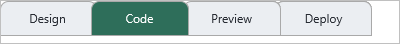
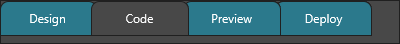
Use TTMSFNCTabSet appearance settings when the whole tab strip should share one visual language. Use per-tab settings only for tabs that need to stand out, such as a warning tab, a progress tab, or a tab with a badge.
Tab appearance
TabAppearance sets the default style for tabs whose UseDefaultAppearance property is True.
| Area | Properties |
|---|---|
| Normal state | Fill, Stroke, TextColor, Font |
| Active state | ActiveFill, ActiveStroke, ActiveTextColor |
| Hover state | HoverFill, HoverStroke, HoverTextColor |
| Down state | DownFill, DownStroke, DownTextColor |
| Disabled state | DisabledFill, DisabledStroke, DisabledTextColor |
| Text layout | TextAlign, Trimming, WordWrapping, TextSpacing |
| Focus | FocusBorderColor, ShowFocus |
Global font
TabAppearance and ButtonAppearance each carry their own font, and every tab can override its own text color. Use GlobalFont instead of visiting each of those individually when the whole tab set should switch to one font family, size, or weight in a single update: setting Name, Size, Scale, or Style cascades that attribute to TabAppearance.Font and TabAppearance.BadgeFont, and setting Color also cascades to the normal, hover, active, and down text color of every tab.
procedure TForm1.FormCreate(Sender: TObject);
begin
  TMSFNCTabSet1.BeginUpdate;
  try
    // Applied to TabAppearance.Font and TabAppearance.BadgeFont, and to every
    // tab's normal/hover/active/down text color, without touching each
    // sub-object individually.
    TMSFNCTabSet1.GlobalFont.Name := 'Segoe UI';
    TMSFNCTabSet1.GlobalFont.Size := 11;
    TMSFNCTabSet1.GlobalFont.Style := [TFontStyle.fsBold];
    TMSFNCTabSet1.GlobalFont.Color := gcSteelBlue;
  finally
    TMSFNCTabSet1.EndUpdate;
  end;
end;
Note
GlobalFont only touches the attributes you set. Leave Color at gcNull
(the default) to cascade font family, size, and style while keeping each
tab's own text colors.
Tab shape
Set TabAppearance.Shape to control the default tab outline. The current shape values are tsRectangle, tsPyramidLeft, tsPyramidRight, tsPyramid, tsRoundLeft, tsRoundRight, and tsRound.
| Property | Purpose |
|---|---|
Shape |
Default tab outline |
ShapeOverlap |
Amount adjacent tabs overlap |
ShapeRounding |
Rounding used by round shapes |
ShapeSlope |
Slope used by pyramid shapes |
procedure TForm1.ConfigureTabSetAppearance;
begin
  TMSFNCTabSet1.TabAppearance.Shape := tsRound;
  TMSFNCTabSet1.TabAppearance.ShapeRounding := 8;
  TMSFNCTabSet1.TabAppearance.Fill.Color := gcWhite;
  TMSFNCTabSet1.TabAppearance.Stroke.Color := gcLightgray;
  TMSFNCTabSet1.TabAppearance.ActiveFill.Color := gcOrange;
  TMSFNCTabSet1.TabAppearance.ActiveTextColor := gcWhite;
  TMSFNCTabSet1.TabAppearance.TextColor := gcBlack;
  TMSFNCTabSet1.TabAppearance.ShowFocus := True;

  TMSFNCTabSet1.TabSize.Height := 36;
  TMSFNCTabSet1.TabSize.Spacing := 4;
  TMSFNCTabSet1.TabSize.Mode := tsmAutoTabSize;

  TMSFNCTabSet1.Layout.Position := tlpTop;
  TMSFNCTabSet1.Layout.Multiline := tlmEnabled;

  TMSFNCTabSet1.ButtonAppearance.Size := 28;
  TMSFNCTabSet1.ButtonAppearance.Rounding := 4;
end;
Button appearance
ButtonAppearance controls the menu buttons used for close, insert, tab-list, and scrolling actions.
| Property | Purpose |
|---|---|
Size |
Button area size |
Rounding |
Button corner rounding |
Fill, Stroke |
Normal button background and border |
HoverFill, HoverStroke |
Hover state background and border |
DownFill, DownStroke |
Pressed state background and border |
DisabledFill, DisabledStroke |
Disabled state background and border |
CloseIcon, InsertIcon |
Custom close and insert icons |
TabListIcon |
Custom hidden-tab list icon |
ScrollPreviousIcon, ScrollNextIcon |
Custom scroll icons |
Badge appearance
Badges use the tab-level Badge, BadgeColor, and BadgeTextColor values when UseDefaultAppearance is False. When UseDefaultAppearance is True, the default badge style comes from TabAppearance.BadgeFill, TabAppearance.BadgeStroke, and TabAppearance.BadgeFont.
Progress indicator appearance
Progress indicators can be rectangular or circular. The tab controls the value with Progress, ProgressMax, ProgressMode, and ProgressKind; TabAppearance.ProgressFill, TabAppearance.ProgressStroke, and TabAppearance.ProgressCircularSize control the shared default look.
Tab sizing
TabSize controls the physical size of the tab strip and individual tabs.
| Property | Purpose |
|---|---|
Height |
Height of the tab strip |
Width |
Fixed tab width when Mode is tsmFixedSize or tsmFixedSizeAutoShrink |
Spacing |
Gap between adjacent tabs |
Margins |
Outer margins around the tab strip |
Mode |
tsmAutoSize, tsmFixedSize, tsmFixedSizeAutoShrink, or tsmAutoTabSize |
Layout
Use Layout.Position to place the tab strip on any side of its container. Use Layout.Multiline when tabs should wrap instead of relying only on scrolling.
| Property | Values |
|---|---|
Position |
tlpLeft, tlpTop, tlpBottom, tlpRight |
Multiline |
tlmNone, tlmEnabled, tlmEnabledActiveTab |
Combining tab appearance, shape, and button styles
Apply a rounded tab shape, size the tab strip, style the button area, and enable multiline layout in one setup block:
procedure TForm1.FormCreate(Sender: TObject);
begin
  TMSFNCTabSet1.BeginUpdate;
  try
    // Rounded tab shape with 4 px overlap between adjacent tabs.
    TMSFNCTabSet1.TabAppearance.Shape := tsRound;
    TMSFNCTabSet1.TabAppearance.ShapeRounding := 6;
    TMSFNCTabSet1.TabAppearance.ShapeOverlap := 4;

    // Active and hover colours.
    TMSFNCTabSet1.TabAppearance.ActiveFill.Color := gcSteelBlue;
    TMSFNCTabSet1.TabAppearance.ActiveTextColor := gcWhite;
    TMSFNCTabSet1.TabAppearance.HoverFill.Color := gcLightSteelBlue;

    // Uniform tab width.
    TMSFNCTabSet1.TabSize.Mode := tsmFixedSize;
    TMSFNCTabSet1.TabSize.Width := 120;
    TMSFNCTabSet1.TabSize.Height := 32;

    // Button area: rounded corners, subtle hover.
    TMSFNCTabSet1.ButtonAppearance.Rounding := 4;
    TMSFNCTabSet1.ButtonAppearance.HoverFill.Color := gcGainsboro;

    // Wrap tabs to a second row before falling back to scrolling.
    TMSFNCTabSet1.Layout.Multiline := tlmEnabled;
  finally
    TMSFNCTabSet1.EndUpdate;
  end;
end;
Note
TabAppearance styles a tab only when that tab's UseDefaultAppearance is
True. Tabs default to False (they use their own per-tab colors), so set
UseDefaultAppearance := True on tabs that should follow the shared theme.
Related API
TTMSFNCTabSet- main component
See also
- Tabs - per-tab overrides, badges, bitmaps, progress indicators, and close buttons
- Interaction - editing, reorder behavior, keyboard actions, and tab events
- Custom drawing - owner-draw tab parts when properties are not enough