Tabs
Tabs are stored in the Tabs collection. Add tabs when the user needs to switch between views, filter contexts, documents, or work areas without leaving the current screen.
Creating tabs
Use AddTab or Tabs.Add to create tabs from code. Wrap larger changes in BeginUpdate and EndUpdate so the control redraws once after the batch is complete.
procedure TForm1.CreateDocumentTabs;
var
  Tab: TTMSFNCTabSetTab;
begin
  TMSFNCTabSet1.BeginUpdate;
  try
    TMSFNCTabSet1.Tabs.Clear;

    Tab := TMSFNCTabSet1.AddTab('Overview');
    Tab.Hint := 'Project overview';

    Tab := TMSFNCTabSet1.AddTab('Reports');
    Tab.BitmapVisible := True;
    Tab.BitmapSize := 18;
    Tab.Bitmaps.Add.Bitmap.LoadFromFile('reports.png');

    Tab := TMSFNCTabSet1.AddTab('Archive');
    Tab.Enabled := False;
  finally
    TMSFNCTabSet1.EndUpdate;
  end;
end;
Tab properties
| Property | Description |
|---|---|
Text |
Tab label |
TextVisible |
Shows or hides the label |
TextAlign |
Text alignment when UseDefaultAppearance is False |
Trimming |
Trims text that is too long for the tab |
WordWrapping |
Wraps text inside the tab |
Enabled |
Enables or disables the tab |
TabVisible |
Shows the tab in the visible tab strip |
Width |
Tab width when TabSize.Mode uses a fixed-width mode |
Hint |
Tooltip text when hints are enabled on the control |
UseDefaultAppearance |
Uses TabAppearance when True; uses tab-level colors and shape when False |
Per-tab appearance
Set UseDefaultAppearance to False when a tab needs its own visual state. The tab then uses its Color, ActiveColor, HoverColor, DownColor, DisabledColor, TextColor, ActiveTextColor, HoverTextColor, DownTextColor, DisabledTextColor, and Shape properties.
Use default appearance for most tabs and override only the tabs that communicate status or priority. This keeps the control easier to scan.
Bitmap icons
Attach bitmap icons to a tab with the Bitmaps collection and enable BitmapVisible. Add multiple scaled bitmaps when the same icon must look sharp at different DPI scales.
Disabled tabs can use a separate DisabledBitmaps collection.
Badges
Badges are compact status indicators. They work well for unread counts, validation warnings, or pending actions.
procedure TForm1.ConfigureStatusTabs;
var
  DownloadsTab: TTMSFNCTabSetTab;
  MessagesTab: TTMSFNCTabSetTab;
begin
  TMSFNCTabSet1.BeginUpdate;
  try
    TMSFNCTabSet1.Options.CloseMode := tcmTab;
    TMSFNCTabSet1.Options.CloseAction := ttcaHide;
    TMSFNCTabSet1.Options.TabListButton := True;

    DownloadsTab := TMSFNCTabSet1.AddTab('Downloads');
    DownloadsTab.BitmapVisible := True;
    DownloadsTab.BitmapSize := 18;
    DownloadsTab.Bitmaps.Add.Bitmap.LoadFromFile('download.png');
    DownloadsTab.ProgressKind := tpkRectangular;
    DownloadsTab.ProgressMode := tpmNormal;
    DownloadsTab.ProgressMax := 100;
    DownloadsTab.Progress := 72;
    DownloadsTab.CloseButton := True;

    MessagesTab := TMSFNCTabSet1.AddTab('Messages');
    MessagesTab.Badge := '12';
    MessagesTab.BadgeColor := gcOrange;
    MessagesTab.BadgeTextColor := gcWhite;
    MessagesTab.CloseButton := True;
  finally
    TMSFNCTabSet1.EndUpdate;
  end;
end;
Progress indicators
Tabs support rectangular and circular progress indicators.
| Property | Description |
|---|---|
ProgressKind |
tpkNone, tpkCircular, or tpkRectangular |
ProgressMode |
tpmNormal or tpmMarquee |
Progress |
Current progress value |
ProgressMax |
Maximum progress value |
ProgressColor |
Tab-level progress color when UseDefaultAppearance is False |
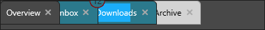
Close buttons
Close buttons can appear on individual tabs when Options.CloseMode is tcmTab.
| Property | Description |
|---|---|
CloseButton |
Shows or hides the close button on a tab |
Options.CloseMode |
Uses tcmTab for per-tab close buttons or tcmMenu for a menu button |
Options.CloseAction |
Uses ttcaFree to destroy a tab or ttcaHide to move it to the hidden-tab list |
When Options.CloseAction is ttcaHide, enable Options.TabListButton so users can restore hidden tabs.
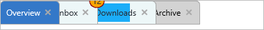
Combining tab creation, badges, and progress indicators
Create tabs with bitmap icons, attach badge counts, show a circular progress indicator, and enable per-tab close buttons:
procedure TForm1.FormCreate(Sender: TObject);
var
  tab: TTMSFNCTabSetTab;
begin
  // The bitmap container is assigned on the control, not on a tab.
  TMSFNCTabSet1.BitmapContainer := TMSFNCBitmapContainer1;

  TMSFNCTabSet1.BeginUpdate;
  try
    TMSFNCTabSet1.Tabs.Clear;

    // Inbox with an icon and an unread badge.
    tab := TMSFNCTabSet1.AddTab('Inbox');
    tab.Bitmaps.AddBitmapName('inbox');
    tab.BitmapVisible := True;
    tab.Badge := '12';
    tab.CloseButton := True;

    // Downloads with a circular progress indicator.
    tab := TMSFNCTabSet1.AddTab('Downloads');
    tab.Bitmaps.AddBitmapName('download');
    tab.BitmapVisible := True;
    tab.ProgressKind := tpkCircular;
    tab.ProgressMode := tpmNormal;
    tab.Progress := 45;
    tab.ProgressMax := 100;
    tab.CloseButton := True;

    // Shared close behaviour: hide on close, with a tab-list button to restore.
    TMSFNCTabSet1.Options.CloseMode := tcmTab;
    TMSFNCTabSet1.Options.CloseAction := ttcaHide;
    TMSFNCTabSet1.Options.TabListButton := True;
  finally
    TMSFNCTabSet1.EndUpdate;
  end;
end;
Related API
TTMSFNCTabSet- main component andTabscollection
See also
- Appearance - default colors, shapes, sizing, and menu button style
- Interaction - reorder, inline editing, keyboard actions, and tab events
- HTML and anchors - rich tab labels and clickable links
- Custom drawing - owner-draw tab parts