Appearance and States
Once a toolbar has the right buttons, appearance controls how it reads: the
surface fill and border, per-state button styling, whether icons sit beside or
above their labels, and whether the whole bar switches to a larger touch layout.
This chapter covers the Appearance sub-objects, the normal and large states,
per-button Layout, bitmaps, and HTML captions. It builds on the elements from
Buttons and pickers.
Style the surface and buttons
The toolbar's Appearance sets the surface Fill and Stroke, item spacing,
an optional edge Separator, and the drag grip. Each button has its own
Appearance with per-state fills and strokes — NormalFill, HoverFill,
DownFill, DisabledFill — plus Rounding, Corners, and FlatStyle for a
borderless look that only shows a background on hover or press.
procedure TForm1.StyleToolBar;
var
  Button: TTMSFNCToolBarButton;
begin
  // Toolbar surface: solid light fill, no outer border, comfortable spacing.
  TMSFNCToolBar1.Appearance.Fill.Kind := gfkSolid;
  TMSFNCToolBar1.Appearance.Fill.Color := gcWhitesmoke;
  TMSFNCToolBar1.Appearance.Stroke.Kind := gskNone;
  TMSFNCToolBar1.Appearance.HorizontalSpacing := 6;

  Button := TMSFNCToolBar1.AddButton(-1, -1, '', '', 'Bold');

  // Per-state button appearance: rounded corners, flat until hovered or pressed.
  Button.Appearance.Rounding := 6;
  Button.Appearance.FlatStyle := True;
  Button.Appearance.HoverFill.Kind := gfkSolid;
  Button.Appearance.HoverFill.Color := gcGainsboro;
  Button.Appearance.DownFill.Kind := gfkSolid;
  Button.Appearance.DownFill.Color := gcSilver;

  TMSFNCToolBar1.Build;
end;
void __fastcall TForm1::StyleToolBar()
{
  // Toolbar surface: solid light fill, no outer border, comfortable spacing.
  TMSFNCToolBar1->Appearance->Fill->Kind = gfkSolid;
  TMSFNCToolBar1->Appearance->Fill->Color = gcWhitesmoke;
  TMSFNCToolBar1->Appearance->Stroke->Kind = gskNone;
  TMSFNCToolBar1->Appearance->HorizontalSpacing = 6;

  TTMSFNCToolBarButton *Button = TMSFNCToolBar1->AddButton(-1, -1, "", "", "Bold");

  // Per-state button appearance: rounded corners, flat until hovered or pressed.
  Button->Appearance->Rounding = 6;
  Button->Appearance->FlatStyle = true;
  Button->Appearance->HoverFill->Kind = gfkSolid;
  Button->Appearance->HoverFill->Color = gcGainsboro;
  Button->Appearance->DownFill->Kind = gfkSolid;
  Button->Appearance->DownFill->Color = gcSilver;

  TMSFNCToolBar1->Build();
}


The large (touch) state
Both the toolbar and its buttons expose State (esNormal or esLarge).
Switching the toolbar to esLarge grows every element to touch-friendly sizes
at once — ideal for tablets and mobile-style command surfaces. Buttons then
render their large-state bitmaps: the fourth AddButton argument (or the
LargeLayoutBitmaps collection) supplies the sharper, bigger icon.
Per-button Layout decides what a button shows — bblNone, bblBitmap
(icon only), bblLabel (text only), or bblLarge (icon above label).
MinimumLayout and MaximumLayout bound how far a button may shrink or grow as
space changes, and BitmapPosition (bbpLeft or bbpTop) places the icon.
procedure TForm1.ConfigureLargeState;
var
  Button: TTMSFNCToolBarButton;
begin
  TMSFNCToolBar1.BitmapContainer := BitmapContainer1;

  // The 3rd/4th AddButton arguments name the normal and large-state bitmaps.
  Button := TMSFNCToolBar1.AddButton(-1, -1, 'save', 'save-large', 'Save');
  Button.BitmapPosition := bbpTop;    // icon above the caption
  Button.Layout := bblLarge;          // large icon + label layout
  Button.MinimumLayout := bblBitmap;  // collapse to icon-only when space is tight
  Button.MaximumLayout := bblLarge;

  // Switch the whole toolbar to the large (touch) state. Buttons render their
  // large-state bitmaps and grow to touch-friendly sizes.
  TMSFNCToolBar1.State := esLarge;
  TMSFNCToolBar1.Build;
end;
void __fastcall TForm1::ConfigureLargeState()
{
  // BitmapContainer is protected at runtime: assign BitmapContainer1 to the
  // toolbar's BitmapContainer in the Object Inspector.

  // The 3rd/4th AddButton arguments name the normal and large-state bitmaps.
  TTMSFNCToolBarButton *Button = TMSFNCToolBar1->AddButton(-1, -1, "save", "save-large", "Save");
  Button->BitmapPosition = bbpTop;    // icon above the caption
  Button->Layout = bblLarge;          // large icon + label layout
  Button->MinimumLayout = bblBitmap;  // collapse to icon-only when space is tight
  Button->MaximumLayout = bblLarge;

  // Switch the whole toolbar to the large (touch) state. Buttons render their
  // large-state bitmaps and grow to touch-friendly sizes.
  TMSFNCToolBar1->State = esLarge;
  TMSFNCToolBar1->Build();
}


Bitmaps
Buttons draw icons from scaled-bitmap collections: Bitmaps for the normal
state, HoverBitmaps and DisabledBitmaps for interaction and disabled states,
and the LargeLayout… variants for the large state. Rather than assigning
bitmaps to each button, share a TTMSFNCBitmapContainer: set the toolbar's (and
button's) BitmapContainer, then reference bitmaps by name through the
AddButton resource arguments. BitmapSize and AutoBitmapSize control the
drawn icon size.
HTML captions and anchors
Button and toolbar captions render HTML, so you can emphasize text
(<b>, <i>) or embed a clickable link. When the user clicks an anchor, the
toolbar's OnAnchorClick fires with the anchor's href.
procedure TForm1.AddHtmlButton;
begin
  // Button and toolbar captions render HTML, including clickable anchors.
  TMSFNCToolBar1.AddButton(-1, -1, '', '', 'Need <a href="help">help</a>?');
  TMSFNCToolBar1.OnAnchorClick := ToolBarAnchorClick;
  TMSFNCToolBar1.Build;
end;

procedure TForm1.ToolBarAnchorClick(Sender: TObject; AAnchor: string);
begin
  // AAnchor is the href of the clicked link.
  if AAnchor = 'help' then
    ShowMessage('Opening help...');
end;
void __fastcall TForm1::AddHtmlButton()
{
  // Button and toolbar captions render HTML, including clickable anchors.
  TMSFNCToolBar1->AddButton(-1, -1, "", "", "Need <a href=\"help\">help</a>?");
  TMSFNCToolBar1->OnAnchorClick = ToolBarAnchorClick;
  TMSFNCToolBar1->Build();
}

void __fastcall TForm1::ToolBarAnchorClick(TObject *Sender, System::UnicodeString AAnchor)
{
  // AAnchor is the href of the clicked link.
  if (AAnchor == "help")
    ShowMessage("Opening help...");
}
Combining a branded surface, large state, and bitmaps
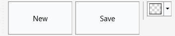
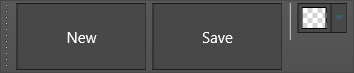
The example below ties the chapter together: a branded surface, large icon-over-label buttons drawing from a shared bitmap container, a separator, and a color picker — all in the large touch state.
procedure TForm1.BuildTouchToolBar;
var
  btnNew, btnSave: TTMSFNCToolBarButton;
  textColor: TTMSFNCToolBarColorPicker;
begin
  TMSFNCToolBar1.BeginUpdate;
  try
    TMSFNCToolBar1.BitmapContainer := BitmapContainer1;

    // Branded surface: light fill, borderless, generous spacing.
    TMSFNCToolBar1.Appearance.Fill.Kind := gfkSolid;
    TMSFNCToolBar1.Appearance.Fill.Color := gcWhitesmoke;
    TMSFNCToolBar1.Appearance.Stroke.Kind := gskNone;
    TMSFNCToolBar1.Appearance.HorizontalSpacing := 8;

    // Large icon-over-label buttons.
    btnNew := TMSFNCToolBar1.AddButton(-1, -1, 'new', 'new-large', 'New');
    btnNew.BitmapPosition := bbpTop;
    btnNew.Layout := bblLarge;
    btnSave := TMSFNCToolBar1.AddButton(-1, -1, 'save', 'save-large', 'Save');
    btnSave.BitmapPosition := bbpTop;
    btnSave.Layout := bblLarge;

    TMSFNCToolBar1.AddSeparator;
    textColor := TMSFNCToolBar1.AddColorPicker;
    textColor.OnColorSelected := ApplyColor;

    // Touch-friendly large state ties the branded look together.
    TMSFNCToolBar1.State := esLarge;
  finally
    TMSFNCToolBar1.EndUpdate;
  end;
  TMSFNCToolBar1.Build;
end;

procedure TForm1.ApplyColor(Sender: TObject; AColor: TTMSFNCGraphicsColor);
begin
  Memo1.TextSettings.FontColor := AColor;
end;
void __fastcall TForm1::BuildTouchToolBar()
{
  TTMSFNCToolBarButton *btnNew, *btnSave;
  TTMSFNCToolBarColorPicker *textColor;

  TMSFNCToolBar1->BeginUpdate();
  try
  {
    // BitmapContainer is protected at runtime: assign BitmapContainer1 to the
    // toolbar's BitmapContainer in the Object Inspector.

    // Branded surface: light fill, borderless, generous spacing.
    TMSFNCToolBar1->Appearance->Fill->Kind = gfkSolid;
    TMSFNCToolBar1->Appearance->Fill->Color = gcWhitesmoke;
    TMSFNCToolBar1->Appearance->Stroke->Kind = gskNone;
    TMSFNCToolBar1->Appearance->HorizontalSpacing = 8;

    // Large icon-over-label buttons.
    btnNew = TMSFNCToolBar1->AddButton(-1, -1, "new", "new-large", "New");
    btnNew->BitmapPosition = bbpTop;
    btnNew->Layout = bblLarge;
    btnSave = TMSFNCToolBar1->AddButton(-1, -1, "save", "save-large", "Save");
    btnSave->BitmapPosition = bbpTop;
    btnSave->Layout = bblLarge;

    TMSFNCToolBar1->AddSeparator();
    textColor = TMSFNCToolBar1->AddColorPicker();
    textColor->OnColorSelected = ApplyColor;

    // Touch-friendly large state ties the branded look together.
    TMSFNCToolBar1->State = esLarge;
  }
  __finally
  {
    TMSFNCToolBar1->EndUpdate();
  }
  TMSFNCToolBar1->Build();
}

void __fastcall TForm1::ApplyColor(TObject *Sender, TTMSFNCGraphicsColor AColor)
{
  Memo1->TextSettings->FontColor = AColor;
}
Common mistakes
- Setting a state without large bitmaps. Switching to
esLargewithout large-state bitmaps leaves buttons scaling up their small icons; provide the large bitmap (the fourthAddButtonargument orLargeLayoutBitmaps). AdaptToStyleoverriding your appearance. When a control adapts to the FMX style it reads colors from the style and ignores its ownAppearance. Style the toolbar manually or let it adapt — not both.- Fighting
FlatStyle. WithFlatStyleon, the normal fill is intentionally invisible; setHoverFill/DownFillfor the interaction feedback rather than expectingNormalFillto show.
Related API
TTMSFNCToolBar—Appearance,State,BitmapContainer,OnAnchorClickTTMSFNCToolBarButton—Appearance,Layout,BitmapPosition,Bitmaps,LargeLayoutBitmaps