Dropdowns and Custom Controls
A toolbar is rarely just buttons. Real command surfaces mix in compact editors,
filters, color selectors, and command palettes that should stay next to the
commands they affect. TTMSFNCToolBar supports this two ways: it can host an
arbitrary control inline, and any toolbar button can open dropdown content
through its DropDownControl and DropDownKind properties. Use a hosted control
when an editor should live permanently on the toolbar (a search box, a zoom
edit); use a button dropdown when the editor should appear on demand and collapse
away again (a color selector, a filter panel). This chapter covers both, then
shows them working together.
Host a custom control
There are two ways to place your own control on the toolbar:
AddCustomControlClass(AControlClass)— the toolbar creates and owns the control from a class you pass, inserts it into the layout, and returns the instance so you can configure it.AddCustomControl(AControl)— you create and configure the instance yourself, then hand the existing control to the toolbar.
Either way the hosted control participates in toolbar layout and alignment like any built-in element. Use the class form when the toolbar should own the control's lifetime; use the instance form when you already have the control (for example one created elsewhere, or one you keep a field reference to).
procedure TForm1.AddSearchEditToToolbar;
var
  Edit: TEdit;
begin
  Edit := TMSFNCToolBar1.AddCustomControlClass(TEdit) as TEdit;
  Edit.Width := 180;
  Edit.Text := 'Search';
end;
To host a control you have already created and configured, pass the instance instead:
procedure TForm1.HostExistingControl;
var
  Search: TEdit;
begin
  // Create and configure the control yourself...
  Search := TEdit.Create(Self);
  Search.Width := 180;
  Search.TextPrompt := 'Search';
  Search.OnChangeTracking := SearchChanged;

  // ...then hand the existing instance to the toolbar. Use AddCustomControl for
  // a control you already own; use AddCustomControlClass when the toolbar should
  // create and own the control from a class.
  TMSFNCToolBar1.AddCustomControl(Search);
  TMSFNCToolBar1.Build;
end;

procedure TForm1.SearchChanged(Sender: TObject);
begin
  { Filter the document as the user types in the hosted search box. }
end;
Button dropdowns
Assign the control that should appear in the popup to a button's
DropDownControl, size it with DropDownWidth and DropDownHeight, and set
DropDownKind to choose how the button behaves:
DropDownKind |
Behavior |
|---|---|
ddkNormal |
Standard button; clicking anywhere on it opens the dropdown. |
ddkDropDown |
A separate arrow opens the popup; the main area still fires OnClick. |
ddkDropDownButton |
The button is split into a main action area and a distinct drop-down button. |
DropDownPosition (ddpRight or ddpBottom) places the arrow for the split
kinds, and DropDownAutoWidth lets the popup match the button width.
procedure TForm1.ConfigureToolbarDropdown;
var
  Button: TTMSFNCToolBarButton;
begin
  Button := TMSFNCToolBar1.AddButton(120, 32, '', '', 'Color');
  Button.DropDownKind := ddkDropDownButton;
  Button.DropDownControl := TMSFNCColorPicker1;
  Button.DropDownWidth := 220;
  Button.DropDownHeight := 260;
end;
React to the dropdown lifecycle
A dropdown raises three events — OnBeforeDropDown (before it opens, the place
to refresh its contents), OnDropDown (after it opens), and OnCloseDropDown
(after it closes). With ddkDropDown/ddkDropDownButton the main area's
OnClick fires independently of the arrow. You can also open and close the
popup from code with DropDown and CloseDropDown.
procedure TForm1.ConfigurePaletteButton;
begin
  FPalette := TMSFNCToolBar1.AddButton(120, 32, '', '', 'Palette');
  // ddkDropDown: the arrow opens the popup while the main area still fires OnClick.
  FPalette.DropDownKind := ddkDropDown;
  FPalette.DropDownControl := TMSFNCColorPicker1;
  FPalette.DropDownWidth := 220;
  FPalette.DropDownHeight := 240;

  FPalette.OnClick := PaletteClick;                 // main-area click
  FPalette.OnBeforeDropDown := PaletteBeforeDropDown; // cancel/prepare before it opens
  FPalette.OnDropDown := PaletteOpened;             // fired after it opens
  FPalette.OnCloseDropDown := PaletteClosed;        // fired after it closes
  TMSFNCToolBar1.Build;
end;

procedure TForm1.PaletteBeforeDropDown(Sender: TObject);
begin
  { Refresh the palette contents just before the popup appears. }
end;

procedure TForm1.PaletteOpened(Sender: TObject);
begin
  { The dropdown is now visible. }
end;

procedure TForm1.PaletteClosed(Sender: TObject);
begin
  { The dropdown has closed. }
end;

procedure TForm1.ShowPaletteFromCode;
begin
  // Open and close the dropdown programmatically.
  FPalette.DropDown;
  // ...later:
  FPalette.CloseDropDown;
end;
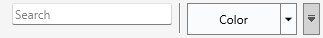
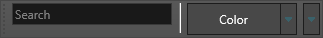
Combining a hosted control with a dropdown button
A single toolbar can carry both an always-present editor and an on-demand
dropdown. The example below hosts a search edit through AddCustomControlClass,
adds a separator, then adds a split button that opens a color picker as dropdown
content:
procedure TForm1.ConfigureToolbar;
var
  SearchEdit: TEdit;
  Button: TTMSFNCToolBarButton;
begin
  // Toolbar-owned custom control: created and inserted by the toolbar.
  SearchEdit := TMSFNCToolBar1.AddCustomControlClass(TEdit) as TEdit;
  SearchEdit.Width := 180;
  SearchEdit.Text := 'Search';

  TMSFNCToolBar1.AddSeparator;

  // Button that opens an existing color picker as dropdown content.
  Button := TMSFNCToolBar1.AddButton(120, 32, '', '', 'Color');
  Button.DropDownKind := ddkDropDownButton;
  Button.DropDownControl := TMSFNCColorPicker1;
  Button.DropDownWidth := 220;
  Button.DropDownHeight := 260;
end;
Common pitfalls
- A dropdown that never opens.
DropDownControlmust be assigned; with it unset the button behaves like a normal button regardless ofDropDownKind. - Unsized dropdown content. Set
DropDownWidth/DropDownHeight(orDropDownAutoWidth); a dropdown control with no explicit size can render too small to use. A design-time versus runtime size mismatch is a common cause of a dropdown that shows only a sliver of its content. - Freeing a control you handed to
AddCustomControl. The toolbar takes the hosted control into its own layout; let the toolbar manage it rather than freeing it while it is still docked.
Related API
TTMSFNCToolBar—AddCustomControl,AddCustomControlClassTTMSFNCToolBarButton—DropDownControl,DropDownKind,DropDownPosition,DropDown,CloseDropDown