Appearance
Blox separates what an element is from how it looks. Every block and line
carries its own Fill, Stroke, Shadow, and font, and the control itself has
a background, a snap grid, and rulers. This chapter shows how to style elements
and how to set up the canvas surface so a diagram reads cleanly and matches your
application theme.
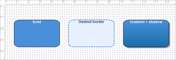
Element fill, stroke and shadow
Each element exposes Fill (TTMSFNCBloxFill), Stroke (TTMSFNCBloxStroke),
and Shadow (TTMSFNCBloxShadow). For the common cases the FillColor,
StrokeColor, and StrokeWidth shortcuts are enough; reach into the objects for
gradients, stroke styles, and shadows.
| Object | Key members |
|---|---|
Fill |
FillType (ftNone, ftSolid, ftTexture, ftGradient), Color, SecondColor, GradientMode (gsHorizontal, gsVertical), Texture |
Stroke |
Color, Width, Style (ssSolid, ssDash, ssDot, ssDashDot, …) |
Shadow |
Visible, Color, HOffset, VOffset |
procedure TForm1.StyleBlock(ABlock: TTMSFNCBloxBlock);
begin
  ABlock.Fill.FillType := ftSolid;
  ABlock.Fill.Color := MakeGraphicsColor(232, 240, 254);

  ABlock.Stroke.Color := MakeGraphicsColor(74, 144, 217);
  ABlock.Stroke.Width := 2;
  ABlock.Stroke.Style := ssDash;
end;
A gradient fill combined with a soft shadow gives blocks depth — this example sets both on one block:
procedure TForm1.AddGradientBlock;
var
  LBlock: TTMSFNCBloxBlock;
begin
  LBlock := TTMSFNCBloxBlock.Create;
  LBlock.Left := 80;
  LBlock.Top := 80;
  LBlock.Width := 200;
  LBlock.Height := 100;
  LBlock.Shape := RoundRect;
  LBlock.Text := 'Gradient';
  LBlock.TextColor := gcWhite;

  LBlock.Fill.FillType := ftGradient;
  LBlock.Fill.GradientMode := gsVertical;
  LBlock.Fill.Color := MakeGraphicsColor(74, 144, 217);
  LBlock.Fill.SecondColor := MakeGraphicsColor(23, 110, 168);

  LBlock.Shadow.Visible := True;
  LBlock.Shadow.Color := MakeGraphicsColor(120, 120, 120);
  LBlock.Shadow.HOffset := 4;
  LBlock.Shadow.VOffset := 4;

  BloxControl1.Blox.Add(LBlock);
end;
The canvas surface
The control's own Fill and Stroke paint the diagram background. DefaultUnit
(duMili, duCenti, duInch) sets the measuring unit applied to the rulers and
snap grid.
procedure TForm1.ConfigureCanvas;
begin
  BloxControl1.BeginUpdate;
  try
    { Background surface. }
    BloxControl1.Fill.Color := MakeGraphicsColor(250, 250, 252);

    { Measuring unit applied to rulers and snap grid. }
    BloxControl1.DefaultUnit := duCenti;

    { Snap grid. }
    BloxControl1.SnapGrid.Active := True;
    BloxControl1.SnapGrid.Visible := True;
    BloxControl1.SnapGrid.Style := gsDots;
    BloxControl1.SnapGrid.SizeX := 0.5;
    BloxControl1.SnapGrid.SizeY := 0.5;

    { Rulers. }
    BloxControl1.TopRuler.Visible := True;
    BloxControl1.LeftRuler.Visible := True;
    BloxControl1.TopRuler.AutoFactor := True;
    BloxControl1.LeftRuler.AutoFactor := True;
  finally
    BloxControl1.EndUpdate;
  end;
end;
Snap grid
SnapGrid aligns inserting, moving, and resizing to a regular step. Active
turns snapping on, Force snaps inserted objects immediately, SizeX / SizeY
set the step (or set SnapToRuler to follow the ruler ticks instead), Style
chooses gsDots or gsLines, and Visible shows or hides it.
Rulers
LeftRuler and TopRuler (TTMSFNCBloxRuler) draw measurement scales. Set
Visible, the MeasureUnit, Divisions between values, and AutoFactor (when
True, the ruler step adapts as the diagram is zoomed). The snap-grid and ruler
setup is shown in the canvas snippet above.
Putting it together
A polished diagram styles both the elements and the surface they sit on. This example configures the canvas background, snap grid, and rulers, then adds a gradient-filled, shadowed block onto it — combining element appearance with the canvas setup:
procedure TForm1.BuildStyledScene;
var
  LBlock: TTMSFNCBloxBlock;
begin
  BloxControl1.BeginUpdate;
  try
    { Canvas surface. }
    BloxControl1.Fill.Color := MakeGraphicsColor(250, 250, 252);
    BloxControl1.DefaultUnit := duCenti;
    BloxControl1.SnapGrid.Active := True;
    BloxControl1.SnapGrid.Style := gsDots;
    BloxControl1.TopRuler.Visible := True;
    BloxControl1.LeftRuler.Visible := True;

    { A gradient, shadowed block on that surface. }
    LBlock := TTMSFNCBloxBlock.Create;
    LBlock.Left := 60;
    LBlock.Top := 60;
    LBlock.Width := 200;
    LBlock.Height := 100;
    LBlock.Shape := RoundRect;
    LBlock.Text := 'Styled';
    LBlock.TextColor := gcWhite;
    LBlock.Fill.FillType := ftGradient;
    LBlock.Fill.GradientMode := gsVertical;
    LBlock.Fill.Color := MakeGraphicsColor(74, 144, 217);
    LBlock.Fill.SecondColor := MakeGraphicsColor(23, 110, 168);
    LBlock.Shadow.Visible := True;
    LBlock.Shadow.HOffset := 4;
    LBlock.Shadow.VOffset := 4;
    BloxControl1.Blox.Add(LBlock);
  finally
    BloxControl1.EndUpdate;
  end;
end;
Pitfalls
- A gradient needs
FillType := ftGradient. SettingColorandSecondColoralone has no effect whileFillTypeisftSolid. SnapToRuleroverridesSizeX/SizeY. When it isTrue, the explicit step sizes are ignored and the grid follows the ruler subdivisions.- The
FillColorshortcut impliesftSolid. To switch back to a gradient after using it, setFillTypeexplicitly again.