TMS FNC Blox Selector — Guides
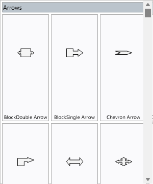
TTMSFNCBloxSelector is a categorized palette of the blocks and lines available
to a TTMSFNCBloxControl. It lists every registered element as an item, and the
user drags an item onto the diagram canvas to insert an element of that type. Use
it alongside (or instead of) the ToolBar when you want a
visible catalog of shapes users can drag from. This guide covers linking,
controlling which elements appear, appearance, and custom item drawing.
Linking to a Blox Control
Assign BloxControl to the target control. When linked, the selector populates
itself from that control's registered elements, and dragging an item onto the
canvas inserts an element of that type at the drop position.
procedure TForm1.FormCreate(Sender: TObject);
begin
  BloxSelector1.BloxControl := BloxControl1;
end;
Controlling the palette
The selector reflects the elements registered with the blox control (see
Custom elements). Shape the palette
with Modes (show blocks, lines, or both), Columns / Rows (grid layout), and
Rebuild to refresh after changes. Each entry is a TTMSFNCBloxSelectorItem you
can fine-tune through the Items collection — its Text, Hint, Visible, and
Enabled.
procedure TForm1.ConfigurePalette;
begin
  BloxSelector1.Modes := [bsmBlocks];   { blocks only; use [bsmBlocks, bsmLines] for both }
  BloxSelector1.Columns := 3;
  BloxSelector1.Rebuild;                { refresh after changing modes }

  { Fine-tune an individual entry. }
  if BloxSelector1.Items.Count > 0 then
  begin
    BloxSelector1.Items[0].Hint := 'Drag onto the canvas to insert';
    BloxSelector1.Items[0].Visible := True;
  end;
end;
Note
Modes is a set — [bsmBlocks, bsmLines] shows both (the default). An item's
RegistrationElement (the element class it inserts) is assigned by the
registration system and is read-only.
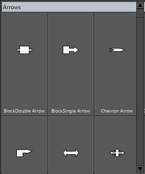
Appearance
Appearance (TTMSFNCBloxSelectorAppearance) styles items in every state. Set
Fill / Stroke for the normal state and the Hover, Down, Selected, and
Disabled variants, plus Font, ItemWidth / ItemHeight, and spacing. This
example themes the palette and limits it to blocks in a three-column grid —
combining appearance, modes, and layout:
procedure TForm1.ThemeSelector;
begin
  BloxSelector1.BeginUpdate;
  try
    BloxSelector1.Modes := [bsmBlocks];
    BloxSelector1.Columns := 3;

    BloxSelector1.Appearance.Fill.Color := MakeGraphicsColor(250, 250, 252);
    BloxSelector1.Appearance.FillSelected.Color := MakeGraphicsColor(74, 144, 217);
    BloxSelector1.Appearance.FillHover.Color := MakeGraphicsColor(232, 240, 254);
    BloxSelector1.Appearance.Font.Name := 'Segoe UI';
    BloxSelector1.Appearance.ItemWidth := 96;
    BloxSelector1.Appearance.ItemHeight := 72;
  finally
    BloxSelector1.EndUpdate;
  end;
  BloxSelector1.Rebuild;
end;
Custom item drawing
For per-item visuals beyond the appearance settings — a badge, a status tint, a
custom glyph — handle OnItemBeforeDrawContent. You receive the item's graphics
surface and rectangle; draw what you need and set ADefaultDraw := False to
replace the default content:
procedure TForm1.BloxSelector1ItemBeforeDrawContent(Sender: TObject;
  AGraphics: TTMSFNCGraphics; ARect: TRectF; AItemIndex: Integer;
  var ADefaultDraw: Boolean);
begin
  { Draw a tinted badge over the top-left of every fifth item. }
  if AItemIndex mod 5 = 0 then
  begin
    AGraphics.Fill.Color := MakeGraphicsColor(246, 140, 30);
    AGraphics.DrawRectangle(RectF(ARect.Left, ARect.Top, ARect.Left + 14, ARect.Top + 14));
  end;
  { Leave ADefaultDraw True to keep the default item content as well. }
end;
Pitfalls
- The palette is empty until elements are registered on the linked control. Register custom blocks (or rely on the built-in libraries) before expecting items to appear.
- Call
Rebuildafter changingModesor registrations at runtime — the selector does not always refresh on its own. RegistrationElementis read-only. To add a new palette entry, register a new element, don't try to construct an item manually.