Showing progress
TTMSFNCWidgetProgress is a circular progress widget — it shows a single value as
a filled arc with the percentage in the center and an optional caption. You set
Value, optionally format the center text, and give it a caption; the widget
draws the rest. This chapter covers setting the value, formatting the readout, and
labelling the widget.
Setting the value
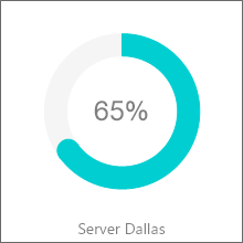
Value is a Single on a 0..100 percentage scale; assign it and the arc fills to
match. Update it over time (for example as a task progresses) and the widget
redraws. The demo drives two widgets — "Server Dallas" and "Server Chicago" —
toward 100% to show a backup completing.
procedure TForm1.SetupProgress;
begin
  FProgress := TTMSFNCWidgetProgress.Create(Self);
  FProgress.Parent := Self;
  FProgress.SetBounds(20, 20, 160, 160);

  FProgress.Value := 65;             // percentage in the 0..100 range
  FProgress.ValueFormat := '%.0f%%'; // render the center text as "65%"
  FProgress.CaptionOptions.Text := 'Server Dallas';
end;
Formatting the center text
ValueFormat is a format string applied to the value shown in the center —
'%.0f%%' renders 65%, '%.1f' renders 65.0. Use it to control decimals and
to add a unit suffix. ValueFont styles that text.
Adding a caption
CaptionOptions places a label with the widget. Set CaptionOptions.Text for the
label and CaptionOptions.Position (for example cpBottom) to place it relative
to the circle. Use it to name what the widget measures.
Pitfalls
Valueis a percentage (0..100), not a fraction. Pass65, not0.65.ValueFormatis a standard Delphi format string. A literal%must be doubled (%%) as in'%.0f%%'.- Clamp your own data to 0..100. Values outside the range do not extend the arc meaningfully.
See also
- Styling the widget — arc, indicator, tickmarks, and fill.
- API reference — full class reference.