Navigation and Arrows
TTMSFNCCalendar supports four navigation modes, swipe gestures, custom arrow rendering, and interactive year/month selection popups.
Navigation modes
Set Interaction.NavigationMode:
| Mode | Behaviour |
|---|---|
nmMonth |
Arrows navigate one month at a time (default). |
nmYear |
Arrows navigate one year at a time. |
nmFocusedDate |
Arrows move the focused date one day at a time. |
nmCustom |
Call OnCustomNavigation to implement your own logic. |
TMSFNCCalendar1.Interaction.NavigationMode := nmYear;
TMSFNCCalendar1->Interaction->NavigationMode = nmYear;
Custom navigation
procedure TForm1.FormCreate(Sender: TObject);
begin
  TMSFNCCalendar1.Interaction.NavigationMode := nmCustom;
end;

procedure TForm1.TMSFNCCalendar1CustomNavigation(Sender: TObject;
  ADate, AFocusedDate: TDate; ADirection: Boolean);
begin
  if ADirection then
    TMSFNCCalendar1.Year := TMSFNCCalendar1.Year - 10
  else
    TMSFNCCalendar1.Year := TMSFNCCalendar1.Year + 10;
end;
void __fastcall TForm1::FormCreate(TObject *Sender)
{
  TMSFNCCalendar1->Interaction->NavigationMode = nmCustom;
}

void __fastcall TForm1::TMSFNCCalendar1CustomNavigation(TObject *Sender,
  TDate ADate, TDate AFocusedDate, bool ADirection)
{
  if (ADirection)
    TMSFNCCalendar1->Year = TMSFNCCalendar1->Year - 10;
  else
    TMSFNCCalendar1->Year = TMSFNCCalendar1->Year + 10;
}
ADirection = True means the right (forward) arrow was pressed; False means the left (back) arrow.
Swipe on header
TMSFNCCalendar1.Interaction.SwipeOnHeader := True;
TMSFNCCalendar1->Interaction->SwipeOnHeader = true;
When enabled, swiping left/right on the header area also triggers navigation.
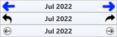
Arrow types
Change the left and right arrow style via Header.Arrow.ArrowLeftType and Header.Arrow.ArrowRightType:
| Type | Appearance |
|---|---|
atArrow |
Chevron arrow (default). |
atTriangle |
Filled triangle. |
atBitmap |
Custom bitmap. Assign Header.Arrow.ArrowLeftBitmap / ArrowRightBitmap. |
atCustom |
Fully custom — implement OnCustomArrowDraw. |
High-DPI arrow bitmaps
ArrowLeftBitmap and ArrowRightBitmap are not single bitmaps but
TTMSFNCScaledBitmaps collections — one entry per display scale, each carrying
its own Scale value. When the calendar draws an atBitmap arrow it asks the
collection for the entry matching the current display scale (falling back to the
largest one available), so a single 16x16 PNG that looks fine at 100% turns soft
on a 150% or 200% monitor while a 24x24 and 32x32 sibling stay sharp.
Register the variants once at startup and keep ArrowLeftBitmapSize in logical
units: the size property frames the arrow, the collection supplies the pixels.
procedure TForm1.FormCreate(Sender: TObject);
begin
  TMSFNCCalendar1.BeginUpdate;
  try
    TMSFNCCalendar1.Header.Arrow.ArrowLeftType  := atBitmap;
    TMSFNCCalendar1.Header.Arrow.ArrowRightType := atBitmap;

    { ArrowLeftBitmap / ArrowRightBitmap are TTMSFNCScaledBitmaps collections:
      add one variant per display scale and the calendar picks the closest match
      for the monitor it is drawn on. Author the 1.0 artwork at the logical size
      and the others at that size multiplied by the scale. }
    TMSFNCCalendar1.Header.Arrow.ArrowLeftBitmap.Clear;
    TMSFNCCalendar1.Header.Arrow.ArrowLeftBitmap.AddBitmapFromFile('arrow-left.png', 1.0);
    TMSFNCCalendar1.Header.Arrow.ArrowLeftBitmap.AddBitmapFromFile('arrow-left@1.5x.png', 1.5);
    TMSFNCCalendar1.Header.Arrow.ArrowLeftBitmap.AddBitmapFromFile('arrow-left@2x.png', 2.0);

    TMSFNCCalendar1.Header.Arrow.ArrowRightBitmap.Clear;
    TMSFNCCalendar1.Header.Arrow.ArrowRightBitmap.AddBitmapFromFile('arrow-right.png', 1.0);
    TMSFNCCalendar1.Header.Arrow.ArrowRightBitmap.AddBitmapFromFile('arrow-right@1.5x.png', 1.5);
    TMSFNCCalendar1.Header.Arrow.ArrowRightBitmap.AddBitmapFromFile('arrow-right@2x.png', 2.0);

    { The bitmap is drawn into a box of this logical size, so keep it in
      design units - the scaled variant above supplies the extra pixels. }
    TMSFNCCalendar1.Header.Arrow.ArrowLeftBitmapSize  := 16;
    TMSFNCCalendar1.Header.Arrow.ArrowRightBitmapSize := 16;
  finally
    TMSFNCCalendar1.EndUpdate;
  end;

  { TTMSFNCUtils reports the scale the calendar will resolve against, which is
    useful when only some scales are shipped or when a high-DPI-only asset set
    has to be loaded lazily. }
  if TTMSFNCUtils.IsHighDPIScale(Self) then
    StatusLabel.Text := Format('Running at %.2fx', [TTMSFNCUtils.GetDPIScale(Self)]);
end;
void __fastcall TForm1::FormCreate(TObject *Sender)
{
  TMSFNCCalendar1->BeginUpdate();
  try
  {
    TMSFNCCalendar1->Header->Arrow->ArrowLeftType  = atBitmap;
    TMSFNCCalendar1->Header->Arrow->ArrowRightType = atBitmap;

    // ArrowLeftBitmap / ArrowRightBitmap are TTMSFNCScaledBitmaps collections:
    // add one variant per display scale and the calendar picks the closest match
    // for the monitor it is drawn on. Author the 1.0 artwork at the logical size
    // and the others at that size multiplied by the scale.
    TMSFNCCalendar1->Header->Arrow->ArrowLeftBitmap->Clear();
    TMSFNCCalendar1->Header->Arrow->ArrowLeftBitmap->AddBitmapFromFile("arrow-left.png", 1.0);
    TMSFNCCalendar1->Header->Arrow->ArrowLeftBitmap->AddBitmapFromFile("arrow-left@1.5x.png", 1.5);
    TMSFNCCalendar1->Header->Arrow->ArrowLeftBitmap->AddBitmapFromFile("arrow-left@2x.png", 2.0);

    TMSFNCCalendar1->Header->Arrow->ArrowRightBitmap->Clear();
    TMSFNCCalendar1->Header->Arrow->ArrowRightBitmap->AddBitmapFromFile("arrow-right.png", 1.0);
    TMSFNCCalendar1->Header->Arrow->ArrowRightBitmap->AddBitmapFromFile("arrow-right@1.5x.png", 1.5);
    TMSFNCCalendar1->Header->Arrow->ArrowRightBitmap->AddBitmapFromFile("arrow-right@2x.png", 2.0);

    // The bitmap is drawn into a box of this logical size, so keep it in
    // design units - the scaled variant above supplies the extra pixels.
    TMSFNCCalendar1->Header->Arrow->ArrowLeftBitmapSize  = 16;
    TMSFNCCalendar1->Header->Arrow->ArrowRightBitmapSize = 16;
  }
  __finally
  {
    TMSFNCCalendar1->EndUpdate();
  }

  // TTMSFNCUtils reports the scale the calendar will resolve against, which is
  // useful when only some scales are shipped or when a high-DPI-only asset set
  // has to be loaded lazily.
  if (TTMSFNCUtils::IsHighDPIScale(this))
    StatusLabel->Text = Format("Running at %.2fx", ARRAYOFCONST(((Extended)TTMSFNCUtils::GetDPIScale(this))));
}
The rest of the calendar chrome — header, footer and day-name heights, fonts, badge size and arrow size — is rescaled by the control itself when the form's DPI changes, so those are authored once at design DPI and need no runtime arithmetic. Bitmaps are the exception, because there is nothing to scale up from.
Custom arrow drawing
procedure TForm1.FormCreate(Sender: TObject);
begin
  TMSFNCCalendar1.Header.Arrow.ArrowLeftType  := atCustom;
  TMSFNCCalendar1.Header.Arrow.ArrowRightType := atCustom;
end;

procedure TForm1.TMSFNCCalendar1CustomArrowDraw(Sender: TObject;
  AGraphics: TTMSFNCGraphics; ARect: TRectF; ADirection: Boolean);
var
  pl, pr: TPointF;
  h, m: Single;
begin
  h  := ARect.Bottom - ARect.Top;
  pl := PointF(ARect.Left,  ARect.Top + h / 2);
  pr := PointF(ARect.Right, ARect.Top + h / 2);
  m  := ARect.Left + (ARect.Right - ARect.Left) / 2;
  AGraphics.Stroke.Width := 2;
  if ADirection then
  begin
    AGraphics.DrawLine(PointF(m, ARect.Top), pl);
    AGraphics.DrawLine(pl, PointF(m, ARect.Bottom));
    AGraphics.DrawLine(pl, pr);
  end
  else
  begin
    AGraphics.DrawLine(PointF(m, ARect.Top), pr);
    AGraphics.DrawLine(PointF(m, ARect.Bottom), pr);
    AGraphics.DrawLine(pr, pl);
  end;
end;
void __fastcall TForm1::FormCreate(TObject *Sender)
{
  TMSFNCCalendar1->Header->Arrow->ArrowLeftType  = atCustom;
  TMSFNCCalendar1->Header->Arrow->ArrowRightType = atCustom;
}

void __fastcall TForm1::TMSFNCCalendar1CustomArrowDraw(TObject *Sender,
  TTMSFNCGraphics *AGraphics, const TRectF &ARect, bool ADirection)
{
  float h = ARect.Bottom - ARect.Top;
  TPointF pl = PointF(ARect.Left,  ARect.Top + h / 2);
  TPointF pr = PointF(ARect.Right, ARect.Top + h / 2);
  float m = ARect.Left + (ARect.Right - ARect.Left) / 2;
  AGraphics->Stroke->Width = 2;
  if (ADirection)
  {
    AGraphics->DrawLine(PointF(m, ARect.Top), pl);
    AGraphics->DrawLine(pl, PointF(m, ARect.Bottom));
    AGraphics->DrawLine(pl, pr);
  }
  else
  {
    AGraphics->DrawLine(PointF(m, ARect.Top), pr);
    AGraphics->DrawLine(PointF(m, ARect.Bottom), pr);
    AGraphics->DrawLine(pr, pl);
  }
}

Year and month selection popups
Enable clicking the year or month text in the header to open a selector popup:
TMSFNCCalendar1.Interaction.AllowYearSelection  := True;
TMSFNCCalendar1.Interaction.AllowMonthSelection := True;
TMSFNCCalendar1->Interaction->AllowYearSelection  = true;
TMSFNCCalendar1->Interaction->AllowMonthSelection = true;
Configure the year popup via Interaction.YearOptions. Subscribe to OnBeforeShowYearPopup or OnBeforeShowMonthPopup to act before the popup appears.
Programmatic navigation
TMSFNCCalendar1.Date  := EncodeDate(2025, 6, 15);  // jump to a date
TMSFNCCalendar1.Month := 3;   // jump to March in the current year
TMSFNCCalendar1.Year  := 2026;
TMSFNCCalendar1->Date  = EncodeDate(2025, 6, 15);  // jump to a date
TMSFNCCalendar1->Month = 3;   // jump to March in the current year
TMSFNCCalendar1->Year  = 2026;
Navigation utilities:
TMSFNCCalendar1.Date := TMSFNCCalendar1.NextMonth;
TMSFNCCalendar1.Date := TMSFNCCalendar1.PreviousMonth;
TMSFNCCalendar1.Date := TMSFNCCalendar1.NextYear;
TMSFNCCalendar1->Date = TMSFNCCalendar1->NextMonth();
TMSFNCCalendar1->Date = TMSFNCCalendar1->PreviousMonth();
TMSFNCCalendar1->Date = TMSFNCCalendar1->NextYear();