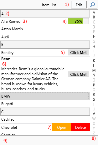
Items, Accessories, and Detail Controls
TTMSFNCTableView renders a scrollable list of TTMSFNCTableViewItem objects. Each item can display HTML formatted text, an accessory (progress bar, badge, button, or custom drawing), and an optional detail control that slides in on tap.
Component anatomy
| Area | Description |
|---|---|
| Header | Displays text and hosts the edit, filter, and back buttons. Not a separate container — position child controls manually during resize. |
| Section | Separator row marking the beginning of a category group. |
| Item | The main row, supporting HTML text and accessories. |
| Accessory | Right-hand area inside the item: image, progress, badge, button, or custom. |
| Lookupbar | Side strip showing category letters; tap or drag to jump. |
| Footer | Optional text area below the list. Not a separate container. |
| More Options | Hidden buttons revealed by swiping an item right-to-left. |
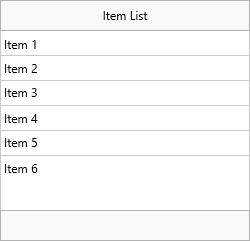
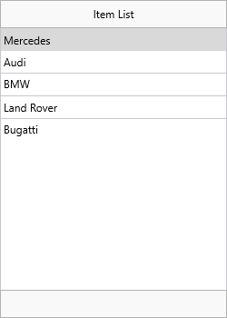
Adding items
// Add items programmatically
TMSFNCTableView1.Items.Clear;
TMSFNCTableView1.AddItem('Item 1');
TMSFNCTableView1.AddItem('Item 2');
TMSFNCTableView1.AddItem('Item 3');

// Load items from a text file (one item per line)
TMSFNCTableView1.LoadFromFile('items.txt');

// Or save the current items
TMSFNCTableView1.SaveToFile('items.txt');
Items can also be loaded from a file, stream, or string list — one item per line:
TMSFNCTableView1.LoadFromStrings(AStrings);
TMSFNCTableView1.LoadFromFile('items.txt');
TMSFNCTableView1.LoadFromStream(AStream);
The equivalent SaveTo* methods export the current items in the same format.
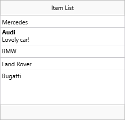
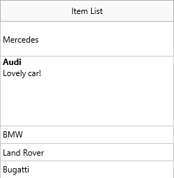
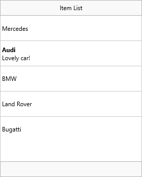
Item size and HTML text
Items automatically resize to fit their HTML content when ItemAppearance.HeightMode is tvhmVariable (the default). Multi-line HTML text expands the row accordingly.
// HTML text — variable height adapts automatically
TMSFNCTableView1.Items[1].Text :=
  '<b>' + TMSFNCTableView1.Items[1].Text + '</b><br/>Lovely car!';

// Fixed height mode — all items the same height
TMSFNCTableView1.ItemAppearance.HeightMode := tvhmFixed;
TMSFNCTableView1.ItemAppearance.FixedHeight := 50;

// Per-item height override — use -1 to revert to automatic
TMSFNCTableView1.Items[0].Height := 50;
TMSFNCTableView1.Items[1].Height := 100;

// HTML template — define placeholders in ItemAppearance, fill per item
var
  it: TTMSFNCTableViewItem;
  I: Integer;
begin
  TMSFNCTableView1.ItemAppearance.HTMLTemplate := '<b><#CAPTION></b><br/><#NOTES>';
  for I := 0 to 4 do
  begin
    it := TMSFNCTableView1.Items.Add;
    it.HTMLTemplateItems.Values['CAPTION'] := 'Item ' + IntToStr(I + 1);
    it.HTMLTemplateItems.Values['NOTES'] := 'Notes for Item ' + IntToStr(I + 1);
  end;
  // Update a single placeholder value later
  TMSFNCTableView1.Items[3].HTMLTemplateItems.Values['NOTES'] := 'Hello World!';
end;
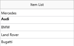
Switch to tvhmFixed to lock all items to a uniform height set by ItemAppearance.FixedHeight. Any text that does not fit is clipped.
HTML templates
Instead of building the full HTML string in Text, define a template in ItemAppearance.HTMLTemplate and fill named placeholders via HTMLTemplateItems:
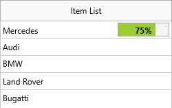
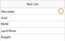
Accessories
Each item has an Accessory property selecting the type of right-side adornment.
| Value | Description |
|---|---|
tviaNone |
No accessory (default). |
tviaDetail |
Image from ItemAppearance.AccessoryDetailBitmaps. |
tviaProgress |
Progress bar from 0–100, set via AccessoryProgress. |
tviaButton |
Clickable text button. |
tviaBadge |
Rounded badge showing AccessoryText. |
tviaCustom |
Custom drawing in OnDrawItemCustomAccessory. |
// Detail accessory — image from BitmapContainer or file
TMSFNCTableView1.ItemAppearance.AccessoryDetailBitmaps.AddBitmapFromFile('MyImage.png');
TMSFNCTableView1.Items[0].Accessory := tviaDetail;
TMSFNCTableView1.Items[0].AccessoryWidth := 16;
TMSFNCTableView1.Items[0].AccessoryHeight := 16;

// Progress accessory
TMSFNCTableView1.Items[0].Accessory := tviaProgress;
TMSFNCTableView1.Items[0].AccessoryProgress := 75;
TMSFNCTableView1.Items[0].AccessoryFontColor := gcBlack;

// Custom accessory — draw in the OnDrawItemCustomAccessory event
TMSFNCTableView1.Items[0].Accessory := tviaCustom;

// Assign a detail control — shown with slide-in when item is clicked
TMSFNCTableView1.Items[0].DetailControl := Panel1;
Note
By default only tviaButton and tviaCustom are click-detectable. Enable others via Interaction.AccessoryClickDetection. Handle accessory clicks in OnItemAccessoryClick.
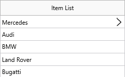
Detail controls
Assign any TControl to an item's DetailControl property. Tapping the item slides in that control with a back-button in the header. Tapping the back button returns to the list.
TMSFNCTableView1.Items[0].DetailControl := Panel1;
| Before tap | After tap |
|---|---|
 |
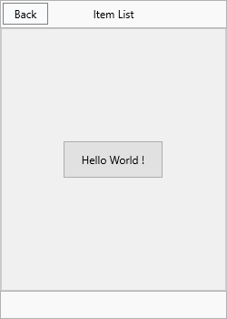 |
Set DefaultItem.DetailControl to show the same control for all items.
Manage the detail control programmatically:
TMSFNCTableView1.ShowDetailControl;  // show for selected item
TMSFNCTableView1.HideDetailControl;  // return to list
TMSFNCTableView1.DetailControlActive; // query state
More options (swipe actions)
The MoreOptions collection defines buttons that appear after swiping an item from right to left. The collection applies globally to all items.
var
  mo: TTMSFNCTableViewMoreOption;
begin
  TMSFNCTableView1.BeginUpdate;

  // Ensure fixed height so swipe buttons have consistent space
  TMSFNCTableView1.ItemAppearance.HeightMode := tvhmFixed;
  TMSFNCTableView1.ItemAppearance.FixedHeight := 50;

  mo := TMSFNCTableView1.MoreOptions.Add;
  mo.Text := 'More';
  mo.Color := gcGray;
  mo.BorderColor := gcGray;
  mo.FontColor := gcWhite;

  mo := TMSFNCTableView1.MoreOptions.Add;
  mo.Text := 'Flag';
  mo.Color := gcOrange;
  mo.BorderColor := gcOrange;
  mo.FontColor := gcWhite;

  mo := TMSFNCTableView1.MoreOptions.Add;
  mo.Text := 'Trash';
  mo.Color := gcRed;
  mo.BorderColor := gcRed;
  mo.FontColor := gcWhite;

  TMSFNCTableView1.EndUpdate;
end;

// Handle swipe button tap
procedure TForm1.TMSFNCTableView1ItemMoreOptionClick(Sender: TObject;
  AItem: TTMSFNCTableViewItem; AMoreOption: TTMSFNCTableViewMoreOption);
begin
  if AMoreOption.Text = 'Trash' then
    TMSFNCTableView1.RemoveItem(AItem);
end;
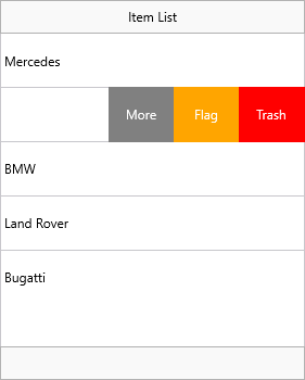
Handle button taps in OnItemMoreOptionClick. The item text shifts left automatically to make room for the buttons.
DefaultItem
DefaultItem is a template item whose properties are inherited by every newly added item. Set frequently reused values — CheckType, DetailControl, Height, accessory settings — on DefaultItem once rather than per item.