TMS FNC Blox ToolBar - Guides
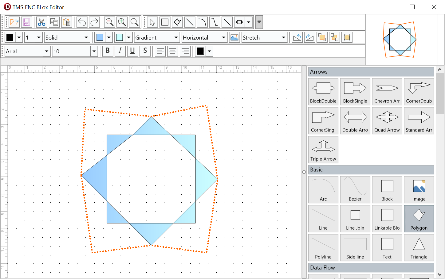
The Blox toolbar family turns TTMSFNCBloxControl into an interactive diagram editor without requiring a separate command implementation for every button. The context toolbar groups actions into popup panels, while the focused toolbars expose editing, selection, block formatting, and text formatting in a conventional editor layout.
Important
The toolbar components use a bridge package that depends on TMS FNC UI Pack. Install the package for the target framework before placing the controls on a form.
Choose and combine toolbar command groups
Use TTMSFNCBloxToolBar for context-sensitive popup panels beside the selected element. Use one or more focused toolbars when commands should remain visible:
| Toolbar | Command groups |
|---|---|
TTMSFNCBloxEditToolBar |
Open/save integration, clipboard, undo/redo, and zoom. |
TTMSFNCBloxFormatBlockToolBar |
Stroke, fill, gradient, picture, rotation, z-order, and snap-to-grid. |
TTMSFNCBloxFormatBlockTextToolBar |
Font name/size/color, text styles, and alignment. |
TTMSFNCBloxSelectToolBar |
Selection mode plus built-in and registered element insertion. |
Each focused toolbar has a VisibleControls set. Configure those sets to keep only the commands that belong in your editor, and use ZoomInterval to control the step applied by the edit toolbar's zoom buttons.
procedure TForm1.ConfigureFocusedToolBars;
begin
  BloxEditToolBar1.VisibleControls :=
    [becCut, becCopy, becPaste, becUndo, becRedo,
     becZoomOut, becZoomIn, becZoomFit];
  BloxEditToolBar1.ZoomInterval := 0.1;

  BloxFormatBlockToolBar1.VisibleControls :=
    [bfcStrokeColor, bfcStrokeWidth, bfcFillColor,
     bfcFillType, bfcRotateLeft, bfcRotateRight,
     bfcBringToFront, bfcSendToBack];

  BloxFormatBlockTextToolBar1.VisibleControls :=
    [btcFontName, btcFontSize, btcBold, btcItalic,
     btcAlignLeft, btcAlignCenter, btcAlignRight, btcFontColor];

  BloxSelectToolBar1.VisibleControls :=
    [bscSelect, bscBlock, bscLine, bscArc, bscBezier, bscOther];
end;
void __fastcall TForm1::ConfigureFocusedToolBars()
{
  BloxEditToolBar1->VisibleControls = TTMSFNCBloxEditVisibleControls()
    << Fmx::Tmsfncbloxtoolbar::becCut << Fmx::Tmsfncbloxtoolbar::becCopy << Fmx::Tmsfncbloxtoolbar::becPaste << Fmx::Tmsfncbloxtoolbar::becUndo << Fmx::Tmsfncbloxtoolbar::becRedo
    << Fmx::Tmsfncbloxtoolbar::becZoomOut << Fmx::Tmsfncbloxtoolbar::becZoomIn << Fmx::Tmsfncbloxtoolbar::becZoomFit;
  BloxEditToolBar1->ZoomInterval = 0.1;

  BloxFormatBlockToolBar1->VisibleControls = TTMSFNCBloxFormatVisibleControls()
    << Fmx::Tmsfncbloxtoolbar::bfcStrokeColor << Fmx::Tmsfncbloxtoolbar::bfcStrokeWidth << Fmx::Tmsfncbloxtoolbar::bfcFillColor
    << Fmx::Tmsfncbloxtoolbar::bfcFillType << Fmx::Tmsfncbloxtoolbar::bfcRotateLeft << Fmx::Tmsfncbloxtoolbar::bfcRotateRight
    << Fmx::Tmsfncbloxtoolbar::bfcBringToFront << Fmx::Tmsfncbloxtoolbar::bfcSendToBack;

  BloxFormatBlockTextToolBar1->VisibleControls = TTMSFNCBloxTextVisibleControls()
    << Fmx::Tmsfncbloxtoolbar::btcFontName << Fmx::Tmsfncbloxtoolbar::btcFontSize << Fmx::Tmsfncbloxtoolbar::btcBold << Fmx::Tmsfncbloxtoolbar::btcItalic
    << Fmx::Tmsfncbloxtoolbar::btcAlignLeft << Fmx::Tmsfncbloxtoolbar::btcAlignCenter << Fmx::Tmsfncbloxtoolbar::btcAlignRight << Fmx::Tmsfncbloxtoolbar::btcFontColor;

  BloxSelectToolBar1->VisibleControls = TTMSFNCBloxSelectVisibleControls()
    << Fmx::Tmsfncbloxtoolbar::bscSelect << Fmx::Tmsfncbloxtoolbar::bscBlock << Fmx::Tmsfncbloxtoolbar::bscLine << Fmx::Tmsfncbloxtoolbar::bscArc << Fmx::Tmsfncbloxtoolbar::bscBezier << Fmx::Tmsfncbloxtoolbar::bscOther;
}
File, clipboard, history, and zoom
TTMSFNCBloxEditToolBar groups the following workflows:
OnOpenFileandOnSaveFileintegrate the toolbar with the application's file picker and storage policy.OnCut,OnCopy, andOnPastereplace the built-in clipboard commands when assigned.OnUndoandOnRedoreplace the built-in history commands when assigned.OnZoomIn,OnZoomOut, andOnZoomFitreplace the built-in zoom commands when assigned.

File commands are application-owned integration points: choose the file or storage location in the handler and call the corresponding Blox persistence method. For example, this save handler supplies the destination explicitly:
procedure TForm1.BloxEditToolBar1SaveFile(Sender: TObject);
begin
  BloxControl1.SaveToFile('diagram.blox');
  StatusLabel.Text := 'Diagram saved';
end;
void __fastcall TForm1::BloxEditToolBar1SaveFile(TObject *Sender)
{
  BloxControl1->SaveToFile("diagram.blox");
  StatusLabel->Text = "Diagram saved";
}
Format blocks
TTMSFNCBloxFormatBlockToolBar follows the active selection and applies changes to the selected elements. Its pickers cover OnApplyStrokeColor, OnApplyStrokeWidth, OnApplyStrokeStyle, OnApplyFillColor, OnApplyFillColorTo, OnApplyFillType, OnApplyFillOrientation, and OnApplyPictureMode. Buttons expose OnInsertBitmap, OnRotateLeft, OnRotateRight, OnBringToFront, OnSendToBack, and OnSnapToGrid.

When no event handler is assigned, the toolbar applies the selected value, pushes an undo entry, redraws the diagram, and refreshes its controls. Assigning an apply event replaces that default action. The handler must apply the value to AElement or the relevant selected elements itself.
procedure TForm1.BloxFormatBlockToolBar1ApplyFillColor(Sender: TObject;
  AElement: TTMSFNCBloxElement; AColor: TTMSFNCGraphicsColor);
begin
  { You assigned the handler, so you must apply the change. }
  if AElement is TTMSFNCBloxBlock then
    TTMSFNCBloxBlock(AElement).FillColor := AColor;
  StatusLabel.Text := 'Fill colour applied';
end;
void __fastcall TForm1::BloxFormatBlockToolBar1ApplyFillColor(TObject *Sender,
  TTMSFNCBloxElement *AElement, TTMSFNCGraphicsColor AColor)
{
  // You assigned the handler, so you must apply the change.
  TTMSFNCBloxBlock *LBlock = dynamic_cast<TTMSFNCBloxBlock *>(AElement);
  if (LBlock != nullptr)
    LBlock->FillColor = AColor;
  StatusLabel->Text = "Fill colour applied";
}
Format text
TTMSFNCBloxFormatBlockTextToolBar exposes font-name, font-size, text-color, bold, italic, underline, strikeout, and alignment controls. Limit them with VisibleControls, or handle OnApplyFontName, OnApplyFontSize, OnApplyTextColor, OnApplyBold, OnApplyItalic, OnApplyUnderline, OnApplyStrikeout, OnAlignLeft, OnAlignCenter, and OnAlignRight when the editor needs application-specific formatting rules.

As with block formatting, assigning one of these events makes the application responsible for the corresponding change. Leave an event unassigned to keep the built-in behavior.
Select and insert elements
TTMSFNCBloxSelectToolBar switches between selection mode and insertion modes for blocks, polygons, lines, arcs, beziers, and polylines. OtherButton opens a TTMSFNCBloxToolBarElementPicker containing other registered elements. Use VisibleControls to hide element types the current workflow does not allow.

The OnSelectMouse, OnSelectBlock, OnSelectPolygon, OnSelectLine, OnSelectArc, OnSelectBezier, OnSelectPolyLine, and OnSelectOther events replace their default mode switch when assigned. After registering a custom element, call Rebuild on the context toolbar and rebuild the selector owned by OtherButton so both insertion surfaces see it.
procedure TForm1.RefreshElementTools;
begin
  BloxToolBar1.Rebuild;
  BloxSelectToolBar1.OtherButton.BloxSelector.Rebuild;
end;
void __fastcall TForm1::RefreshElementTools()
{
  BloxToolBar1->Rebuild();
  BloxSelectToolBar1->OtherButton()->BloxSelector()->Rebuild();
}
Context toolbar layout and state
TTMSFNCBloxToolBar.InitializeDefault creates the standard popup panels. Rebuild recreates them after the registered element set changes, and ClosePopup dismisses the active panel. The inherited Appearance, Mode, EmbeddedMode, EmbeddedItemPosition, EmbeddedSize, Items, BitmapContainer, Fill, and Stroke properties control presentation and layout.
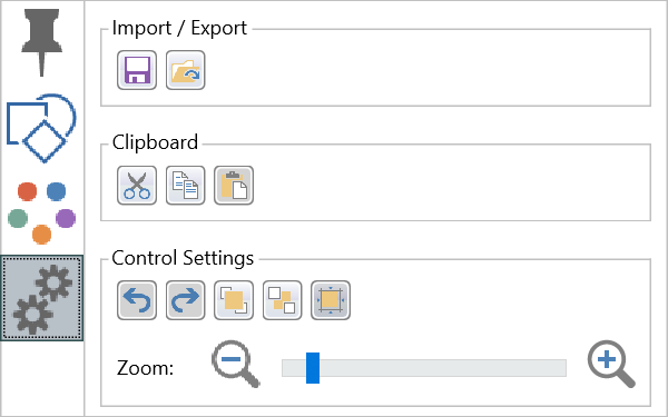
Toolbar controls track the Blox selection. Formatting actions are disabled when no compatible element is active and update to show the active element's current values after the selection changes.
Customize individual controls
The focused toolbar classes expose their buttons, separators, and pickers through methods such as OpenFileButton, CopyButton, ZoomFitButton, FillColorPicker, StrokeStylePicker, BoldButton, TextColorPicker, SelectButton, and OtherButton. Use these accessors to change hints, bitmaps, layout, or appearance without replacing the command implementation.
procedure TForm1.CustomizeToolBarControls;
begin
  BloxEditToolBar1.OpenFileButton.Hint := 'Open a diagram';
  BloxEditToolBar1.ZoomFitButton.Hint := 'Fit the diagram';
  BloxFormatBlockToolBar1.FillColorPicker.Hint := 'Set the block fill';
  BloxFormatBlockTextToolBar1.BoldButton.Hint := 'Toggle bold text';
  BloxSelectToolBar1.OtherButton.Hint := 'Insert another registered element';
end;
void __fastcall TForm1::CustomizeToolBarControls()
{
  BloxEditToolBar1->OpenFileButton()->Hint = "Open a diagram";
  BloxEditToolBar1->ZoomFitButton()->Hint = "Fit the diagram";
  BloxFormatBlockToolBar1->FillColorPicker()->Hint = "Set the block fill";
  BloxFormatBlockTextToolBar1->BoldButton()->Hint = "Toggle bold text";
  BloxSelectToolBar1->OtherButton()->Hint = "Insert another registered element";
}
For custom insertion behavior, TTMSFNCBloxToolBarButton.ElementType selects the built-in element kind and OnSetElement can replace or configure the new instance. TTMSFNCBloxToolBarElementPicker.Items, SelectedItemIndex, and OnItemSelected provide the equivalent extension points for a picker.
Combining the focused toolbars into an editor
A typical editor places TTMSFNCBloxEditToolBar, TTMSFNCBloxSelectToolBar, TTMSFNCBloxFormatBlockToolBar, and TTMSFNCBloxFormatBlockTextToolBar above the canvas and links all four to the same BloxControl. Start with the link snippet, trim each VisibleControls set to the product workflow, then override only the file or command events that need application-specific behavior. This preserves the built-in selection synchronization and undo-aware formatting while keeping storage and policy decisions in the application.
procedure TForm1.FormCreate(Sender: TObject);
begin
  BloxEditToolBar1.BloxControl := BloxControl1;
  BloxFormatBlockToolBar1.BloxControl := BloxControl1;
  BloxFormatBlockTextToolBar1.BloxControl := BloxControl1;
end;
void __fastcall TForm1::FormCreate(TObject *Sender)
{
  BloxEditToolBar1->BloxControl = BloxControl1;
  BloxFormatBlockToolBar1->BloxControl = BloxControl1;
  BloxFormatBlockTextToolBar1->BloxControl = BloxControl1;
}
Pitfalls
- Assigning an apply, command, or selection event suppresses that command's default action. Perform the action in the handler or leave the event unassigned.
- Treat
OnOpenFileandOnSaveFileas application integration points; choose the path or storage mechanism in application code. - Link every focused toolbar to the intended
BloxControlwhen a form contains more than one diagram. - Call
Rebuildafter registering custom elements so the insertion panels and picker reflect the current registry. - Keep
VisibleControlsaligned with the workflow; hiding selection mode can leave users without an obvious way to exit insertion mode.