Hints & comments
Two ways to attach extra text to a cell: a tooltip on hover, or a persistent comment with a corner indicator and a popup balloon.
Overview
| Mechanism | API | When to use |
|---|---|---|
| Hint | Grid.Hints[col, row] or OnGetCellHint |
Tooltip on hover. Doesn't show in the cell itself. |
| Comment | Grid.Comments[col, row] |
Persistent annotation. Shows a small indicator in the corner; balloon opens on hover or click. |
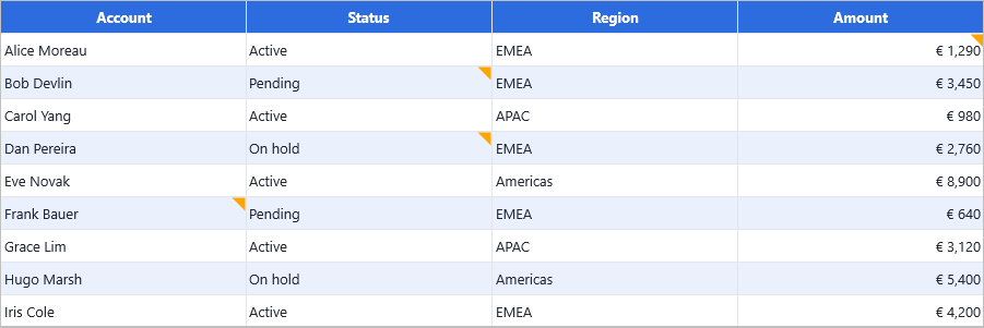
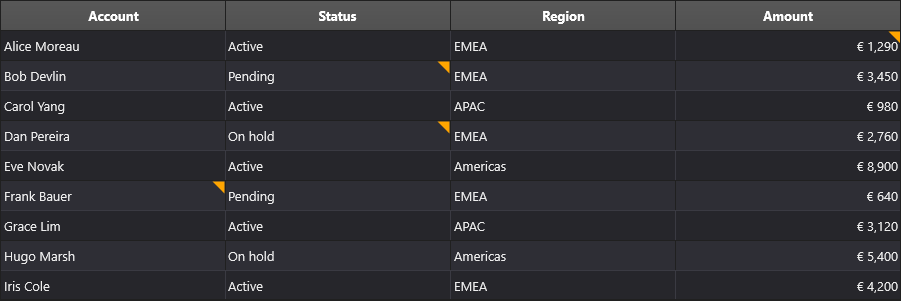
Comments stay visible when the user moves away; hints disappear as soon as the cursor leaves the cell.
Hints (tooltips)
Static hint per cell
Grid.Hints[1, 2] := 'This value was imported from the ERP system';
Dynamic hint via OnGetCellHint
For hints that depend on cell content:
procedure TForm1.GridGetCellHint(Sender: TObject;
  ACell: TTMSFNCDataGridCellCoord; var AHint: string);
begin
  if ACell.Column = StatusColumn then
    AHint := 'Status: ' + Grid.Strings[ACell.Column, ACell.Row];
end;
When both the static Hints[] array and the event are set for the same cell, the event wins.
HTML in hints
The grid's HTML engine renders inside hints too:
Grid.Hints[1, 2] :=
  '<B>Imported value</B><BR>' +
  '<FONT color="gcGray" size="10">Source: ERP, 2025-01-12</FONT>';
See HTML, anchors & highlighting for the full tag reference.
Comments
Set a comment programmatically
Grid.Comments[1, 3] := 'Reviewed by J. Smith on 2025-01-15';
A small indicator appears in the cell corner. Hovering the cell — or clicking the indicator — opens the comment balloon.
Set a comment via OnGetCellProperties
For dynamic comments that depend on cell content:
procedure TForm1.GridGetCellProperties(Sender: TObject;
  ACell: TTMSFNCDataGridCell);
begin
  if ACell.Column = ReviewColumn then
    ACell.Comment := 'Last reviewed: ' + DateToStr(Grid.Floats[ReviewColumn, ACell.Row]);
end;
React to clicks on the indicator
Attach an anonymous method as the click handler:
procedure TForm1.GridGetCellProperties(Sender: TObject;
  ACell: TTMSFNCDataGridCell);
begin
  ACell.OnCommentIndicatorClick :=
    procedure(Sender: TObject)
    begin
      ShowMessage('Comment: ' + Grid.Comments[ACell.Column, ACell.Row]);
    end;
end;
Customise the comment balloon
The balloon control is exposed via Grid.Root.CommentPopup (on the renderer). Use it to change appearance, padding, or behaviour:
Grid.Root.CommentPopup.FillColor   := gcLightYellow;
Grid.Root.CommentPopup.StrokeColor := gcGoldenrod;
Related API
Grid.Hints[col, row]— static hint text.Grid.Comments[col, row]— static comment text.OnGetCellHint— dynamic hint per cell.OnGetCellProperties— setACell.CommentandACell.OnCommentIndicatorClickper cell.Grid.CommentPopup— appearance of the comment balloon.
See also
- HTML, anchors & highlighting — both hints and comments support HTML markup.
- Custom cells — for richer in-cell annotations than what hints/comments provide.