Tree mode
Display hierarchical data as an expandable/collapsible tree without any additional components. Rows carry a level and a node state; the grid handles collapse, expand, indentation, and icons automatically.
Overview
Tree mode is row-level metadata: each row can be a node (expandable parent) or a leaf (plain row with a level ≥ 1). There is no separate tree model class — you set RowNodeLevel and RowNodeState directly on the grid rows.
| Property | Purpose |
|---|---|
RowNodeLevel[row] |
0 = top-level, 1 = child, 2 = grandchild, … |
RowNodeState[row] |
grnsExpanded or grnsCollapsed (only relevant for node rows that have children) |
Options.Columns.NodeIndex |
Which column shows the expand/collapse button (default: 0) |
The grid determines which rows are children of a node automatically: a node at level n owns all consecutive rows with level n+1 that follow it until the next level-n (or lower) row.
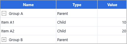
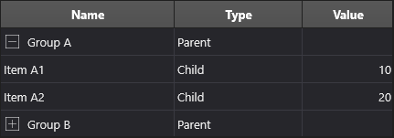
Quick example
  Row: Integer;
begin
  Grid.BeginUpdate;
  try
    Grid.ColumnCount    := 3;
    Grid.FixedRowCount  := 1;
    Grid.RowCount       := 1;               // will grow as we add

    // Header row
    Grid.Cells[0, 0] := 'Name';
    Grid.Cells[1, 0] := 'Type';
    Grid.Cells[2, 0] := 'Value';

    // The expand/collapse button appears in column 0
    Grid.Options.Column.NodeIndex := 0;

    // --- Parent A (level 0, starts collapsed) ---
    Row := Grid.RowCount;
    Grid.RowCount := Row + 1;
    Grid.RowNodeLevel[Row] := 0;
    Grid.RowNodeState[Row] := grnsCollapsed;
    Grid.Cells[0, Row] := 'Group A';
    Grid.Cells[1, Row] := 'Parent';

    // Child A1 (level 1)
    Inc(Row);  Grid.RowCount := Row + 1;
    Grid.RowNodeLevel[Row] := 1;
    Grid.Cells[0, Row] := 'Item A1';
    Grid.Cells[1, Row] := 'Child';
    Grid.Cells[2, Row] := 10;

    // Child A2 (level 1)
    Inc(Row);  Grid.RowCount := Row + 1;
    Grid.RowNodeLevel[Row] := 1;
    Grid.Cells[0, Row] := 'Item A2';
    Grid.Cells[1, Row] := 'Child';
    Grid.Cells[2, Row] := 20;

    // --- Parent B (level 0, starts expanded) ---
    Inc(Row);  Grid.RowCount := Row + 1;
    Grid.RowNodeLevel[Row] := 0;
    Grid.RowNodeState[Row] := grnsExpanded;
    Grid.Cells[0, Row] := 'Group B';
    Grid.Cells[1, Row] := 'Parent';

    // Child B1 (level 1)
    Inc(Row);  Grid.RowCount := Row + 1;
    Grid.RowNodeLevel[Row] := 1;
    Grid.Cells[0, Row] := 'Item B1';
    Grid.Cells[1, Row] := 'Child';
    Grid.Cells[2, Row] := 30;

  finally
    Grid.EndUpdate;
  end;
end;

// React to expand/collapse
procedure TForm1.GridCellBeforeNodeExpand(Sender: TObject;
  AColumn, ARow: Integer; var ACanExpand: Boolean);
begin
  // Optionally prevent expanding certain rows
  // ACanExpand := Grid.RowNodeChildCount[ARow] > 0;
end;

procedure TForm1.GridCellAfterNodeExpand(Sender: TObject;
  AColumn, ARow: Integer);
begin
  StatusBar1.SimpleText := Format('Row %d expanded', [ARow]);
end;

procedure TForm1.GridCellAfterNodeCollapse(Sender: TObject;
  AColumn, ARow: Integer);
begin
  StatusBar1.SimpleText := Format('Row %d collapsed', [ARow]);
end;
Step by step
1. Configure the grid
Grid.ColumnCount   := 3;
Grid.FixedRowCount := 1;

// Column 0 shows the expand/collapse button
Grid.Options.Columns.NodeIndex := 0;
2. Add node rows
Set RowNodeLevel and RowNodeState for every row:
// Top-level parent — starts collapsed
Grid.RowNodeLevel[1] := 0;
Grid.RowNodeState[1] := grnsCollapsed;
Grid.Cells[0, 1]     := 'Europe';

// Children
Grid.RowNodeLevel[2] := 1;
Grid.Cells[0, 2]     := 'Germany';

Grid.RowNodeLevel[3] := 1;
Grid.Cells[0, 3]     := 'France';

// Second top-level node
Grid.RowNodeLevel[4] := 0;
Grid.RowNodeState[4] := grnsExpanded;
Grid.Cells[0, 4]     := 'Americas';

Grid.RowNodeLevel[5] := 1;
Grid.Cells[0, 5]     := 'USA';
Note: rows with
RowNodeLevel > 0that have no children are leaves — they don't display an expand button. Only a row that is followed by rows at a higher level is treated as a node.
3. Expand and collapse programmatically
// Collapse or expand a specific row
Grid.RowNodeState[4] := grnsCollapsed;
Grid.RowNodeState[4] := grnsExpanded;

// Collapse or expand all nodes at once
Grid.CollapseAllNodes;
Grid.ExpandAllNodes;
4. Inspect tree structure at runtime
var Level := Grid.RowNodeLevel[ARow];
var State := Grid.RowNodeState[ARow];
var IsNode := Grid.IsRowNode(ARow);            // True if row has an expand button

var Parent := Grid.GetParentRow(ARow);         // row index of direct parent (-1 for roots)
var Root   := Grid.GetRootRow(ARow);           // row index of the root ancestor
var Depth  := Grid.GetMaxLevel;               // deepest level in the whole grid
5. React to expand and collapse
procedure TForm1.GridCellBeforeNodeExpand(Sender: TObject;
  AColumn, ARow: Integer; var ACanExpand: Boolean);
begin
  // Load children on demand here, then allow expansion
  LoadChildren(ARow);
  ACanExpand := True;
end;

procedure TForm1.GridCellAfterNodeExpand(Sender: TObject;
  AColumn, ARow: Integer);
begin
  Caption := Format('%d node expanded', [ARow]);
end;
| Event | Fires |
|---|---|
OnCellBeforeNodeExpand |
Before the expand animation. Set ACanExpand := False to block it. |
OnCellAfterNodeExpand |
After expansion is complete. |
OnCellBeforeNodeCollapse |
Before collapse. Set ACanCollapse := False to block it. |
OnCellAfterNodeCollapse |
After collapse is complete. |
OnRowExpand |
Data-layer event: fires when a row's node state changes to expanded. |
OnRowCollapse |
Data-layer event: fires when a row's node state changes to collapsed. |
6. Lazy (on-demand) child loading
A common pattern is to load children only when a node is first expanded. Use AddNodeRow to convert an existing empty row into a node header, then set RowNodeLevel on its children.
// Mark nodes that still need loading (using the Objects[] slot for a flag)
Grid.Objects[0, ParentRow] := Pointer(1);  // 1 = needs load

procedure TForm1.GridCellBeforeNodeExpand(Sender: TObject;
  AColumn, ARow: Integer; var ACanExpand: Boolean);
begin
  if Grid.Objects[0, ARow] = Pointer(1) then
  begin
    LoadChildrenFromDatabase(ARow);
    Grid.Objects[0, ARow] := nil;          // mark as loaded
  end;
  ACanExpand := True;
end;

procedure TForm1.LoadChildrenFromDatabase(AParentRow: Integer);
var
  Children: TStringList;
  R, i: Integer;
begin
  Children := FetchChildRecords(Grid.Cells[0, AParentRow]);
  try
    // Insert rows for the children
    Grid.InsertRows(AParentRow + 1, Children.Count);

    // Convert the parent into a node header that owns <Children.Count> child rows
    Grid.AddNodeRow(AParentRow, Children.Count, Grid.RowNodeLevel[AParentRow], True);

    // Populate children
    for i := 0 to Children.Count - 1 do
    begin
      R := AParentRow + 1 + i;
      Grid.RowNodeLevel[R] := Grid.RowNodeLevel[AParentRow] + 1;
      Grid.Cells[0, R] := Children[i];
    end;
  finally
    Children.Free;
  end;
end;
AddNodeRow(ARow, AChildCount, ALevel, AMerge) parameters:
| Parameter | Description |
|---|---|
ARow |
The row index to convert into a node header. |
AChildCount |
Number of direct child rows it owns. |
ALevel |
Nesting depth (0 = top level). |
AMerge |
When True, merges the header cell across all columns. |
7. Three-level hierarchy
Levels can go as deep as needed:
Grid.RowNodeLevel[1] := 0;  Grid.RowNodeState[1] := grnsExpanded;  Grid.Cells[0, 1] := 'Continent';
Grid.RowNodeLevel[2] := 1;  Grid.RowNodeState[2] := grnsExpanded;  Grid.Cells[0, 2] := 'Country';
Grid.RowNodeLevel[3] := 2;                                          Grid.Cells[0, 3] := 'City';
Grid.RowNodeLevel[4] := 2;                                          Grid.Cells[0, 4] := 'City';
Grid.RowNodeLevel[5] := 1;  Grid.RowNodeState[5] := grnsCollapsed;  Grid.Cells[0, 5] := 'Country';
Grid.RowNodeLevel[6] := 2;                                          Grid.Cells[0, 6] := 'City';
8. Combine tree with grouping
Tree mode and data-layer grouping are independent features. If you use the grid's built-in grouping, the grouping engine may insert node rows automatically. For hand-built hierarchies use RowNodeLevel directly, not grouping.
// Use EITHER tree mode OR built-in grouping — not both.

// Tree mode: assign node levels manually (do NOT call Grid.Group)
Grid.RowNodeLevel[2] := 1;  // parent node
Grid.RowNodeLevel[3] := 2;  // child
Grid.RowNodeLevel[4] := 2;  // child

// Grouping: let the data layer insert group rows automatically (do NOT set RowNodeLevel)
// Grid.Group([CountryColumn]);
Appearance
The expand/collapse icons can be replaced with custom bitmaps. See Custom icons for ExpandIcon and CollapseIcon.
Row indentation and node-button size are controlled by the grid's cell layout at each level. Use OnGetCellLayout to indent child rows:
procedure TForm1.GridGetCellLayout(Sender: TObject; ACell: TTMSFNCDataGridCell);
var
  R: TRectF;
begin
  if ACell.Row > 0 then
  begin
    R := ACell.Rect;
    R.Left := R.Left + Grid.RowNodeLevel[ACell.Row] * 20;
    ACell.Rect := R;
  end;
end;
Related API
Grid.RowNodeLevel[ARow]— nesting level (0-based)Grid.RowNodeState[ARow]—grnsExpanded/grnsCollapsedGrid.RowNodeChildCount[ARow]— direct child countGrid.Options.Columns.NodeIndex— column that hosts the expand/collapse buttonGrid.IsRowNode(ARow)— True if the row has an expand buttonGrid.GetParentRow(ARow)— direct parent row indexGrid.GetRootRow(ARow)— root ancestor row indexGrid.GetMaxLevel— deepest nesting level in the gridGrid.CollapseAllNodes/Grid.ExpandAllNodesGrid.AddNodeRow(ARow, AChildCount, ALevel, AMerge)— convert a plain row into a collapsible node headerOnCellBeforeNodeExpand/OnCellAfterNodeExpandOnCellBeforeNodeCollapse/OnCellAfterNodeCollapseOnRowExpand/OnRowCollapse
See also
- Grouping — data-driven grouping that creates node rows automatically.
- Custom icons — replace expand/collapse icons.
- Cell controls — embed controls in tree rows.
- Data, formatting & conversion —
Objects[]for tagging tree rows. - Demo:
Demo/FMX/DataGrid/Advanced/Tree