Cell controls
Embed live FMX/VCL controls inside grid cells — buttons, progress bars, checkboxes, radio buttons, bitmaps, even nested grids — and lay them out inside the cell with align or position rules.
Overview
Four flavours of in-cell content:
| Type | API | Use it for |
|---|---|---|
| Live control | Grid.Controls[col, row] := SomeControl |
Any FMX/VCL control: a button, a slider, a custom panel. |
| Built-in data control | Grid.AddDataCheckBoxColumn(col), AddDataProgressBarColumn(col), AddRadioButtonColumn(col) |
Common controls that bind directly to the cell value. |
| Decorative elements | Grid.AddButton(col, row), AddBitmap(col, row), AddCheckBox(col, row) |
Non-data controls for decoration or user actions. |
| Nested grid | Grid.AddGrid(col, row) |
A full sub-grid living inside one cell (master-detail in one component). |
For each live control you choose alignment (fills a cell edge — top, left, client, …) or position (anchored to a corner — top-left, center-right, …).
Quick example
procedure TForm1.FormCreate(Sender: TObject);
var
b: TButton;
i: Integer;
begin
Grid.BeginUpdate;
try
Grid.ColumnCount := 8;
Grid.LinearFill;
// Embed live FMX buttons in selected cells.
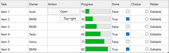
b := TButton.Create(Self);
b.Text := 'Client';
Grid.Controls[4, 1] := b;
Grid.ControlAligns[4, 1] := gcaClient; // fills the cell
b := TButton.Create(Self);
b.Text := 'Top Right';
Grid.Controls[2, 2] := b;
Grid.ControlPositions[2, 2] := gcpTopRight; // anchored at top-right
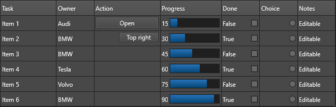
// Built-in progress bar bound to the cell value.
Grid.AddDataProgressBar(0, 5);
Grid.Ints[0, 5] := 25;
// Whole-column data-bound checkbox / radio button columns.
Grid.AddDataCheckBoxColumn(5);
Grid.AddRadioButtonColumn(6);
for i := 0 to Grid.RowCount - 1 do
Grid.Booleans[5, i] := Random(2) = 0;
finally
Grid.EndUpdate;
end;
end;
Step by step
Live FMX/VCL controls
Assign any control instance to Grid.Controls[col, row]. The grid manages
layout but not ownership — your form still owns the control instance.
b := TButton.Create(Self);
b.Text := 'Click me';
Grid.Controls[2, 3] := b;

Grid.ControlAligns[2, 3]    := gcaClient;        // fill cell
Grid.ControlPositions[2, 3] := gcpCenterCenter;  // or anchored to center
with Grid.ControlMargins[2, 3] do begin Left := 4; Top := 4; Right := 4; Bottom := 4; end;
ControlAligns (gcaTop, gcaLeft, gcaClient, …) and ControlPositions
(gcpTopLeft, gcpCenterCenter, …) are mutually exclusive — set one, leave
the other at its default.
Data-bound controls (whole column)
These render a live control bound to each cell's value:
Grid.AddDataCheckBoxColumn(5);         // column 5 → data-bound checkbox
Grid.AddDataProgressBarColumn(7);      // column 7 → data-bound progress bar
For data-bound checkboxes, Grid.Booleans[col, row] reads/writes the state.
For progress bars, Grid.Ints[col, row] is the percentage (0–100).
Radio buttons are not data-bound. AddRadioButtonColumn renders a static
radio button whose state you manage manually with Grid.SetRadioButton.
Grid.AddRadioButtonColumn(6); // column 6 → static radio button
Buttons, bitmaps, and static checkboxes
These are decorative controls not directly tied to a cell value:
Grid.AddButton(2, 3, 'Open');          // button in cell (2, 3)
Grid.AddButtonColumn(2, 'Edit');       // button in every cell of column 2
Grid.AddBitmap(3, 3, MyBitmap);        // bitmap in cell (3, 3)
Grid.AddCheckBox(4, 5, False);         // static checkbox in cell (4, 5)
Nested grid (sub-grid in a cell)
procedure TForm1.AddNestedGrid;
var
  g: TTMSFNCDataGridRenderer;
begin
  g := Grid.AddGrid(2, 9);              // returns a TTMSFNCDataGridRenderer
  g.ColumnCount := 5;
  g.LoadSampleData;
end;
The nested grid is a fully functional grid — you can nest grids inside cells of nested grids when your design calls for it.
Buttons that fire grid events
For buttons, handle clicks centrally via Grid.OnCellButtonClick rather
than setting individual OnClick handlers — it keeps all button logic in
one place:
procedure TForm1.GridCellButtonClick(Sender: TObject;
  AColumn, ARow: Integer);
begin
  case AColumn of
    EditColumn:  EditRecord(ARow);
    DeleteColumn: DeleteRecord(ARow);
  end;
end;
Bitmap cache for non-interactive controls
For performance, non-interactive cell controls can be rendered into a bitmap cache instead of kept as live framework controls in every visible cell. A live control is used only when the cell needs real interaction, such as focus or editing.
The default cache key includes the control type, dimensions, text/caption, focus state, and tag. If a custom control has additional visual state, add those property names with OnGetCellControlExtraProperties:
procedure TForm1.GridGetCellControlExtraProperties(Sender: TObject;
  AColumn, ARow: Integer; AControl: TControl;
  var AExtraProperties: TArray<string>);
begin
  if AControl is TPriorityBar then
    AExtraProperties := ['Level'];
end;
Use OnGetCellSupportsRealControl when a cell must host a live control instead of a cached bitmap:
procedure TForm1.GridGetCellSupportsRealControl(Sender: TObject;
  AColumn, ARow: Integer; AControl: TControl;
  var ASupportsRealControl: Boolean);
begin
  if AColumn = InteractiveColumn then
    ASupportsRealControl := True;
end;
Combining multiple control types with bitmap caching
This example adds a progress bar to one column, a button to another, and a checkbox column — then turns on bitmap caching for the progress bar so the grid stays performant with many rows:
procedure TForm1.FormCreate(Sender: TObject);
begin
  // Progress bar column (non-interactive — use bitmap cache)
  Grid.AddDataProgressBarColumn(ProgressColumn);
  Grid.ControlAligns[ProgressColumn, -1] := gcaClient; // -1 applies to whole column

  // Button column (interactive — must stay a real control)
  Grid.AddButtonColumn(ActionColumn);
  Grid.Columns[ActionColumn].ControlWidth  := 80;
  Grid.Columns[ActionColumn].ControlHeight := 22;
  Grid.OnCellButtonClick := GridCellButtonClick;

  // Checkbox column (data-bound)
  Grid.AddDataCheckBoxColumn(DoneColumn);
  Grid.OnCellCheckBoxChange := GridCellCheckBoxChange;

  // Bitmap cache: progress bar doesn't need interaction — cache it
  // Real control required only for the action button column
  Grid.OnGetCellSupportsRealControl := GridGetCellSupportsRealControl;
end;

procedure TForm1.GridGetCellSupportsRealControl(Sender: TObject;
  AColumn, ARow: Integer; AControl: TControl;
  var ASupportsRealControl: Boolean);
begin
  ASupportsRealControl := (AColumn = ActionColumn);
end;
Related API
Grid.Controls[AColumn, ARow]Grid.ControlAligns[AColumn, ARow]—gcaNone,gcaTop,gcaLeft,gcaRight,gcaBottom,gcaClientGrid.ControlPositions[AColumn, ARow]— nine corner constants (gcpTopLeft…gcpBottomRight)Grid.ControlMargins[AColumn, ARow]— per-cell margins (TTMSFNCMargins)Grid.Columns[AColumn].ControlWidth/ControlHeight— per-column control dimensionsGrid.AddButton/AddButtonColumn— button in cell or columnGrid.AddBitmap/AddBitmapColumn— bitmap in cell or columnGrid.AddCheckBox/AddCheckBoxColumn— static checkboxGrid.AddDataCheckBox/AddDataCheckBoxColumn— data-bound checkboxGrid.AddDataProgressBar/AddDataProgressBarColumn— data-bound progress barGrid.AddRadioButtonColumn— radio button columnGrid.AddGrid(AColumn, ARow)— nested sub-gridOnCellButtonClick,OnCellCheckBoxChange,OnCellRadioButtonChange
See also
- Editing cells — inplace editors are a different mechanism (replace cell content during edit).
- Custom cells — for owner-drawn rendering instead of embedded controls.
- Merging cells — merged cells are often used to host one large control.
- Demo:
Demo/FMX/DataGrid/Basic/Cell Controls - Demo:
Demo/FMX/DataGrid/Advanced/Grid in Grid