Grouping
Group rows by one or more columns, with optional summary aggregations (sum, average, count, min, max) and collapsible group headers.
Overview
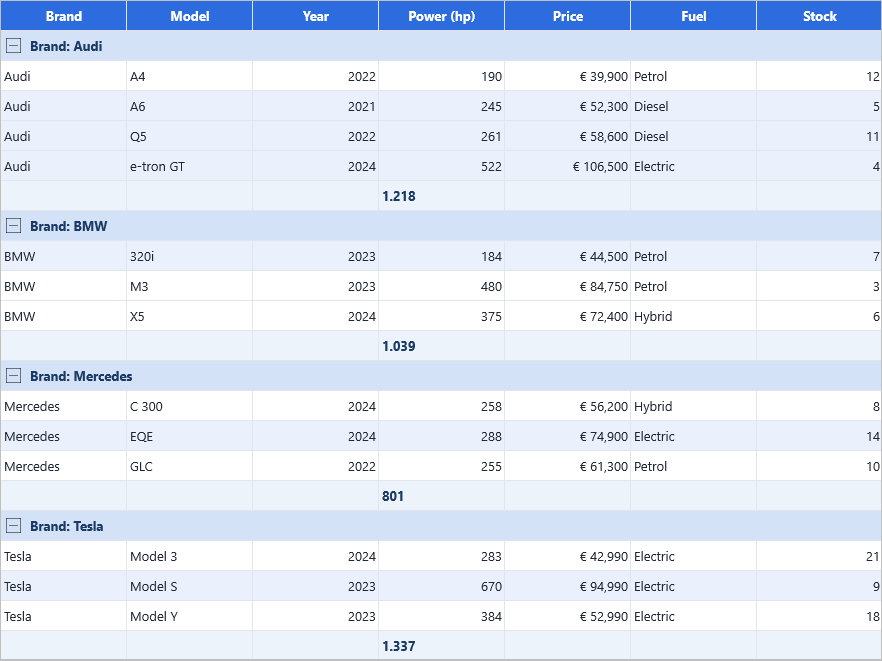
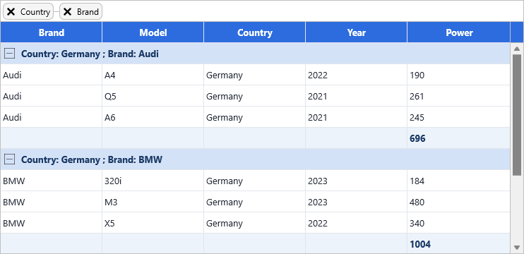
Grouping splits the rows of the grid into buckets based on the value of a group column. Each bucket is shown under a tree-style group header that the user can expand or collapse. Multi-level grouping (group by Country, then by Brand) is supported by passing an array of column indices.
Aggregations — sum, average, count, min, max — render as a footer row at the
bottom of each group (or inside the header when SummaryInHeader is on).
Quick example
procedure TForm1.GroupButtonClick(Sender: TObject);
begin
  // Visual settings
  Grid.Options.Grouping.MergeHeader := True;
  Grid.Options.Grouping.Summary := True;

  // Group by column 1 (Brand)
  Grid.Group(1);

  // Add aggregations on the grouped data
  Grid.GroupSum(6);          // sum of Kw column per group
  Grid.GroupAverage(5);      // average of Cyl column per group
end;

procedure TForm1.UngroupButtonClick(Sender: TObject);
begin
  Grid.UnGroup;
end;

procedure TForm1.ToggleExpandClick(Sender: TObject);
begin
  if AllExpanded then
    Grid.CollapseAllNodes
  else
    Grid.ExpandAllNodes;
  AllExpanded := not AllExpanded;
end;
Step by step
Group by one or more columns
Group by a single column, or pass an array — the first column is the outer group, the rest are nested:
uses
  FMX.TMSFNCDataGrid;

procedure TForm1.GroupBySingleColumn;
begin
  Grid.Group(1); // group by column 1
end;

procedure TForm1.GroupByMultipleColumns;
begin
  Grid.Group([8, 1]); // outer group by Country, nested by Brand
end;
Configure visual options
uses
  FMX.TMSFNCDataGrid;

procedure TForm1.ConfigureGroupVisuals;
begin
  Grid.Options.Grouping.MergeHeader     := True; // span the group header full-width
  Grid.Options.Grouping.Summary         := True; // show summary footer rows
  Grid.Options.Grouping.SummaryInHeader := True; // embed summary in the header instead
  Grid.Options.Grouping.HideColumns     := True; // hide the grouped column(s)
end;
Add aggregations
uses
  FMX.TMSFNCDataGrid;

procedure TForm1.AddGroupAggregations;
begin
  Grid.GroupSum(6);                   // sum the "Kw" column per group
  Grid.GroupAverage(5);               // average the "Cyl" column
  Grid.GroupCount(1);                 // count rows per group
  Grid.GroupMin(4); Grid.GroupMax(4); // min/max of "Hp"
end;
Aggregation format
Options.Grouping.CalculationFormat sets the display format string for
aggregated values. CalculationFormatType determines whether values are
treated as gcfNumber (integer) or gcfFloat (floating-point):
These options tune aggregation display and header behaviour: CalculationFormat / CalculationFormatType (gcfNumber integer or gcfFloat), MergeDelimiter (the separator used when multiple grouped values are joined into the header text), AutoSort (sort before grouping — True by default; set False to preserve pre-sorted order within groups), and UseFirstRowAsHeader:
uses
  FMX.TMSFNCDataGrid;

procedure TForm1.ConfigureGroupFormat;
begin
  // Aggregation display format
  Grid.Options.Grouping.CalculationFormat     := '%.2f';
  Grid.Options.Grouping.CalculationFormatType := gcfFloat;

  // Separator when multiple grouped values are joined in the header
  Grid.Options.Grouping.MergeDelimiter := ' — ';

  // Sort by the group column(s) before building groups (default True)
  Grid.Options.Grouping.AutoSort := True;

  // Promote the first data row as the group header
  Grid.Options.Grouping.UseFirstRowAsHeader := True;
end;
Expand and collapse
uses
  FMX.TMSFNCDataGrid;

procedure TForm1.ExpandCollapseGroups(ARow: Integer);
begin
  Grid.ExpandAllNodes;
  Grid.CollapseAllNodes;
  Grid.ExpandNode(ARow);
  Grid.CollapseNode(ARow);
end;

procedure TForm1.RemoveGrouping;
begin
  Grid.UnGroup;
end;
Remove grouping
Call Grid.UnGroup to remove grouping entirely (the RemoveGrouping procedure above).
Group with explicit sort direction per level
Grid.Group([col]) sorts each level ascending by default (when AutoSort is True). To specify descending sort, or to sort by a different column than the grouping key, use CreateGroupAndSortInfo to build a TTMSFNCDataGridDataGroupInfo record and pass it to the structured Group overload:
uses
  FMX.TMSFNCDataGrid;

// Group by Country (col 8) descending, nested by Brand (col 1) ascending.
procedure TForm1.GroupWithSortInfo;
var
  Info: TTMSFNCDataGridDataGroupInfo;
begin
  Info := CreateGroupAndSortInfo(
    [8],  // Level 0: group columns
    [8],  // Level 0: sort columns (can differ from group columns)
    [1],  // Level 1: group columns
    [1]); // Level 1: sort columns
  Grid.Group(Info);
  Grid.Options.Grouping.AutoSort := False; // the sort is already described
end;

// Two-level grouping structure without explicit sort columns.
procedure TForm1.GroupWithInfo;
var
  Info: TTMSFNCDataGridDataGroupInfo;
begin
  Info := CreateGroupInfo([8], [1]); // Country -> Brand
  Grid.Group(Info);
end;
When you only need to specify the grouping structure without explicit sort columns, use CreateGroupInfo (the GroupWithInfo procedure above). Both helpers also have a three-level overload — pass a third column array pair for Level2.
Interactive (visual) grouping
Visual grouping lets the user build the group structure at runtime by dragging column header chips into a dedicated drop zone above the column headers. Dropping a chip groups by that column; dropping it at a second level nests within the existing group. Each chip has a close button to remove the level and, optionally, a click handler to re-sort.
uses
  FMX.TMSFNCDataGrid;

procedure TForm1.EnableVisualGrouping;
begin
  Grid.Header.Visible := True;                 // show the header area
  Grid.Header.VisualGrouping.Visible := True;  // show the drop zone
  Grid.Header.VisualGrouping.AutoSize := True; // grow the zone as chips accumulate

  Grid.Options.Mouse.ColumnDragging := True;   // allow column header dragging
  // ColumnDragModes defaults to [gcdmReorder, gcdmVisualGrouping] — no change needed

  // Chip behaviour
  Grid.Header.VisualGrouping.CloseIndicator := True;  // show x on each chip
  Grid.Header.VisualGrouping.SortOnClick := True;     // click chip to sort by that column
  Grid.Header.VisualGrouping.ConnectionLines := True; // draw lines linking nested levels
end;
Enable the visual grouping zone and chips
The EnableVisualGrouping snippet above shows the full setup. Header.VisualGrouping.AutoSize grows the zone as chips accumulate, while CloseIndicator, SortOnClick, and ConnectionLines control the chip's × button, click-to-sort, and the connector lines linking nested levels. The user can then drag any column header chip into the zone — dropping at a different vertical position nests a level — and click the × to remove a level without calling UnGroup from code.
Add header bar action buttons
A button bar (Header.Bar) provides a natural home for Collapse All / Expand All / Ungroup commands:
uses
  FMX.TMSFNCDataGrid;

procedure TForm1.AddGroupingHeaderBar;
var
  Btn: TTMSFNCDataGridButton;
begin
  Grid.Header.Bar.Visible := True;
  Grid.Header.Bar.Size    := 35;

  Btn := Grid.Header.Bar.Buttons.Add;
  Btn.Text     := 'Collapse';
  Btn.Width    := 100;
  Btn.Callback := procedure begin Grid.CollapseAllNodes end;

  Btn := Grid.Header.Bar.Buttons.Add;
  Btn.Text     := 'Expand';
  Btn.Width    := 100;
  Btn.Callback := procedure begin Grid.ExpandAllNodes end;

  Btn := Grid.Header.Bar.Buttons.Add;
  Btn.Text     := 'Ungroup';
  Btn.Width    := 100;
  Btn.Callback := procedure begin Grid.Ungroup end;
end;
Custom group key via OnGetCustomGroup
By default the group chip and header text show the raw cell value. Override this with OnGetCustomGroup to build a bucketed or formatted key — for example age bands from a numeric age column:
procedure TForm1.GridGetCustomGroup(Sender: TObject;
  ACell: TTMSFNCDataGridCellCoord; AData: TTMSFNCDataGridCellValue;
  ALevel: Integer; var AGroup: string);
var
  Age, Decade: Integer;
begin
  if ACell.Column = AgeColumn then
  begin
    Age    := TTMSFNCDataGridData.ValueToInteger(AData);
    Decade := (Age div 10) * 10;
    AGroup := Format('Age %d – %d', [Decade, Decade + 9]);
  end;
end;
AGroup is pre-filled with the default key string; change it to whatever display text you want. The event fires for every cell during Group(), so keep it fast.
Disable drag-to-group while keeping column reorder
ColumnDragModes is a set — remove gcdmVisualGrouping to disable the drop zone without disabling column reorder:
uses
  FMX.TMSFNCDataGrid;

procedure TForm1.KeepReorderOnly;
begin
  Grid.Options.Mouse.ColumnDragModes := [gcdmReorder];
end;
Control the chips with events
Each grouped column shows as a chip in the visual-grouping zone (the API
calls a chip a header group). A set of events lets you control the chip
lifecycle: relabel or restyle a chip before it draws, stop the user removing a
mandatory grouping level, lock the structure for some roles, and react to chip
clicks. Each var ACan… guard is pre-set to the grid's normal behaviour — only
override it when you want to change the outcome.
procedure TForm1.WireChipEvents;
begin
  Grid.OnCustomizeHeaderGroup   := GridCustomizeHeaderGroup;
  Grid.OnBeforeCloseHeaderGroup := GridBeforeCloseHeaderGroup;
  Grid.OnCanDragHeaderGroup     := GridCanDragHeaderGroup;
  Grid.OnHeaderGroupClick       := GridHeaderGroupClick;
end;

procedure TForm1.GridCustomizeHeaderGroup(Sender: TObject;
  AHeaderGroup: TTMSFNCDataGridHeaderGroup);
begin
  // Adjust the chip just before it renders: relabel and tint the outer level.
  AHeaderGroup.Text := 'Grouped by: ' + AHeaderGroup.Text;
  if AHeaderGroup.Level = 0 then
    AHeaderGroup.Layout.Fill.Color := $00E8F0FF;
end;

procedure TForm1.GridBeforeCloseHeaderGroup(Sender: TObject; AColumn: Integer;
  var ACanClose: Boolean);
begin
  // Keep the mandatory primary grouping level; the user cannot remove it.
  ACanClose := AColumn <> FPrimaryGroupColumn;
end;

procedure TForm1.GridCanDragHeaderGroup(Sender: TObject; AColumn: Integer;
  var ACanDrag: Boolean);
begin
  // Lock the group structure for non-editor roles.
  ACanDrag := FAllowRegroup;
end;

procedure TForm1.GridHeaderGroupClick(Sender: TObject; AColumn: Integer);
begin
  StatusBar1.SimpleText := Format('Grouped by column %d', [AColumn]);
end;
OnCustomizeHeaderGroup fires for every chip just before it renders, so keep it
light; OnBeforeCloseHeaderGroup and OnCanDragHeaderGroup gate the user's
close (×) and drag gestures; OnHeaderGroupClick fires when a chip is clicked
(for example with SortOnClick enabled).
Per-level appearance with OnGetGroupOptions
OnGetGroupOptions fires once per group level each time Group() runs. It lets you customise the display options for each level independently — for example to give the outer group a taller header and hide its summary row while the inner group uses the defaults.
procedure TForm1.GridGetGroupOptions(Sender: TObject;
  AColumns: TArray<Integer>; ALevel: Integer;
  var AOptions: TTMSFNCDataGridDataGroupOptions);
begin
  case ALevel of
    0: begin
         AOptions.HeaderHeight    := 36;
         AOptions.MergeHeader     := True;
         AOptions.Summary         := False;   // no summary row for the outer level
       end;
    1: begin
         AOptions.HeaderHeight    := 24;
         AOptions.Summary         := True;
         AOptions.SummaryInHeader := True;    // embed summary inside the header
       end;
  end;
end;
Assign the event handler and set Grid.OnGetGroupOptions := GridGetGroupOptions before calling Grid.Group(...). The event fires after each group level is built, so AColumns contains the column index array for that level.
TTMSFNCDataGridDataGroupOptions fields:
| Field | Effect |
|---|---|
AutoSort |
Sort the level before grouping. |
HeaderHeight |
Height of auto-inserted group header rows (0 = default row height). |
HideColumns |
Hide the grouped column(s) for this level. |
MergeDelimiter |
Separator used when joining multiple group key values in the header text. |
MergeHeader |
Span the group header cell across all columns. |
MergeSummary |
Span the summary cell across all columns. |
Summary |
Add a summary row at the bottom of each group. |
SummaryHeight |
Height of auto-inserted summary rows. |
SummaryInHeader |
Embed summary values inside the header row instead of a separate summary row. |
UseFirstRowAsHeader |
Promote the first data row as the group header. |
Custom group headers
Hook OnGetCellLayout for the group rows to customise the look — change the
fill colour, font, or render computed text. The grid identifies group cells
by their state flag gcsGroup.
procedure TForm1.GridGetCellLayout(Sender: TObject; ACell: TTMSFNCDataGridCell);
var
  G: TTMSFNCDataGrid;
begin
  G := Sender as TTMSFNCDataGrid;
  if G.IsRowNode(ACell.Row) then
  begin
    ACell.Layout.Fill.Kind    := gfkSolid;
    ACell.Layout.Fill.Color   := $00D8EDF8;   // light blue background
    ACell.Layout.Font.Style   := [fsBold];
    ACell.Layout.Font.Color   := $00003A6B;   // dark blue text
    ACell.Layout.Font.Size    := 11;
    ACell.Layout.Stroke.Color := $00A8C8E0;
    ACell.Layout.TextAlign    := gtaLeading;
  end;
end;
To render computed text inside group header cells, handle OnGetCellProperties and modify ACell.Text:
procedure TForm1.GridGetCellProperties(Sender: TObject; ACell: TTMSFNCDataGridCell);
var
  G: TTMSFNCDataGrid;
begin
  G := Sender as TTMSFNCDataGrid;
  if G.IsRowNode(ACell.Row) and (ACell.Column = G.FixedColumnCount) then
    ACell.Text := ACell.Text + ' — click to expand';
end;
Combining grouping, aggregations, visual grouping, and custom appearance
This example wires all grouping features together: two-level programmatic grouping with per-group aggregations, visual drag-to-group enabled, group header styling via OnGetCellLayout, and a button bar for expand/collapse control.
procedure TForm1.FormCreate(Sender: TObject);
begin
  // ---- Two-level programmatic group with aggregations ----
  Grid.Group([CountryColumn, BrandColumn]);  // Country → Brand
  Grid.GroupSum(HpColumn);                  // horsepower total per group
  Grid.GroupAverage(CylColumn);             // average cylinders per group
  Grid.GroupCount(BrandColumn);             // row count per group

  Grid.Options.Grouping.MergeHeader     := True;  // full-width header cell
  Grid.Options.Grouping.Summary         := True;  // show summary footer per group
  Grid.Options.Grouping.HideColumns     := True;  // hide the grouped columns

  // ---- Visual drag-to-group ----
  Grid.Header.Visible                       := True;
  Grid.Header.VisualGrouping.Visible        := True;
  Grid.Header.VisualGrouping.AutoSize       := True;
  Grid.Header.VisualGrouping.CloseIndicator := True;
  Grid.Header.VisualGrouping.SortOnClick    := True;
  Grid.Options.Mouse.ColumnDragging         := True;

  // ---- Action bar: Collapse All / Expand All / Ungroup ----
  Grid.Header.Bar.Visible := True;
  Grid.Header.Bar.Size    := 35;
  with Grid.Header.Bar.Buttons.Add do begin
    Text := 'Collapse All'; Width := 110;
    Callback := procedure begin Grid.CollapseAllNodes end;
  end;
  with Grid.Header.Bar.Buttons.Add do begin
    Text := 'Expand All'; Width := 100;
    Callback := procedure begin Grid.ExpandAllNodes end;
  end;
  with Grid.Header.Bar.Buttons.Add do begin
    Text := 'Ungroup'; Width := 90;
    Callback := procedure begin Grid.Ungroup end;
  end;

  // ---- Custom header appearance via event ----
  Grid.OnGetCellLayout := GridGetCellLayout;
end;

procedure TForm1.GridGetCellLayout(Sender: TObject; ACell: TTMSFNCDataGridCell);
var
  G: TTMSFNCDataGrid;
begin
  G := Sender as TTMSFNCDataGrid;
  if G.IsRowNode(ACell.Row) then
  begin
    ACell.Layout.Fill.Kind  := gfkSolid;
    ACell.Layout.Fill.Color := $00DDEEFF;
    ACell.Layout.Font.Style := [fsBold];
  end
  else if G.IsRowSummary(ACell.Row) then
  begin
    ACell.Layout.Fill.Color := $00EEEEFF;
    ACell.Layout.Font.Style := [fsItalic];
  end;
end;
Inspecting group and summary rows in code
After grouping, use these predicates to distinguish data rows from group rows when iterating:
uses
  FMX.TMSFNCDataGrid;

procedure TForm1.InspectRows;
var
  R: Integer;
begin
  for R := Grid.FixedRowCount to Grid.RowCount - 1 do
  begin
    if Grid.IsRowNode(R) then
      // this is a collapsible group header row
    else if Grid.IsRowSummary(R) then
      // this is an aggregation footer row (count, sum, ...)
    else if Grid.IsRowDisplayed(R) then
      // this is a regular data row currently visible
  end;
end;
Related API
TTMSFNCDataGrid.Group(AColumn)/Group(AColumns: array of Integer)/Group(AGroupInfo: TTMSFNCDataGridDataGroupInfo)CreateGroupInfo(AColumnsLevel0)/CreateGroupInfo(L0, L1)/CreateGroupInfo(L0, L1, L2)— build group structure recordsCreateGroupAndSortInfo(AColumnsLevel0, ASortColumnsLevel0)/ two- and three-level overloads — include sort column listsTTMSFNCDataGrid.UnGroupTTMSFNCDataGrid.IsGrouped— True when grouping is currently appliedTTMSFNCDataGrid.GroupSum/GroupAverage/GroupCount/GroupMin/GroupMaxTTMSFNCDataGrid.IsRowNode(ARow)— True for collapsible group header rowsTTMSFNCDataGrid.IsRowSummary(ARow)— True for aggregation footer rowsTTMSFNCDataGrid.IsRowNormal(ARow)— True for plain data rows only (not node, summary, or filter rows)TTMSFNCDataGrid.IsRowDisplayed(ARow)— True for visible data rowsTTMSFNCDataGrid.ExpandAllNodes/CollapseAllNodes/ExpandNode/CollapseNodeTTMSFNCDataGrid.Options.Grouping.MergeHeader/Summary/SummaryInHeaderTTMSFNCDataGrid.Options.Grouping.HideColumns— hide the grouped column(s)TTMSFNCDataGrid.Options.Grouping.AutoSort— sort before groupingTTMSFNCDataGrid.Options.Grouping.MergeDelimiter— separator between joined header valuesTTMSFNCDataGrid.Options.Grouping.CalculationFormat/CalculationFormatTypeTTMSFNCDataGrid.Options.Grouping.HeaderHeight/SummaryHeightTTMSFNCDataGrid.Options.Grouping.UseFirstRowAsHeaderTTMSFNCDataGrid.Options.Grouping.HideEmptyGroupsTTMSFNCDataGridCellAppearance.GroupLayout/SummaryLayoutTTMSFNCDataGrid.Header.Visible— show the header areaTTMSFNCDataGrid.Header.VisualGrouping.Visible— show the drag-to-group drop zoneTTMSFNCDataGrid.Header.VisualGrouping.AutoSize— grow zone automatically as chips accumulateTTMSFNCDataGrid.Header.VisualGrouping.CloseIndicator— show × button on each chipTTMSFNCDataGrid.Header.VisualGrouping.SortOnClick— click chip to sort by that columnTTMSFNCDataGrid.Header.VisualGrouping.ConnectionLines/ConnectionStrokeTTMSFNCDataGrid.Header.VisualGrouping.Layout— fill/font/stroke of the chip areaTTMSFNCDataGrid.Header.VisualGrouping.LevelIndicationFill/LevelActiveIndicationFillTTMSFNCDataGrid.Header.Bar.Visible/Size— toolbar strip below the visual grouping zoneTTMSFNCDataGrid.Header.Bar.Buttons.Add— add action buttons to the barTTMSFNCDataGrid.Options.Mouse.ColumnDragging— enable column header draggingTTMSFNCDataGrid.Options.Mouse.ColumnDragModes—gcdmReorder,gcdmVisualGroupingOnGetCustomGroup— override the group key string per cell (bucketing, formatting)OnGetGroupOptions— per-level grouping display options (header height, merge mode, summary visibility)OnCustomizeHeaderGroup— adjust a chip (TTMSFNCDataGridHeaderGroup:Text,Layout,Level) before it rendersOnBeforeCloseHeaderGroup— veto removing a grouping level via the chip × (var ACanClose)OnCanDragHeaderGroup— veto dragging a chip to re-group (var ACanDrag)OnHeaderGroupClick— fired when the user clicks a chip in the visual grouping zone
See also
- Calculations — per-group aggregations together with a grand-total footer row.
- Sorting — group order follows sort order.
- Filtering — empty groups can be hidden via
Options.Filtering.HideEmptyGroups. - Headers, footers & buttons — full reference for
Header.BarandFooter.Bar. - Demo:
Demo/FMX/DataGrid/Basic/Grouping - Demo:
Demo/FMX/DataGrid/Advanced/Multi-Column Grouping - Demo:
Demo/FMX/DataGrid/Advanced/Visual Grouping