Headers, footers & buttons
Configure the grid header and footer bars, group columns visually, and add custom header or footer buttons for application commands.
Overview
The grid header and footer are more than captions. They can host visual column groups, paging controls, and custom buttons. Keep these commands close to the grid when they act on grid state: filtering, exporting, toggling hidden columns, or switching views.
| Area | Purpose |
|---|---|
Header.Visible |
Shows or hides the header area. |
Header.VisualGrouping |
Groups related columns under visual bands. |
Header.Bar.Buttons |
Adds custom buttons to the header bar. |
Footer.Visible |
Shows or hides the footer area. |
Footer.Bar.Buttons |
Adds custom buttons to the footer bar. |
Visual grouping zone
Header.VisualGrouping is an interactive drop zone above the column headers. The user drags column header chips into it to group rows by that column; dropping a second chip at a different vertical position creates a nested group level. Clicking the × on a chip removes that group level.
Enable it with:
Grid.Header.Visible := True;
Grid.Header.VisualGrouping.Visible := True;
Grid.Header.VisualGrouping.AutoSize := True;   // zone grows as chips accumulate

Grid.Options.Mouse.ColumnDragging := True;     // allow header dragging
Style the chip area and level indicators:
Grid.Header.VisualGrouping.Layout.Fill.Color             := gcLightgray;
Grid.Header.VisualGrouping.LevelIndicationFill.Color     := gcLightgray;
Grid.Header.VisualGrouping.LevelActiveIndicationFill.Color := gcLightblue;
Grid.Header.VisualGrouping.ConnectionLines               := True;
Grid.Header.VisualGrouping.CloseIndicator                := True;
Grid.Header.VisualGrouping.SortOnClick                   := True;
For the full interactive-grouping workflow — including OnGetCustomGroup for custom keys and adding bar buttons — see Grouping → Interactive (visual) grouping.
Header buttons
Add buttons through Header.Bar.Buttons. Buttons can display text, a bitmap, or both.
var
  Btn: TTMSFNCDataGridButton;
begin
  Btn := Grid.Header.Bar.Buttons.Add;
  Btn.Name := 'FilterButton';
  Btn.Text := 'Filter';
  Btn.Hint := 'Apply the current filter';
  Btn.Width := 160;
  Btn.OnClick := HeaderFilterButtonClick;
end;
You can also use a callback for compact button logic:
Btn.Callback :=
  procedure
  begin
    Grid.ShowFilterDialog;
  end;
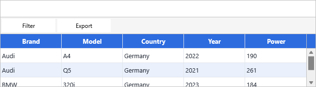
Footer buttons
Footer buttons use the same pattern on Footer.Bar.Buttons.
Grid.Footer.Visible := True;

with Grid.Footer.Bar.Buttons.Add do
begin
  Name := 'ExportButton';
  Text := 'Export';
  OnClick := ExportButtonClick;
end;
Footer buttons work well for paging, totals, export commands, and commands that apply to the entire grid rather than one column.
Related API
TTMSFNCDataGrid.HeaderTTMSFNCDataGrid.FooterHeader.VisualGroupingHeader.Bar.ButtonsFooter.Bar.ButtonsTTMSFNCDataGridButton
See also
- Grouping — full interactive (visual) grouping guide including drag-to-group, custom keys, and bar buttons.
- Column management — hiding, moving, and stretching columns.
- Paging — built-in footer paging controls.
- Advanced filtering — opening the filter dialog from header commands.