Appearance
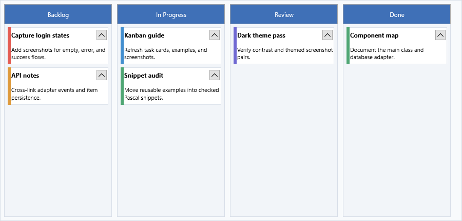
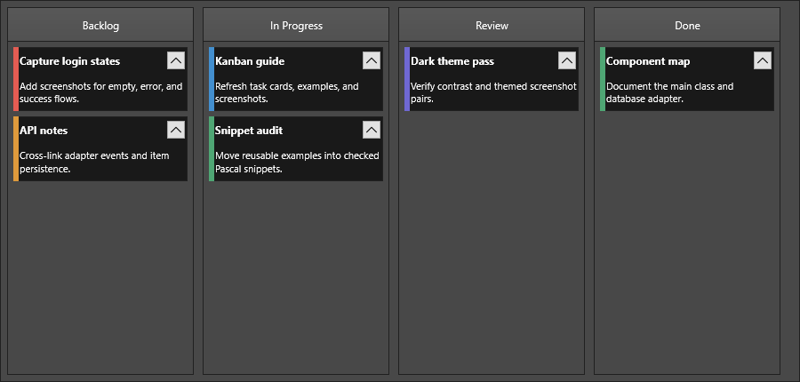
The Kanban board exposes appearance settings at board, column, and item level so a board can follow the product theme while still highlighting specific work streams. Start with board-wide defaults such as GlobalFont, ColumnsAppearance, and ItemsAppearance, then opt individual columns or items out of those defaults only when they need a distinct status, priority, or selection state. This keeps the common styling path short and makes later theme changes predictable.
Global font
Use GlobalFont when the board should adopt one typography baseline for column headers, column footers, item titles, item bodies, and item text. The property is useful during application theme changes because it updates the font family, size, color, and scale through the shared appearance interface before any deliberate per-column or per-item overrides are applied.
procedure TForm1.ApplyKanbanGlobalFont;
begin
  KanbanBoard1.GlobalFont.Name := 'Segoe UI';
  KanbanBoard1.GlobalFont.Size := 11;
  KanbanBoard1.GlobalFont.Color := gcBlack;
  KanbanBoard1.GlobalFont.Scale := 1.0;
end;
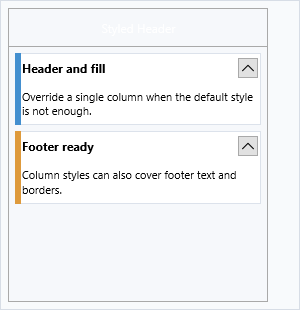
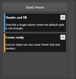
Column appearance
ColumnsAppearance on TTMSFNCKanbanBoard sets the default visual style for all columns. Individual columns can override specific properties by setting UseDefaultAppearance to False.
| Property | Description |
|---|---|
Fill |
Column background fill |
Stroke |
Column border |
Margins |
Outer margins around each column |
Spacing |
Gap between adjacent columns |
HeaderFill |
Header area background |
HeaderFont |
Header text font |
HeaderSize |
Height of the header area |
HeaderStroke |
Header area border |
FooterFill |
Footer area background |
FooterFont |
Footer text font |
FooterSize |
Height of the footer area |
FooterStroke |
Footer area border |
// Rounded headers with a subtle border
KanbanBoard1.ColumnsAppearance.HeaderFill.Color := gcSteelBlue;
KanbanBoard1.ColumnsAppearance.HeaderFont.Color := gcWhite;
KanbanBoard1.ColumnsAppearance.HeaderSize := 36;
KanbanBoard1.ColumnsAppearance.Spacing := 8;
Item appearance
ItemsAppearance controls the default visual style for all items:
| Property | Description |
|---|---|
Fill |
Item background fill |
Stroke |
Item border |
Font |
Body text font |
TitleFont |
Title text font |
SelectedFill |
Fill in selected state |
SelectedStroke |
Border in selected state |
DisabledFill |
Fill in disabled state |
DisabledStroke |
Border in disabled state |
Height |
Default item height |
HeightMode |
kbhmFixed for uniform height; kbhmVariable for auto-sizing |
FixedHeight |
Item height when HeightMode is kbhmFixed |
Margins |
Inner margins around each item |
Spacing |
Gap between items in the same column |
ShowFocus |
Whether a focus border is drawn around the selected item |
HTMLTemplate |
Template string for HTML-rendered items |
// Light card style
KanbanBoard1.ItemsAppearance.Fill.Color := gcWhite;
KanbanBoard1.ItemsAppearance.Stroke.Color := gcLightGray;
KanbanBoard1.ItemsAppearance.SelectedFill.Color := gcAliceBlue;
KanbanBoard1.ItemsAppearance.SelectedStroke.Color := gcSteelBlue;
KanbanBoard1.ItemsAppearance.Spacing := 6;
KanbanBoard1.ItemsAppearance.Margins.Left := 4;
KanbanBoard1.ItemsAppearance.Margins.Right := 4;
Height modes
| Value | Description |
|---|---|
kbhmVariable |
Each item sizes to its content (default) |
kbhmFixed |
All items use FixedHeight |
KanbanBoard1.ItemsAppearance.HeightMode := kbhmFixed;
KanbanBoard1.ItemsAppearance.FixedHeight := 80;
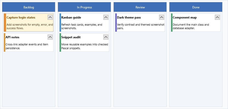
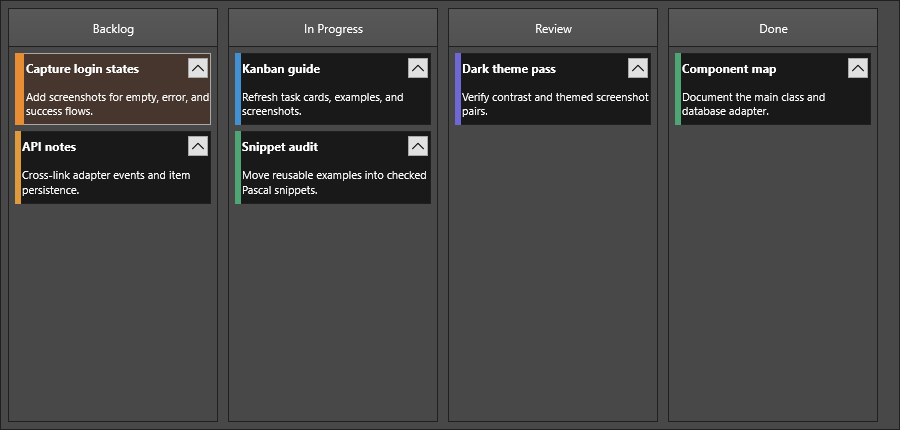
Per-column and per-item overrides
Set UseDefaultAppearance to False on a column or item to override the board defaults:
// Highlight a specific column
var col := KanbanBoard1.Columns[2];
col.UseDefaultAppearance := False;
col.Fill.Color := gcLightGreen;

// Highlight a specific item
var item := col.Items[0];
item.UseDefaultAppearance := False;
item.Color := gcLightYellow;
item.TitleColor := gcGold;
Combined example
// Dark-header board with auto-height items and colored focus border
KanbanBoard1.BeginUpdate;
try
  KanbanBoard1.ColumnsAppearance.Fill.Color := gcWhiteSmoke;
  KanbanBoard1.ColumnsAppearance.HeaderFill.Color := gcDimGray;
  KanbanBoard1.ColumnsAppearance.HeaderFont.Color := gcWhite;
  KanbanBoard1.ColumnsAppearance.HeaderSize := 40;
  KanbanBoard1.ColumnsAppearance.Spacing := 10;

  KanbanBoard1.ItemsAppearance.Fill.Color := gcWhite;
  KanbanBoard1.ItemsAppearance.Stroke.Color := gcSilver;
  KanbanBoard1.ItemsAppearance.SelectedFill.Color := gcLightBlue;
  KanbanBoard1.ItemsAppearance.ShowFocus := True;
  KanbanBoard1.ItemsAppearance.HeightMode := kbhmVariable;
  KanbanBoard1.ItemsAppearance.Margins.Left := 6;
  KanbanBoard1.ItemsAppearance.Margins.Right := 6;
  KanbanBoard1.ItemsAppearance.Spacing := 6;
finally
  KanbanBoard1.EndUpdate;
end;
Pitfalls
- Set board-level
ColumnsAppearanceandItemsAppearancebefore applying per-column or per-item overrides so an override is not masked byUseDefaultAppearance. - Wrap multi-property style changes in
BeginUpdateandEndUpdateso intermediate layouts do not flicker and variable-height items recalculate once. - Use
GlobalFontfor broad typography changes, then override only special columns or items. DirectHeaderFontandTitleFontedits are better for deliberate exceptions.
Related API
TTMSFNCKanbanBoard—ColumnsAppearance,ItemsAppearance
See also
- Columns — column setup and header/footer text
- Items — per-item color overrides and mark areas
- Interaction — editing and drag-and-drop behavior