Columns
Columns are the main workflow containers in a Kanban board. Each column owns its item collection, header and footer text, optional filter UI, collapse state, and appearance override flag. Build the column set in one update block, then tune behavior per column: enable filtering only where users need to narrow dense lists, collapse secondary lanes when screen space is limited, and use footer summaries to expose counts or totals that help users scan the board.
Adding columns
Columns are the vertical lanes of the board. Add them at design time in the Object Inspector or programmatically:
var
  col: TTMSFNCKanbanBoardColumn;
begin
  col := KanbanBoard1.Columns.Add;
  col.HeaderText := 'To Do';
  col.Width := 220;
end;
TTMSFNCKanbanBoardColumn *col = KanbanBoard1->Columns->Add();
col->HeaderText = "To Do";
col->Width = 220;
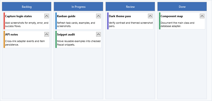
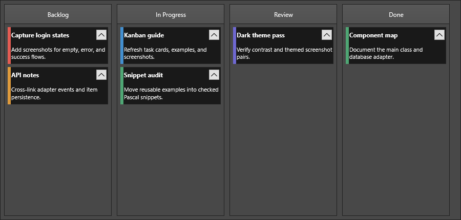
Add multiple columns in one pass with BeginUpdate / EndUpdate:
procedure TForm1.AddWorkflowColumns;
var
  col: TTMSFNCKanbanBoardColumn;
begin
  KanbanBoard1.BeginUpdate;
  try
    col := KanbanBoard1.Columns.Add;
    col.HeaderText := 'Backlog';

    col := KanbanBoard1.Columns.Add;
    col.HeaderText := 'In Progress';

    col := KanbanBoard1.Columns.Add;
    col.HeaderText := 'Review';

    col := KanbanBoard1.Columns.Add;
    col.HeaderText := 'Done';
  finally
    KanbanBoard1.EndUpdate;
  end;
end;
void __fastcall TForm1::AddWorkflowColumns()
{
  TTMSFNCKanbanBoardColumn *col;
  KanbanBoard1->BeginUpdate();
  try
  {
    col = KanbanBoard1->Columns->Add();
    col->HeaderText = "Backlog";

    col = KanbanBoard1->Columns->Add();
    col->HeaderText = "In Progress";

    col = KanbanBoard1->Columns->Add();
    col->HeaderText = "Review";

    col = KanbanBoard1->Columns->Add();
    col->HeaderText = "Done";
  }
  __finally
  {
    KanbanBoard1->EndUpdate();
  }
}
Column properties
| Property | Description |
|---|---|
HeaderText |
Text shown in the column header |
HeaderVisible |
Show or hide the header area |
HeaderFill |
Background fill of the header area |
HeaderStroke |
Border stroke around the header area |
HeaderFont |
Font for header text |
HeaderHorizontalTextAlign |
Horizontal alignment of header text |
HeaderVerticalTextAlign |
Vertical alignment of header text |
HeaderTrimming |
Text trimming in the header |
HeaderWordWrapping |
Word-wrap in the header |
FooterText |
Text shown in the column footer |
FooterVisible |
Show or hide the footer area |
FooterFill |
Background fill of the footer area |
FooterStroke |
Border stroke around the footer area |
FooterHorizontalTextAlign |
Horizontal alignment of footer text |
FooterVerticalTextAlign |
Vertical alignment of footer text |
FooterTrimming |
Text trimming in the footer |
FooterWordWrapping |
Word-wrap in the footer |
Fill |
Background fill behind the column items |
Stroke |
Border stroke around the column |
Width |
Column width when expanded |
Visible |
Show or hide the entire column |
UseDefaultAppearance |
When False, overrides the board-level ColumnsAppearance |
Use these per-column properties only when UseDefaultAppearance is False. Otherwise the board-level ColumnsAppearance wins — see Appearance.
Collapse and expand
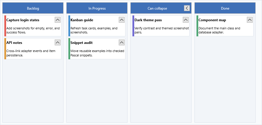
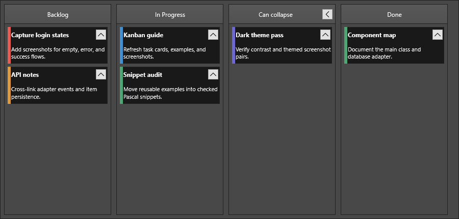
Columns can be collapsed to a narrow strip to save horizontal space:
// Make a column collapsible
col.Expandable := True;

// Set the width in collapsed state
col.CollapsedWidth := 40;

// Collapse programmatically
col.Expanded := False;
When Expandable is True, an expand/collapse button appears in the header. Users can click it or the control can be toggled in code.
Filter
Each column has an independent filter. Set ShowFilterButton to True to display the filter UI in the header:
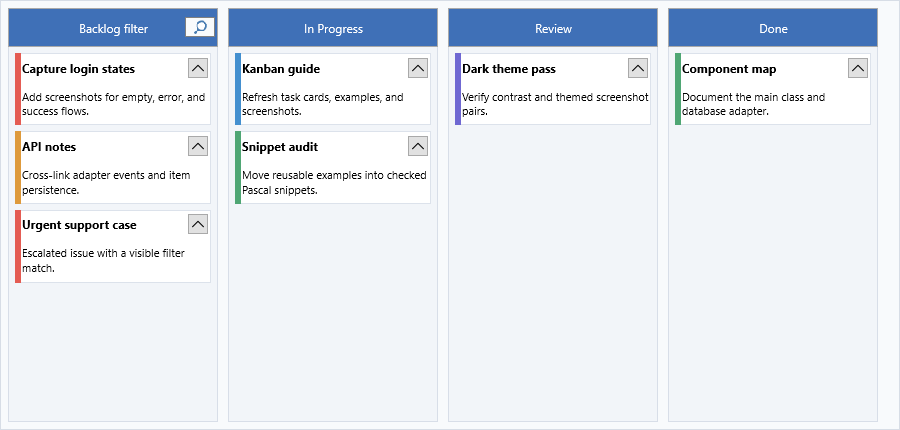
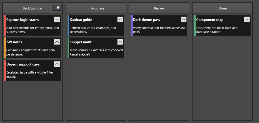
col.ShowFilterButton := True;
Apply or clear a filter programmatically:
// Open the filter UI and apply the current filter settings
col.StartFiltering;
col.ApplyFilter;

// Remove filter but keep filter data
col.RemoveFilter;

// Remove filter and clear filter data
col.RemoveFilters;
Use StartFiltering and StopFiltering to activate the filter UI in code without user interaction.
Sorting
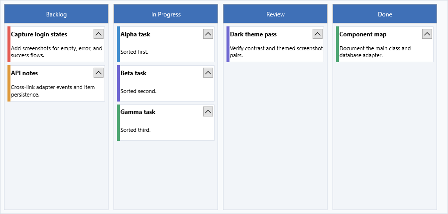
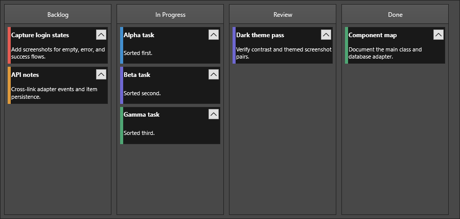
col.Sorting := kbsNormal;
When Sorting is kbsNormal or kbsNormalCaseSensitive, users can click the column header to sort items. Sort direction cycles through ascending and descending.
Combining setup, filter, sorting, and collapse
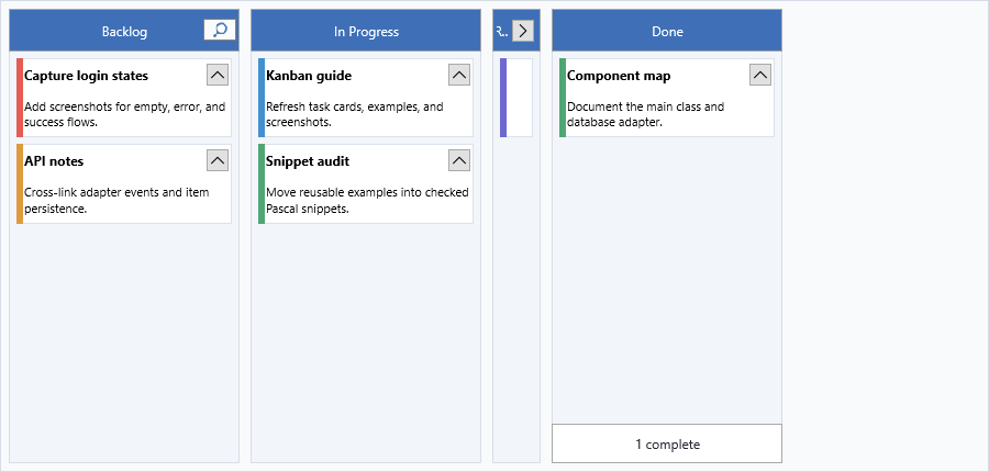
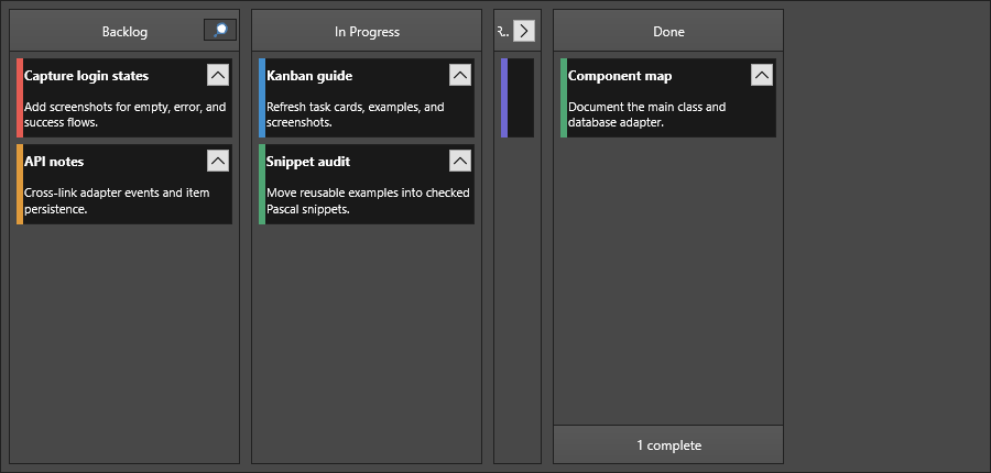
Use a single update block when a board initializes multiple column behaviors at once. The following example creates four lanes, enables filtering on the backlog, sorts the in-progress lane, makes the review lane collapsible, and exposes a footer on the done lane.
procedure TForm1.ConfigureKanbanColumns;
var
  backlog: TTMSFNCKanbanBoardColumn;
  progress: TTMSFNCKanbanBoardColumn;
  review: TTMSFNCKanbanBoardColumn;
  done: TTMSFNCKanbanBoardColumn;
begin
  KanbanBoard1.BeginUpdate;
  try
    backlog := KanbanBoard1.Columns.Add;
    backlog.HeaderText := 'Backlog';
    backlog.ShowFilterButton := True;

    progress := KanbanBoard1.Columns.Add;
    progress.HeaderText := 'In Progress';
    progress.Sorting := kbsNormal;

    review := KanbanBoard1.Columns.Add;
    review.HeaderText := 'Review';
    review.Expandable := True;
    review.CollapsedWidth := 48;

    done := KanbanBoard1.Columns.Add;
    done.HeaderText := 'Done';
    done.FooterVisible := True;
    done.FooterText := 'Completed this sprint';
  finally
    KanbanBoard1.EndUpdate;
  end;
end;
void __fastcall TForm1::ConfigureKanbanColumns()
{
  TTMSFNCKanbanBoardColumn *backlog, *progress, *review, *done;

  KanbanBoard1->BeginUpdate();
  try
  {
    backlog = KanbanBoard1->Columns->Add();
    backlog->HeaderText = "Backlog";
    backlog->ShowFilterButton = true;

    progress = KanbanBoard1->Columns->Add();
    progress->HeaderText = "In Progress";
    progress->Sorting = kbsNormal;

    review = KanbanBoard1->Columns->Add();
    review->HeaderText = "Review";
    review->Expandable = true;
    review->CollapsedWidth = 48;

    done = KanbanBoard1->Columns->Add();
    done->HeaderText = "Done";
    done->FooterVisible = true;
    done->FooterText = "Completed this sprint";
  }
  __finally
  {
    KanbanBoard1->EndUpdate();
  }
}
Disabling interaction
col.DisableInteraction;
// ... do batch work ...
col.EnableInteraction;
Scrolling to an item
col.ScrollToItem(2); // scroll column so item index 2 is visible
Item lookup and bulk selection
Each column exposes hit-testing and selection helpers that operate on items inside that column. Use them when responding to mouse coordinates or when the user needs to act on more than one item at a time.
procedure TForm1.InspectKanbanColumn(AColumn: TTMSFNCKanbanBoardColumn; X,
  Y: Single; AItemToRemove: TTMSFNCKanbanBoardItem);
var
  HitItem: TTMSFNCKanbanBoardItem;
  HitIndex: Integer;
  SelectedItems: TTMSFNCKanbanBoardItemArray;
  SelectedCount: Integer;
begin
  HitItem := AColumn.XYToItem(X, Y);
  HitIndex := AColumn.XYToItemIndex(X, Y);

  AColumn.SelectItem(0);
  AColumn.SelectItems([0, 2, 4]);
  SelectedItems := AColumn.GetSelectedItems;
  SelectedCount := AColumn.SelectedItemCount;
  AColumn.ClearSelection;

  if Assigned(AItemToRemove) then
    AColumn.RemoveItem(AItemToRemove);
end;
void __fastcall TForm1::InspectKanbanColumn(TTMSFNCKanbanBoardColumn *AColumn, float X,
  float Y, TTMSFNCKanbanBoardItem *AItemToRemove)
{
  TTMSFNCKanbanBoardItem *HitItem = AColumn->XYToItem(X, Y);
  int HitIndex = AColumn->XYToItemIndex(X, Y);

  AColumn->SelectItem(0);
  System::DynamicArray<int> idx;
  idx.Length = 3;
  idx[0] = 0; idx[1] = 2; idx[2] = 4;
  AColumn->SelectItems(idx);
  TTMSFNCKanbanBoardItemArray SelectedItems = AColumn->GetSelectedItems();
  int SelectedCount = AColumn->SelectedItemCount();
  AColumn->ClearSelection();

  if (AItemToRemove != nullptr)
    AColumn->RemoveItem(AItemToRemove);
}
XYToItem / XYToItemIndex return nil / -1 when no item is under the supplied point. Selection helpers respect the board's Interaction.MultiSelect flag — when multi-select is off, SelectItems selects only the last index in the array.
Edit mode
A column owns the in-place editor for its currently selected item. Start, stop, or toggle the editor without waiting for a double-click:
col.StartEditMode;     // open the editor on the selected item
col.StopEditMode;      // commit edits and close the editor
col.ToggleEditMode;    // open if closed, close if open
When the user finishes editing, the board fires OnUpdateItemText. See Interaction → Programmatic edit control for the event-driven flow.
Pitfalls
- Use
BeginUpdateandEndUpdatewhen creating or reconfiguring several columns so item layout, filter UI, and footer text refresh once. - Set
UseDefaultAppearance := Falsebefore changing column-specific fill, header, or footer properties; otherwise board-level appearance remains in control. - Treat
Filteras the column filter object. Show and enter the filter UI withShowFilterButtonandStartFiltering, then clear it withRemoveFilterorRemoveFilters.
Related API
TTMSFNCKanbanBoard—Columns,ColumnsAppearance,XYToColumn,FindItemWithDBKeyTTMSFNCKanbanBoardColumn—XYToItem,XYToItemIndex,SelectItem,SelectItems,GetSelectedItems,SelectedItemCount,ClearSelection,RemoveItem,StartEditMode,StopEditMode,ToggleEditMode
See also
- Items — adding and configuring items within a column
- Appearance — column colors, fonts, and layout
- Interaction — drag-and-drop, editing, and keyboard