Items
Items are the cards users scan, move, and update during day-to-day work. Each item belongs to one column, carries its own title, body text, optional HTML content, and optional appearance overrides, and can store additional state through custom values or persistence. Create items through the owning column collection, keep frequently changed text in clear properties such as Title and Text, and reserve item-specific styling for meaningful states such as blocked, selected, overdue, or review-ready work.
Adding items
Items live inside a column's Items collection:
var
  item: TTMSFNCKanbanBoardItem;
begin
  item := KanbanBoard1.Columns[0].AddItem('Fix login bug');
  item.Title := 'AUTH-42';
  item.Color := gcLightYellow;
end;
TTMSFNCKanbanBoardItem *item = KanbanBoard1->Columns->Items[0]->AddItem("Fix login bug");
item->Title = "AUTH-42";
item->Color = gcLightyellow;
AddItem accepts an optional text argument. The returned object can be configured further before the board refreshes.
Item properties
| Property | Description |
|---|---|
Title |
Short label shown above the body text |
Text |
Body / description text (HTML if it starts with <) |
Color |
Background color when UseDefaultAppearance is False |
TitleColor |
Title background color when UseDefaultAppearance is False |
TextColor |
Body text color when UseDefaultAppearance is False |
SelectedTextColor |
Body text color in selected state |
SelectedTitleColor |
Title color in selected state |
DisabledTextColor |
Body text color in disabled state |
DisabledTitleColor |
Title color in disabled state |
Enabled |
When False, item is drawn in a disabled style |
Visible |
Show or hide the item |
UseDefaultAppearance |
When False, per-item colors override ItemsAppearance |
Height |
Item height; -1 uses auto-sizing |
HorizontalTextAlign |
Horizontal alignment of body text |
VerticalTextAlign |
Vertical alignment of body text |
Trimming |
Text trimming for body text |
WordWrapping |
Word-wrap for body text |
TitleHorizontalTextAlign |
Horizontal alignment of title |
TitleVerticalTextAlign |
Vertical alignment of title |
TitleTrimming |
Text trimming for title |
TitleWordWrapping |
Word-wrap for title |
Expand and collapse
Individual items can be expandable, allowing the user to show or hide extra detail:
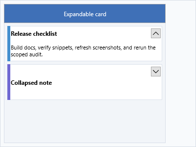
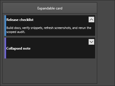
item.Expandable := True;
item.Expanded := False;   // start collapsed
Mark areas
Mark areas are colored stripes on item edges, useful for status or priority indicators:
item.MarkType := [kbmtLeft];         // show mark on left edge only
item.MarkColor := gcOrangeRed;       // default color for all edges
item.MarkColorLeft := gcOrangeRed;   // left edge color specifically
item.MarkSizeLeft := 6;              // width of left stripe in pixels
MarkType flags can be combined using set syntax to show marks on multiple edges:
item.MarkType := [kbmtTop, kbmtBottom];
item.MarkColorTop := gcGreen;
item.MarkColorBottom := gcRed;
Bitmap
Attach an image to the left side of an item:
item.BitmapName := 'avatar';
HTML template
For rich formatting, set an HTMLTemplate on ItemsAppearance and supply values per item via HTMLTemplateItems:
// Board-level template (set once)
KanbanBoard1.ItemsAppearance.HTMLTemplate :=
  '<b>[TITLE]</b><br/><font color="gray">[ASSIGNEE]</font>';

// Per-item substitution values
item.HTMLTemplateItems.AddPair('TITLE', item.Title);
item.HTMLTemplateItems.AddPair('ASSIGNEE', 'Alice');
Moving and copying items
// Move item to column index 2 at the end
item.MoveItem(KanbanBoard1.Columns[2]);

// Copy item to column index 1 at position 0
item.CopyItem(KanbanBoard1.Columns[1], 0);
Column-level equivalents accept a source item:
KanbanBoard1.Columns[0].CopyItem(item, KanbanBoard1.Columns[2]);
Selecting items
// Select a single item
KanbanBoard1.Columns[0].SelectItem(0);

// Select multiple items (requires MultiSelect = True)
KanbanBoard1.Columns[0].SelectItems([0, 2, 4]);

// Check whether an item is selected
if item.IsSelected then ...;

// Get all selected items in a column
var arr := KanbanBoard1.Columns[0].GetSelectedItems;
Persistence
// Save an item to a string
var s := item.SaveToString;

// Restore from the saved string
item.LoadFromString(s);
SaveToString accepts an optional ATextOnly: Boolean flag (default True) — set it to False to also serialise appearance overrides such as colors and mark settings.
Finding items and columns
When you have a database-backed adapter, look up an item by its primary key:
var item := KanbanBoard1.FindItemWithDBKey('TASK-1042');
if Assigned(item) then
  KanbanBoard1.Columns[0].SelectItem(item.Index);
FindItemWithDBKey scans every column for the first item whose DBKey matches and returns nil if none is found.
Hit-test board coordinates to discover which column the user clicked:
procedure TForm1.KanbanBoard1MouseDown(Sender: TObject;
  Button: TMouseButton; Shift: TShiftState; X, Y: Single);
var
  col: TTMSFNCKanbanBoardColumn;
begin
  col := KanbanBoard1.XYToColumn(X, Y);
  if Assigned(col) then
    StatusBar1.SimpleText := 'In column: ' + col.HeaderText;
end;
void __fastcall TForm1::KanbanBoard1MouseDown(TObject *Sender,
  TMouseButton Button, TShiftState Shift, float X, float Y)
{
  TTMSFNCKanbanBoardColumn *col = KanbanBoard1->XYToColumn(X, Y);
  if (col != nullptr)
    StatusLabel->Text = "In column: " + col->HeaderText;
}
For item-level hit-testing inside a single column, see Item lookup and bulk selection.
Combined example — colored marks, bitmap, and HTML template
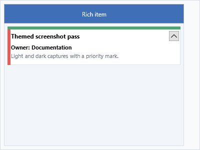
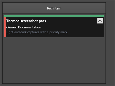
procedure TForm1.ConfigureTaskCard;
var
  col: TTMSFNCKanbanBoardColumn;
  item: TTMSFNCKanbanBoardItem;
begin
  KanbanBoard1.BeginUpdate;
  try
    KanbanBoard1.ItemsAppearance.HTMLTemplate :=
      '<b>[TITLE]</b><br/><font size="10" color="gray">[DESC]</font>';

    col := KanbanBoard1.Columns[0];
    item := col.AddItem;
    item.HTMLTemplateItems.AddPair('TITLE', 'Deploy to staging');
    item.HTMLTemplateItems.AddPair('DESC', 'Run smoke tests after deploy');
    item.MarkType := [kbmtLeft];
    item.MarkColorLeft := gcDodgerBlue;
    item.MarkSizeLeft := 5;
    item.BitmapName := 'deploy-icon';
  finally
    KanbanBoard1.EndUpdate;
  end;
end;
void __fastcall TForm1::ConfigureTaskCard()
{
  TTMSFNCKanbanBoardColumn *col;
  TTMSFNCKanbanBoardItem *item;

  KanbanBoard1->BeginUpdate();
  try
  {
    KanbanBoard1->ItemsAppearance->HTMLTemplate =
      "<b>[TITLE]</b><br/><font size=\"10\" color=\"gray\">[DESC]</font>";

    col = KanbanBoard1->Columns->Items[0];
    item = col->AddItem();
    item->HTMLTemplateItems->AddPair("TITLE", "Deploy to staging");
    item->HTMLTemplateItems->AddPair("DESC", "Run smoke tests after deploy");
    item->MarkType = TTMSFNCKanbanBoardMarkTypes() << kbmtLeft;
    item->MarkColorLeft = gcDodgerblue;
    item->MarkSizeLeft = 5;
    item->BitmapName = "deploy-icon";
  }
  __finally
  {
    KanbanBoard1->EndUpdate();
  }
}
Related API
TTMSFNCKanbanBoard—Columns,ItemsAppearance,SelectedItem,SelectItem,FindItemWithDBKey,XYToColumnTTMSFNCKanbanBoardItem—MoveItem,CopyItem,SaveToString,LoadFromString,IsSelected,SelectItem
See also
- Columns — column setup, filter, and sort
- Appearance — item colors and layout
- Interaction — drag-and-drop and editing