Items
Every row in the list is a TTMSFNCListBoxItem in the Items collection. An
item holds its display text, an optional icon, per-state text colors, layout
flags, and five general-purpose data fields you can use to associate a record,
object, or key with the row. This guide covers building the collection,
seeding new items from DefaultItem, attaching application data, and rendering
icons and HTML text. Reach for items whenever you need more than a flat list of
strings — when each row maps to a domain object you look up again on selection.
Adding and removing items
Items.Add appends a row and returns it; the overload with a string sets the
text in one call. Items.Insert(Index) adds at a position, RemoveItem
deletes a specific item, and Items.Clear empties the collection. Always wrap
bulk changes in BeginUpdate/EndUpdate.
procedure TForm1.EditItems;
var
  Item: TTMSFNCListBoxItem;
begin
  ListBox1.BeginUpdate;
  try
    Item := ListBox1.Items.Add('First item');    // append with text
    ListBox1.Items.Insert(0).Text := 'Top item';  // insert at the front
    ListBox1.RemoveItem(Item);                     // remove a specific item
  finally
    ListBox1.EndUpdate;
  end;
end;
You can also load many strings at once with Items.AddStrings(AStringList) or
LoadFromStrings — see Data & persistence.
Default item, item data, and lookup
DefaultItem holds property values copied into every item created after you
set them, so you can establish a baseline (text color, alignment, word
wrapping) once. Each item exposes DataString, DataInteger, DataBoolean,
DataObject, and DataPointer for application use, plus DBKey for a stable
identifier and Tag for an integer marker. Items.FindItem(AText) returns the
first item with matching text:
procedure TForm1.BuildContacts;
var
  Item: TTMSFNCListBoxItem;
begin
  ListBox1.BeginUpdate;
  try
    ListBox1.Items.Clear;

    // DefaultItem values are copied into every item created afterwards.
    ListBox1.DefaultItem.TextColor := gcBlack;
    ListBox1.DefaultItem.WordWrapping := False;
    ListBox1.DefaultItem.TextAlign := gtaLeading;

    Item := ListBox1.Items.Add('Ada Lovelace');
    Item.DataString := 'ada@example.com';   // arbitrary payload for this item
    Item.DataInteger := 1815;
    Item.DBKey := 'C-001';

    Item := ListBox1.Items.Add('Alan Turing');
    Item.DataString := 'alan@example.com';
    Item.DataInteger := 1912;
    Item.DBKey := 'C-002';
  finally
    ListBox1.EndUpdate;
  end;
end;

procedure TForm1.SelectByText(const AText: string);
var
  Item: TTMSFNCListBoxItem;
begin
  Item := ListBox1.Items.FindItem(AText);
  if Assigned(Item) then
    ShowMessage(Item.Text + ' -> ' + Item.DataString);
end;
Note
DefaultItem values apply only to items added after they are set. Items
already in the collection keep their current values — set DefaultItem
before the loop that adds rows.
Item properties
| Property | Description |
|---|---|
Text |
Item label; rendered as HTML when it begins with < |
TextColor |
Text color in the normal state |
SelectedTextColor |
Text color when the item is selected |
DisabledTextColor |
Text color when the item is disabled |
TextAlign |
Horizontal alignment: gtaLeading, gtaCenter, gtaTrailing |
Trimming |
How overlong text is trimmed (gttNone, gttCharacter, gttWord) |
WordWrapping |
Wrap item text across multiple lines |
Enabled |
When False, the item is grayed out and cannot be selected |
Height |
Per-item height; applies when ItemsAppearance.HeightMode is lihmVariable |
Bitmap |
Icon loaded from a file or stream |
BitmapName |
Icon name resolved from a TTMSFNCBitmapContainer |
BitmapWidth / BitmapHeight |
Reserved icon size; 0 uses the natural bitmap size |
Checked |
Check state (shown as a check box by the Checked ListBox variant) |
Bitmaps and HTML-formatted text
Assign BitmapContainer once and reference icons by name, or load a bitmap
into an item directly. Item text is rendered as HTML when it starts with <,
so you can mix bold, colored, and plain runs in a single label:
procedure TForm1.BuildRichItems;
var
  Item: TTMSFNCListBoxItem;
begin
  ListBox1.BitmapContainer := BitmapContainer1;

  ListBox1.BeginUpdate;
  try
    ListBox1.Items.Clear;

    // Icon resolved by name from the attached TTMSFNCBitmapContainer.
    Item := ListBox1.Items.Add;
    Item.BitmapName := 'mail';
    Item.Text := '<b>Inbox</b> <font color="gray">- 3 unread</font>';

    // Icon loaded directly from a file.
    Item := ListBox1.Items.Add;
    Item.Bitmap.LoadFromFile('archive.png');
    Item.Text := '<b>Archive</b>';
    Item.WordWrapping := True;
  finally
    ListBox1.EndUpdate;
  end;
end;
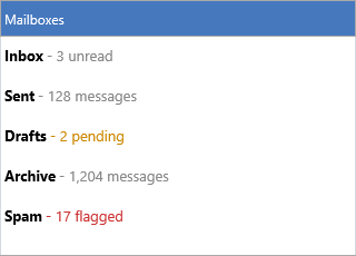
Putting it together
A realistic list combines several of the features above: seed shared values
through DefaultItem, give each row an icon by name, render an HTML label, and
attach a key in DataString for selection lookup — all in one batched build:
procedure TForm1.BuildMailboxes;
var
  Item: TTMSFNCListBoxItem;
begin
  ListBox1.BitmapContainer := BitmapContainer1;

  ListBox1.BeginUpdate;
  try
    ListBox1.Items.Clear;

    // Shared defaults applied to every item added below.
    ListBox1.DefaultItem.WordWrapping := False;
    ListBox1.DefaultItem.TextAlign := gtaLeading;

    Item := ListBox1.Items.Add;
    Item.BitmapName := 'inbox';
    Item.Text := '<b>Inbox</b> <font color="gray">- 3 unread</font>';
    Item.DataString := 'inbox';

    Item := ListBox1.Items.Add;
    Item.BitmapName := 'archive';
    Item.Text := '<b>Archive</b> <font color="gray">- 1,204 messages</font>';
    Item.DataString := 'archive';
  finally
    ListBox1.EndUpdate;
  end;
end;
Checked list variant
For per-item check boxes, use the dedicated
TTMSFNCCheckedListBox component, which builds
on the same item model and adds a check box column plus check-state events. The
Checked property exists on the base item, but the check-box rendering and
OnItemCheckChanged event are provided by the checked variant.
Related API
TTMSFNCListBox—Items,DefaultItem,RemoveItem,BitmapContainerTTMSFNCCheckedListBox— per-item check boxes
See also
- Appearance — item colors, fonts, and height modes
- Data & persistence — loading items from strings, files, and streams
- Custom drawing — drawing on top of items using their data fields