Table of Contents

TMS FNC ListBox

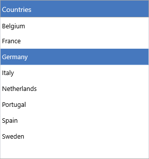
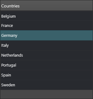
TTMSFNCListBox is a cross-platform list control with fixed or variable item heights, bitmap and HTML-formatted items, multi-select, header sorting, a filter drop-down, keyboard lookup, clipboard support, reordering, and drag-and-drop. It renders identically across FMX, VCL, and WEB. For per-item check boxes, use the companion TTMSFNCCheckedListBox component, which builds on the same item model.

A populated TMS FNC ListBox with a styled header and a selected row A populated TMS FNC ListBox with a styled header and a selected row

Documentation

Resource What you'll find
Get started Drop the component, add items, handle selection
Guides Task-oriented chapters for every feature area
API reference Full TTMSFNCListBox member reference
Release notes Version history

Features

  • Fixed or auto-height items
  • Bitmap icons via file or TTMSFNCBitmapContainer
  • HTML-formatted item text
  • Multi-select with keyboard and mouse
  • Header-click sorting (ascending/descending, case modes)
  • Interactive filter drop-down and a programmatic filter collection
  • Keyboard type-ahead lookup
  • Clipboard cut, copy, and paste
  • In-list reordering and cross-control drag-and-drop
  • Owner drawing of items, icons, text, and the sort indicator
  • Touch scrolling and a configurable header

API classes

Class Purpose
TTMSFNCListBox Main list control
TTMSFNCCheckedListBox Checked variant with per-item check boxes

Guides

  • Items — text, icons, HTML, default item, per-item data
  • Appearance — fills, fonts, height modes, header
  • Interaction — selection, sorting, reorder, drag-and-drop, clipboard, lookup
  • Filtering — the filter drop-down and programmatic filters
  • Events — selection, hover, scroll, clipboard, reorder events
  • Custom drawing — owner-drawn rows, icons, and text
  • Data & persistence — strings, files, streams, clipboard

See also