Appearance
The list box separates shared appearance — applied to every item through
ItemsAppearance — from per-item overrides set on each TTMSFNCListBoxItem.
Together with the Header bar and the control-level Fill/Stroke, these let
you match the list to your application's visual style without owner-drawing.
Reach for ItemsAppearance when the whole list should look consistent; use
per-item colors (see Items) only for exceptions such as a
highlighted or disabled row.
Item appearance
ItemsAppearance controls the default visual style for all items across their
normal, selected, and disabled states:
| Property | Description |
|---|---|
Fill |
Background fill in the normal state |
Stroke |
Border in the normal state |
SelectedFill |
Background fill when an item is selected |
SelectedStroke |
Border when an item is selected |
DisabledFill |
Background fill for disabled items |
DisabledStroke |
Border for disabled items |
Font |
Default item text font |
HeightMode |
lihmFixed for uniform height; lihmVariable for per-item height |
FixedHeight |
Item height when HeightMode is lihmFixed |
ShowFocus |
Draw a focus rectangle around the focused item |
Height modes
| Value | Description |
|---|---|
lihmFixed |
All items use FixedHeight (default) |
lihmVariable |
Each item sizes to its own Height / content |
Use lihmFixed for dense, uniform lists; switch to lihmVariable when items
wrap to multiple lines or carry differently-sized icons.
Header appearance
The Header bar sits above the list and shows a title, an optional sort
indicator, and configurable text:
| Property | Description |
|---|---|
Visible |
Show or hide the header |
Text |
Header label (supports HTML) |
Fill / Stroke |
Header background and border |
Font |
Header text font |
Size |
Header height in pixels |
HorizontalTextAlign / VerticalTextAlign |
Header text alignment |
WordWrapping / Trimming |
Header text overflow handling |
SortIndicatorColor |
Color of the sort-direction triangle |
Combining item appearance, height, and header
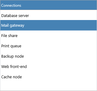
The setup below builds a compact, fixed-height list with a styled header, custom selection colors, and a focus rectangle — all inside one batched update:
procedure TForm1.StyleListBox;
begin
  ListBox1.BeginUpdate;
  try
    // Header
    ListBox1.Header.Visible := True;
    ListBox1.Header.Text := 'Connections';
    ListBox1.Header.Fill.Color := gcSteelblue;
    ListBox1.Header.Font.Color := gcWhite;
    ListBox1.Header.Size := 32;
    ListBox1.Header.HorizontalTextAlign := gtaLeading;
    ListBox1.Header.SortIndicatorColor := gcWhite;

    // Fixed-height rows
    ListBox1.ItemsAppearance.HeightMode := lihmFixed;
    ListBox1.ItemsAppearance.FixedHeight := 32;
    ListBox1.ItemsAppearance.ShowFocus := True;

    // Normal and selected state
    ListBox1.ItemsAppearance.Fill.Color := gcWhite;
    ListBox1.ItemsAppearance.Stroke.Color := gcGainsboro;
    ListBox1.ItemsAppearance.SelectedFill.Color := gcSteelblue;
    ListBox1.ItemsAppearance.SelectedStroke.Color := gcSteelblue;
    ListBox1.ItemsAppearance.Font.Size := 13;
  finally
    ListBox1.EndUpdate;
  end;
end;
Control background and scrollbar
The control itself exposes Fill and Stroke for the list background and
border, and VerticalScrollBarVisible toggles the scrollbar. GlobalFont
applies one font across the whole control when you want a single typographic
setting instead of separate item and header fonts.
{ Inside a method of your form: }
ListBox1.Fill.Color := gcWhitesmoke;
ListBox1.Stroke.Color := gcGainsboro;
ListBox1.VerticalScrollBarVisible := True;
Pitfalls
- Setting
FixedHeighthas no visible effect whileHeightModeislihmVariable— setHeightMode := lihmFixedfirst. - A per-item
TextColoroverridesItemsAppearance.Fontcolor for that row; clear per-item colors if you want the shared appearance to win. - Apply multiple appearance changes inside
BeginUpdate/EndUpdateto avoid intermediate repaints and flicker.
Related API
TTMSFNCListBox—ItemsAppearance,Header,Fill,Stroke,VerticalScrollBarVisible,GlobalFont
See also
- Items — per-item color and layout overrides
- Interaction — selection behavior that uses the selected-state colors
- Custom drawing — go beyond appearance properties with owner drawing