Getting started
TTMSFNCListBox is a cross-platform list control that displays a scrollable
collection of TTMSFNCListBoxItem rows. Each item carries its own text, icon,
colors, and application data, and the control adds header sorting, a filter
drop-down, keyboard lookup, clipboard support, reordering, and drag-and-drop on
top of the basic list. This page covers the shortest path to a working list:
drop the component, add items, show a header, and respond to selection. The
Items, Appearance,
Interaction, Filtering,
Events, Custom drawing, and
Data & persistence guides go deeper on each
area.
Requirements
- Delphi 10.1 Berlin or later
- TMS FNC Core (required dependency)
- TMS FNC UI Pack
Drop the component
- Drop a
TTMSFNCListBoxonto a form. - Set
Alignto fill the available area, or size it manually. - Add items at design time through the
Itemscollection editor, or programmatically as shown below.
Populate, select, and handle selection
Add items inside a BeginUpdate/EndUpdate pair so the control repaints once
instead of after every item. Items.Add accepts the item text directly and
returns the created TTMSFNCListBoxItem, and OnItemSelected fires with the
selected item:
procedure TForm1.FormCreate(Sender: TObject);
const
Countries: array[0..4] of string =
('Belgium', 'France', 'Germany', 'Netherlands', 'Spain');
var
I: Integer;
begin
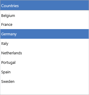
ListBox1.Header.Text := 'Countries';
ListBox1.Header.Visible := True;
ListBox1.BeginUpdate;
try
ListBox1.Items.Clear;
for I := Low(Countries) to High(Countries) do
ListBox1.Items.Add(Countries[I]);
finally
ListBox1.EndUpdate;
end;
ListBox1.ItemIndex := 0;
end;
procedure TForm1.ListBox1ItemSelected(Sender: TObject;
AItem: TTMSFNCListBoxItem);
begin
Caption := 'Selected: ' + AItem.Text;
end;
The selection handler receives the TTMSFNCListBoxItem directly — read
ListBox1.ItemIndex for its position, or ListBox1.SelectedItem for the item
reference. With Interaction.MultiSelect enabled, use SelectedItemCount and
the SelectedItems[] array to read every selected row.
Next steps
- Items — item text, icons, HTML, default item, and per-item data
- Appearance — fills, strokes, fonts, height modes, and the header
- Interaction — multi-select, sorting, reorder, drag-and-drop, clipboard, lookup
- Filtering — the header filter drop-down and programmatic filters
- Events — selection, click, hover, scroll, and clipboard events
- Custom drawing — owner-drawn items, icons, and text
- Data & persistence — strings, files, streams, and the clipboard