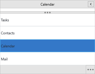
Appearance
The navigation panel styles three surfaces independently: the item area
(ItemsAppearance), the button bar (ButtonsAppearance), and each panel's
own header, footer and content (through Item.Container). Every interactive
surface carries a full state palette — normal, hover, down, active and disabled —
so you can build anything from a light sidebar to a branded dark rail. Use this
chapter when you need the panel to match your application's theme rather than the
default look.
Styling item states
ItemsAppearance is a
TTMSFNCNavigationPanelItemsAppearance.
Each state has its own Fill and Stroke; Size sets the header height and
Spacing the gap between headers. Label text color is set once for the whole
control through GlobalFont (see One font everywhere).
procedure TForm1.StyleItems;
begin
  NavigationPanel1.BeginUpdate;
  try
    NavigationPanel1.ItemsAppearance.Fill.Color := gcWhite;
    NavigationPanel1.ItemsAppearance.Stroke.Color := gcGainsboro;

    NavigationPanel1.ItemsAppearance.HoverFill.Color := gcWhiteSmoke;
    NavigationPanel1.ItemsAppearance.ActiveFill.Color := gcSteelBlue;
    NavigationPanel1.ItemsAppearance.DisabledFill.Color := gcWhiteSmoke;

    // Item header height and the gap between headers.
    NavigationPanel1.ItemsAppearance.Size := 40;
    NavigationPanel1.ItemsAppearance.Spacing := 2;

    // Item label text is set through GlobalFont (the per-state fonts are
    // managed internally and follow the active style).
    NavigationPanel1.GlobalFont.Color := gcBlack;
  finally
    NavigationPanel1.EndUpdate;
  end;
end;
Styling the button bar
ButtonsAppearance is a
TTMSFNCNavigationPanelButtonsAppearance.
It shares the same state palette as items and adds a BackgroundFill /
BackgroundStroke behind the bar, plus the options-button properties.
procedure TForm1.StyleButtons;
begin
  NavigationPanel1.BeginUpdate;
  try
    NavigationPanel1.ButtonsAppearance.BackgroundFill.Color := gcSteelBlue;
    NavigationPanel1.ButtonsAppearance.BackgroundStroke.Color := gcDarkBlue;

    NavigationPanel1.ButtonsAppearance.ActiveFill.Color := gcDarkBlue;
    NavigationPanel1.ButtonsAppearance.HoverFill.Color := gcCornflowerBlue;

    // The three-dots overflow button.
    NavigationPanel1.ButtonsAppearance.ShowOptionsButton := True;
    NavigationPanel1.ButtonsAppearance.OptionsButtonBulletColor := gcWhite;
  finally
    NavigationPanel1.EndUpdate;
  end;
end;
Styling each panel's header and content
A panel item's Container is a TTMSFNCPanel, so you can style its Header
(fill, font, stroke), Footer, and content Fill per panel. Walk the Panels
collection to apply a consistent look.
procedure TForm1.StylePanels;
var
  I: Integer;
begin
  NavigationPanel1.BeginUpdate;
  try
    for I := 0 to NavigationPanel1.Panels.Count - 1 do
    begin
      NavigationPanel1.Panels[I].Container.Header.Fill.Color := gcSteelBlue;
      NavigationPanel1.Panels[I].Container.Header.Font.Color := gcWhite;
      NavigationPanel1.Panels[I].Container.Header.Stroke.Color := gcDarkBlue;
      NavigationPanel1.Panels[I].Container.Fill.Color := gcLightSteelBlue;
      NavigationPanel1.Panels[I].Container.Stroke.Color := gcDarkBlue;
    end;
  finally
    NavigationPanel1.EndUpdate;
  end;
end;
One font everywhere
GlobalFont applies a single family, size and color across every item, button
and header in one step — set it instead of touching each state's font.
procedure TForm1.ApplyGlobalFont;
begin
  // GlobalFont propagates to every item, button and panel header in one step.
  NavigationPanel1.GlobalFont.Name := 'Segoe UI';
  NavigationPanel1.GlobalFont.Size := 13;
  NavigationPanel1.GlobalFont.Color := gcDarkSlateGray;
end;
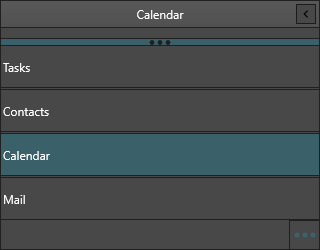
Combining states, splitter and panels into a dark theme
Putting it together — control surface, item and button states, the splitter and per-panel headers combined into one dark theme:
procedure TForm1.ApplyDarkSidebar;
var
I: Integer;
begin
NavigationPanel1.BeginUpdate;
try
// Control surface.
NavigationPanel1.Fill.Color := gcGray;
NavigationPanel1.Fill.Kind := gfkSolid;
NavigationPanel1.Stroke.Color := gcDarkGray;
// One light font across every item, button and header.
NavigationPanel1.GlobalFont.Color := gcWhite;
// Item states.
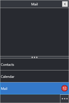
NavigationPanel1.ItemsAppearance.Fill.Color := gcDimGray;
NavigationPanel1.ItemsAppearance.HoverFill.Color := gcGray;
NavigationPanel1.ItemsAppearance.ActiveFill.Color := gcSteelBlue;
NavigationPanel1.ItemsAppearance.BadgeFill.Color := gcCrimson;
// Button bar.
NavigationPanel1.ButtonsAppearance.BackgroundFill.Color := gcDimGray;
NavigationPanel1.ButtonsAppearance.OptionsButtonBulletColor := gcSilver;
// Splitter.
NavigationPanel1.Splitter.Visible := True;
NavigationPanel1.Splitter.Fill.Color := gcDimGray;
NavigationPanel1.Splitter.BulletColor := gcSilver;
// Per-panel headers and content.
for I := 0 to NavigationPanel1.Panels.Count - 1 do
begin
NavigationPanel1.Panels[I].Container.Header.Fill.Color := gcDimGray;
NavigationPanel1.Panels[I].Container.Header.Font.Color := gcWhite;
NavigationPanel1.Panels[I].Container.Fill.Color := gcGray;
end;
finally
NavigationPanel1.EndUpdate;
end;
end;
Common mistakes
- Styling outside
BeginUpdate/EndUpdate. Many appearance writes each trigger a repaint; wrap a theme pass inBeginUpdate/EndUpdateso it paints once. ApplyStyleoverriding your colors. WithAdaptToStyle := True, the panel derives colors from the active FMX style and ignores the matching appearance colors. LeaveAdaptToStyleoff when you set colors by hand.
Related API
TTMSFNCNavigationPanelItemsAppearance— item state fills, fonts and badge stylingTTMSFNCNavigationPanelButtonsAppearance— button states, background, options buttonTTMSFNCNavigationPanelSplitter— splitter fill, stroke and bullet color