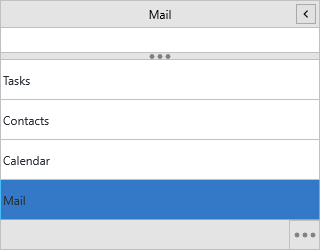
Managing panels and items
Every entry in a TTMSFNCNavigationPanel is a panel item — a header in the
navigation list that, when selected, exposes its own content area. This chapter
covers how to build and maintain that list: adding and removing items, setting
their text, hints, icons and badges, and filling each item with real content.
Reach for the Panels collection (or the AddPanel helper) whenever you build
the navigation structure in code; use the Object Inspector's Panels editor for
a static, design-time layout.
The control ships pre-populated with three sample panels, so most real setups start by clearing them and adding your own.
Adding panels
Panels is the collection of items; AddPanel is a convenience that adds an
item and sets both its Text and CompactText in one call. Wrap bulk changes
in BeginUpdate/EndUpdate so the panel repaints once instead of on every add.
procedure TForm1.FormCreate(Sender: TObject);
begin
  // Replace the three sample panels the control ships with.
  NavigationPanel1.BeginUpdate;
  try
    NavigationPanel1.Panels.Clear;

    // AddPanel sets both Text and CompactText to the supplied caption.
    NavigationPanel1.AddPanel('Mail');
    NavigationPanel1.AddPanel('Calendar');
    NavigationPanel1.AddPanel('Contacts');

    // Or add through the collection when you need to set more properties.
    with NavigationPanel1.Panels.Add do
    begin
      Text := 'Tasks';
      CompactText := 'Tasks';
      Hint := 'Open the task list';
    end;
  finally
    NavigationPanel1.EndUpdate;
  end;

  NavigationPanel1.ActivePanelIndex := 0;
end;
Item properties
Each TTMSFNCNavigationPanelItem
exposes the following members:
| Property | Description |
|---|---|
Text |
Header label; supports HTML formatting (<b>, <font>, <a>). |
CompactText |
Short label shown in the vertical strip when the panel is collapsed. |
Hint |
Tooltip shown on hover. |
Badge |
Corner badge text; supports HTML (see Badges). |
Kind |
pikItem for a full panel item, pikButton for a bottom-bar button (see Display modes). |
Enabled |
When False, the header is greyed out and cannot be clicked. |
Visible |
When False, the item moves into the options overflow menu. |
Bitmaps |
Scaled bitmaps shown as the item icon. |
Container |
The content panel for this item (read-only). |
Filling an item with content
An item's Container is a full TTMSFNCPanel. Divide it into one or more named
Sections, and assign any FMX control to a section's Control property — that
control becomes the section body. This is how you host a grid, tree, editor or
custom layout behind each navigation item.
procedure TForm1.BuildMailPanel;
var
  item: TTMSFNCNavigationPanelItem;
  body: TTMSFNCPanel;
begin
  item := NavigationPanel1.AddPanel('Mail');

  // Each item owns a container panel (a TTMSFNCPanel). Divide it into
  // named, sizable sections and drop your own controls into each one.
  with item.Container.Sections.Add do
  begin
    Text := 'Folders';
    Size := 220;

    body := TTMSFNCPanel.Create(Self);
    body.Header.Visible := False;
    Memo1.Parent := body;          // any FMX control can be hosted
    Control := body;               // the section renders this control
  end;

  with item.Container.Sections.Add do
  begin
    Text := 'Quick actions';
    Size := 120;
  end;
end;
Note
Set a section's Size to control its height, and hide a hosted panel's own
header with body.Header.Visible := False when the section header is enough.
Adding icons
Assign a TTMSFNCBitmapContainer to the panel's BitmapContainer, then
reference images by name through each item's Bitmaps collection. Names are
resolved against the container, so the same icon set scales across DPI.
procedure TForm1.FormCreate(Sender: TObject);
var
  item: TTMSFNCNavigationPanelItem;
begin
  // Point the panel at a container that holds the named bitmaps.
  NavigationPanel1.BitmapContainer := TMSFNCBitmapContainer1;

  NavigationPanel1.BeginUpdate;
  try
    item := NavigationPanel1.AddPanel('Mail');
    // AddBitmapName references an image in the bitmap container by name.
    item.Bitmaps.AddBitmapName('mail');

    item := NavigationPanel1.AddPanel('Calendar');
    item.Bitmaps.AddBitmapName('calendar');
  finally
    NavigationPanel1.EndUpdate;
  end;
end;
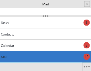
Badges
Any item can show a badge in the corner of its header. The badge is plain text
or HTML — including images pulled from the bitmap container — and its colors are
shared across all items via ItemsAppearance.Badge*.
procedure TForm1.ShowBadges;
begin
  // A plain numeric badge in the corner of the item header.
  NavigationPanel1.Panels[0].Badge := '5';

  // Badges accept HTML, including images resolved from the bitmap container.
  NavigationPanel1.BitmapContainer := TMSFNCBitmapContainer1;
  NavigationPanel1.Panels[1].Badge :=
    '<p><img src="' + TMSFNCBitmapContainer1.RandomBitmapName + '"/> new</p>';

  // Badge fill and border are shared by all items via ItemsAppearance.
  NavigationPanel1.ItemsAppearance.BadgeFill.Color := gcYellowGreen;
  NavigationPanel1.ItemsAppearance.BadgeStroke.Color := gcBlack;
end;
Removing and reordering panels
| Method | Effect |
|---|---|
RemovePanel(AIndex) |
Removes the item at AIndex and its container. |
MovePanel(AFrom, ATo) |
Moves an item; ActivePanelIndex follows the moved item. |
InsertPanel(AIndex, AText) |
Inserts a new item at AIndex. |
Panels.Clear |
Removes every item. |
Building an item with icons, badges and content together
This combines the collection, an icon, a badge, a content section and a disabled item in one setup pass:
procedure TForm1.FormCreate(Sender: TObject);
var
  item: TTMSFNCNavigationPanelItem;
  body: TTMSFNCPanel;
begin
  NavigationPanel1.BitmapContainer := TMSFNCBitmapContainer1;

  NavigationPanel1.BeginUpdate;
  try
    NavigationPanel1.Panels.Clear;

    // 1) An item with an icon, content and an unread badge.
    item := NavigationPanel1.AddPanel('Mail');
    item.Bitmaps.AddBitmapName('mail');
    item.Badge := '12';
    with item.Container.Sections.Add do
    begin
      Text := 'Inbox';
      Size := 260;
      body := TTMSFNCPanel.Create(Self);
      body.Header.Visible := False;
      Memo1.Parent := body;
      Control := body;
    end;

    // 2) A plain navigation item with an icon.
    item := NavigationPanel1.AddPanel('Calendar');
    item.Bitmaps.AddBitmapName('calendar');

    // 3) A disabled item starts greyed out.
    item := NavigationPanel1.AddPanel('Archive');
    item.Bitmaps.AddBitmapName('archive');
    item.Enabled := False;
  finally
    NavigationPanel1.EndUpdate;
  end;

  NavigationPanel1.ActivePanelIndex := 0;
end;
Common mistakes
BeginUpdatewithoutEndUpdate. Always pair them (usetry/finally) — a missingEndUpdateleaves the panel frozen and unpainted.- Setting
Bitmapswithout aBitmapContainer.AddBitmapNameresolves the name against the panel'sBitmapContainer; assign the container first or the icon stays blank. - Expecting an
Itemsproperty. The collection isPanels, notItems; the per-item content lives onItem.Container.Sections.
Related API
TTMSFNCNavigationPanel—Panels,AddPanel,BitmapContainerTTMSFNCNavigationPanelItem—Text,CompactText,Badge,Bitmaps,Container