Display modes and compact mode
The navigation panel can present its items in three layouts and can collapse to
an icon-only rail. Pick a mode to decide whether items appear as full
headers, as compact buttons, or both; use compact mode to shrink the whole
panel to a narrow strip — the pattern users know from Outlook and modern
sidebars. This chapter covers Mode, the per-item Kind, and the compact-mode
properties and event.
Choosing a mode
Mode is a TTMSFNCNavigationPanelMode:
| Value | Layout |
|---|---|
npmItems |
Only the full item headers; no bottom button bar. Hidden items go to the options menu. |
npmButtons |
Only the compact button bar; items fill it right-to-left and overflow into the options menu. |
npmMixed (default) |
Both areas — each item's Kind decides where it lands. |
procedure TForm1.ApplyMode;
begin
  // npmItems  - only full item headers, no bottom button bar.
  // npmButtons- only the compact button bar (items shown right to left).
  // npmMixed  - both areas; each item's Kind decides where it appears (default).
  NavigationPanel1.Mode := npmMixed;
end;
Item kind: header vs. button
In npmMixed mode, each item's Kind places it. pikItem shows the item as a
full header in the upper area; pikButton puts it in the bottom button bar — the
right spot for secondary actions like Settings.
procedure TForm1.FormCreate(Sender: TObject);
var
item: TTMSFNCNavigationPanelItem;
begin
NavigationPanel1.Mode := npmMixed;
NavigationPanel1.BeginUpdate;
try
NavigationPanel1.Panels.Clear;
// Full panel items appear in the upper item area.
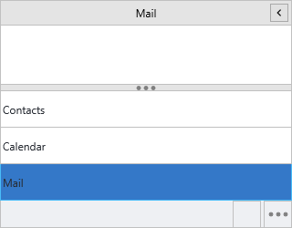
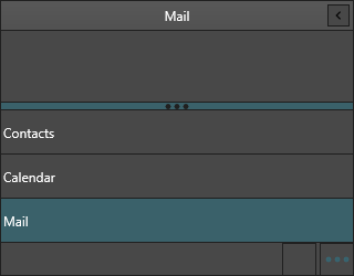
NavigationPanel1.AddPanel('Mail').Kind := pikItem;
NavigationPanel1.AddPanel('Calendar').Kind := pikItem;
// Button-kind items sit in the compact bar at the bottom.
item := NavigationPanel1.AddPanel('Settings');
item.Kind := pikButton;
item.CompactText := 'Settings';
finally
NavigationPanel1.EndUpdate;
end;
end;
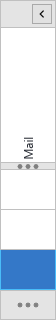
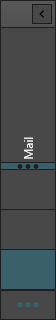
Compact mode
Compact mode collapses the panel to CompactModeSize pixels wide and reduces
each item to its icon plus its vertical CompactText. The content area is
replaced by a single vertical button per item; clicking it raises
OnCompactItemClick. Users toggle compact mode with the header button (shown
when ShowCompactModeButton is True), or you can drive it from CompactMode.
procedure TForm1.FormCreate(Sender: TObject);
begin
  // Show the collapse button in the header (default True).
  NavigationPanel1.ShowCompactModeButton := True;
  // Width the panel collapses to.
  NavigationPanel1.CompactModeSize := 56;
  // Start collapsed if you want an icon rail by default.
  NavigationPanel1.CompactMode := False;
end;

procedure TForm1.NavigationPanel1CompactItemClick(Sender: TObject;
  AItemIndex: Integer);
begin
  // The vertical compact button expands the panel again.
  NavigationPanel1.CompactMode := False;
end;
Tip
Set a meaningful CompactText on every item — it is the only label visible
while the panel is collapsed.
Combining mixed mode with a compact rail
Putting it together: a mixed-mode panel whose items carry both full and button kinds, launched as a collapsed rail and expanded on a compact click.
procedure TForm1.FormCreate(Sender: TObject);
var
  item: TTMSFNCNavigationPanelItem;
begin
  NavigationPanel1.BeginUpdate;
  try
    NavigationPanel1.Mode := npmMixed;
    NavigationPanel1.ShowCompactModeButton := True;
    NavigationPanel1.CompactModeSize := 56;

    NavigationPanel1.Panels.Clear;

    item := NavigationPanel1.AddPanel('Mail');
    item.Kind := pikItem;
    item.CompactText := 'Mail';

    item := NavigationPanel1.AddPanel('Calendar');
    item.Kind := pikItem;
    item.CompactText := 'Cal';

    item := NavigationPanel1.AddPanel('Settings');
    item.Kind := pikButton;        // lives in the bottom button bar
    item.CompactText := 'Settings';
  finally
    NavigationPanel1.EndUpdate;
  end;

  NavigationPanel1.CompactMode := True;   // launch as an icon rail
end;
Common mistakes
- Empty
CompactText. Collapsed items with noCompactTextshow only an icon and read as unlabeled. - Expecting a splitter in
npmButtons. There is no item area in buttons-only mode, so the splitter never appears — overflow goes straight to the options menu.
Related API
TTMSFNCNavigationPanel—Mode,CompactMode,CompactModeSize,ShowCompactModeButtonTTMSFNCNavigationPanelItem—Kind,CompactText