Table of Contents

TMS FNC NavigationPanel

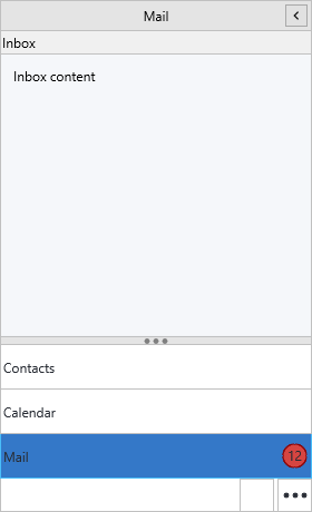
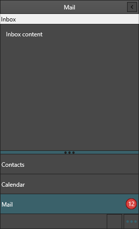
TTMSFNCNavigationPanel is a cross-platform, Outlook-style navigation sidebar. It presents a collection of panel items as selectable headers, each with its own content area, and can host a compact button bar, a draggable splitter, an options overflow menu and a collapsible icon rail. Appearance is fully themable across all interaction states, and every visual part can be owner-drawn.

TMS FNC NavigationPanel with items, badges and a button bar TMS FNC NavigationPanel with items, badges and a button bar

Documentation

Where What you'll find
Get started Drop the control, add items, switch a content area.
Guides Task chapters: panels, modes, overflow, appearance, events, custom drawing.
API reference Full member reference for TTMSFNCNavigationPanel.
Release notes Version history for this component.

Supported frameworks

Framework Unit
FMX FMX.TMSFNCNavigationPanel
VCL VCL.TMSFNCNavigationPanel
Web (TMS WEB Core) WEBLib.TMSFNCNavigationPanel

Minimal example

procedure TForm1.FormCreate(Sender: TObject);
begin
  NavigationPanel1.Align := TAlignLayout.Left;
  NavigationPanel1.Width := 220;

  NavigationPanel1.BeginUpdate;
  try
    NavigationPanel1.Panels.Clear;
    NavigationPanel1.AddPanel('Mail');
    NavigationPanel1.AddPanel('Calendar');
    NavigationPanel1.AddPanel('Contacts');
  finally
    NavigationPanel1.EndUpdate;
  end;

  NavigationPanel1.ActivePanelIndex := 0;
end;

procedure TForm1.NavigationPanel1ItemClick(Sender: TObject; AItemIndex: Integer);
begin
  // Show the view that matches the clicked item.
  ContentLayout.Visible := True;
  Caption := 'Selected panel ' + IntToStr(AItemIndex);
end;

API map

Role Class
Main control TTMSFNCNavigationPanel
Panel item TTMSFNCNavigationPanelItem
Item collection TTMSFNCNavigationPanelItems
Item-area appearance TTMSFNCNavigationPanelItemsAppearance
Button-bar appearance TTMSFNCNavigationPanelButtonsAppearance
Splitter TTMSFNCNavigationPanelSplitter
Item content container TTMSFNCNavigationPanelContainer

Guides

See also