Appearance
The planner draws everything through a set of appearance objects — one per
visual area. Each groups the fills, strokes, and fonts for that area, so you
restyle the whole component by configuring objects rather than handling draw
events. Use this guide to give the planner a branded look: colored items with a
distinct selected state, a readable grid with greyed inactive hours, a styled
timeline header, and a coordinated selection overlay. For per-pixel control
beyond these objects, the planner also exposes OnBeforeDraw* / OnAfterDraw*
events — see Custom drawing.
Appearance objects
| Property | Type | Styles |
|---|---|---|
ItemsAppearance |
TTMSFNCPlannerItemsAppearance |
Item body and title fills, strokes, fonts, and per-state variants. |
GridCellAppearance |
TTMSFNCPlannerGridCellAppearance |
Active/inactive cell fills and grid lines. |
TimeLineAppearance |
TTMSFNCPlannerTimeLineAppearance |
Timeline header fonts, fills, and the current-time color. |
PositionsAppearance |
TTMSFNCPlannerPositionsAppearance |
Resource/day header fills and fonts. |
GroupsAppearance |
TTMSFNCPlannerGroupsAppearance |
Group header fills and fonts. |
FullDaysAppearance |
TTMSFNCPlannerFullDaysAppearance |
Full-day band fills and fonts. |
SelectionAppearance |
TTMSFNCPlannerSelectionAppearance |
The time-range selection overlay. |
Fills, strokes, and fonts
Most appearance members are one of three TMS graphics types:
TTMSFNCGraphicsFill— aKind(gfkSolid,gfkGradient,gfkTexture, orgfkNone), aColor, aColorTofor gradients, and anOpacity.TTMSFNCGraphicsStroke— aKind(gskSolid,gskDash,gskDot, … orgskNone), aColor, and aWidth.TTMSFNCGraphicsFont— aColor,Name,Size, andStyle.
Set Kind to gfkSolid / gskSolid whenever you assign a color; a fill or
stroke left at gfkNone / gskNone draws nothing regardless of its color.
Styling items
Item colors come from each item, not from ItemsAppearance: when the planner
draws an item it takes the fill kind, stroke, and fonts from ItemsAppearance
but then sets the fill color from the item's own Color (and SelectedColor
/ ActiveColor / DisabledColor per state). Seed those colors for every new item
through DefaultItem, or set them per item — see
Items.
ItemsAppearance owns the shared baseline the items draw against — the fill kind
(solid vs gradient), the stroke, and the default Font / TitleFont — plus the
item-area extras: the dependency link lines (ShowLinks, LinkStroke) and
the move/size/delete handles. The snippet below seeds a shared item color through
DefaultItem and enables link drawing through ItemsAppearance:
procedure TForm1.StyleItems;
begin
  Planner1.BeginUpdate;
  try
    // Item colors come from each item's own Color/FontColor; DefaultItem seeds
    // them so every new item shares one look (see the Items guide for per-item
    // and per-state colors).
    Planner1.DefaultItem.Color := gcCornflowerblue;
    Planner1.DefaultItem.FontColor := gcWhite;

    // ItemsAppearance sets the shared baseline the items draw against - the fill
    // kind (solid vs gradient), default fonts - and owns the item-area extras.
    Planner1.ItemsAppearance.Fill.Kind := gfkSolid;
    Planner1.ItemsAppearance.Font.Size := 12;

    // Dependency link lines are drawn only when ShowLinks is enabled.
    Planner1.ItemsAppearance.ShowLinks := True;
    Planner1.ItemsAppearance.LinkStroke.Color := gcDimgray;
  finally
    Planner1.EndUpdate;
  end;
end;
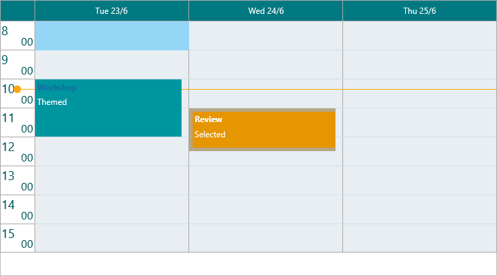
Grid cells and the timeline header
GridCellAppearance.Fill paints the active hours and InActiveFill paints the
greyed hours outside the active range. The
VerticalStroke, HorizontalStroke, and HorizontalSubStroke members draw the
grid lines. TimeLineAppearance styles the time labels through its LeftFont /
RightFont and sets the current-time indicator color with CurrentTimeColor
(default gcOrange):
procedure TForm1.StyleGridAndTimeline;
begin
  Planner1.BeginUpdate;
  try
    // Active hours vs. greyed inactive hours.
    Planner1.GridCellAppearance.Fill.Kind := gfkSolid;
    Planner1.GridCellAppearance.Fill.Color := gcWhite;
    Planner1.GridCellAppearance.InActiveFill.Kind := gfkSolid;
    Planner1.GridCellAppearance.InActiveFill.Color := gcWhitesmoke;

    // Hour grid lines.
    Planner1.GridCellAppearance.HorizontalStroke.Kind := gskSolid;
    Planner1.GridCellAppearance.HorizontalStroke.Color := gcGainsboro;

    // Timeline header text and the current-time indicator color.
    Planner1.TimeLineAppearance.LeftFont.Color := gcDimgray;
    Planner1.TimeLineAppearance.LeftFont.Size := 11;
    Planner1.TimeLineAppearance.CurrentTimeColor := gcRed;
  finally
    Planner1.EndUpdate;
  end;
end;
Header areas
PositionsAppearance and GroupsAppearance style the resource/day and group
headers respectively. Both expose TopFill / BottomFill, TopFont /
BottomFont, and TopStroke / BottomStroke (the top/bottom split matches the
Layouts set, e.g. [pplTop]). FullDaysAppearance styles the full-day band the
same way. For example, to give day headers a branded bar:
{ Inside your form's OnCreate event: }
Planner1.PositionsAppearance.TopFill.Kind := gfkSolid;
Planner1.PositionsAppearance.TopFill.Color := gcRoyalblue;
Planner1.PositionsAppearance.TopFont.Color := gcWhite;
Selection overlay
SelectionAppearance styles the overlay drawn while the user selects a time
range. Give its Fill a low Opacity so items underneath stay visible, and
match the Stroke color:
{ Inside your form's OnCreate event: }
Planner1.SelectionAppearance.Fill.Kind := gfkSolid;
Planner1.SelectionAppearance.Fill.Color := gcDodgerblue;
Planner1.SelectionAppearance.Fill.Opacity := 0.25;
Planner1.SelectionAppearance.Stroke.Kind := gskSolid;
Planner1.SelectionAppearance.Stroke.Color := gcDodgerblue;
Global font
Each appearance object owns its own fonts, so changing the typeface everywhere
would mean touching ItemsAppearance.Font, TimeLineAppearance.LeftFont,
PositionsAppearance.TopFont, and the rest one by one. GlobalFont does it in
one place: assign its Name, Size, Color, or Style and the planner
propagates each attribute to every appearance font at once. Leave an attribute at
its default (Color at gcNull, an empty Name) to leave that aspect of the
per-object fonts untouched.
procedure TForm1.ApplyGlobalFont;
begin
  Planner1.BeginUpdate;
  try
    // GlobalFont propagates each attribute to every appearance font
    // (items, headers, time-line, groups, full-day) in one place.
    Planner1.GlobalFont.Name := 'Segoe UI';
    Planner1.GlobalFont.Size := 11;
    Planner1.GlobalFont.Color := gcDarkslategray;
    Planner1.GlobalFont.Style := [TFontStyle.fsBold];
  finally
    Planner1.EndUpdate;
  end;
end;
Tip
GlobalFont is an override layer. Set the family and size globally, then
still fine-tune an individual font (e.g. a larger ItemsAppearance.TitleFont)
afterwards — the per-object change wins for that one font.
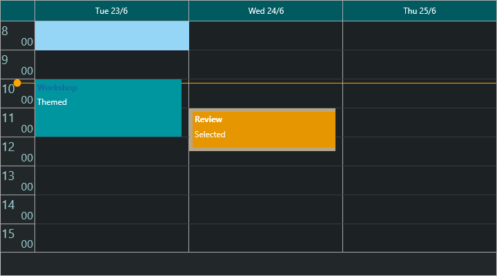
Putting it together
This example combines item, grid, timeline, and selection appearance into one coordinated dark theme:
procedure TForm1.ApplyDarkTheme;
begin
  Planner1.BeginUpdate;
  try
    // Grid surface.
    Planner1.GridCellAppearance.Fill.Kind := gfkSolid;
    Planner1.GridCellAppearance.Fill.Color := gcDarkslategray;
    Planner1.GridCellAppearance.InActiveFill.Kind := gfkSolid;
    Planner1.GridCellAppearance.InActiveFill.Color := gcBlack;
    Planner1.GridCellAppearance.HorizontalStroke.Kind := gskSolid;
    Planner1.GridCellAppearance.HorizontalStroke.Color := gcDimgray;

    // Items: the fill color comes from each item, so seed it through DefaultItem.
    Planner1.ItemsAppearance.Fill.Kind := gfkSolid;
    Planner1.DefaultItem.Color := gcCornflowerblue;
    Planner1.DefaultItem.FontColor := gcWhite;
    Planner1.DefaultItem.SelectedColor := gcOrange;
    Planner1.DefaultItem.ActiveColor := gcOrange;

    // Timeline header.
    Planner1.TimeLineAppearance.LeftFont.Color := gcGainsboro;
    Planner1.TimeLineAppearance.CurrentTimeColor := gcOrange;

    // Time-range selection overlay.
    Planner1.SelectionAppearance.Fill.Kind := gfkSolid;
    Planner1.SelectionAppearance.Fill.Color := gcOrange;
    Planner1.SelectionAppearance.Fill.Opacity := 0.3;
    Planner1.SelectionAppearance.Stroke.Kind := gskSolid;
    Planner1.SelectionAppearance.Stroke.Color := gcOrange;
  finally
    Planner1.EndUpdate;
  end;
end;
Pitfalls
- Item fill color always comes from the item, not
ItemsAppearance. SettingItemsAppearance.Fill.Colordoes not color the items — the planner overrides it with each item'sColor. UseDefaultItem.Colorto seed a shared color, or setColorper item (see Items).ItemsAppearance.Fillstill controls the fill kind (e.g. gradient) and stroke. - A selected item that is also the active item uses
ActiveColor. Selecting an item makes it the active item, which draws withActiveColor, notSelectedColor. Set both if you want one selection color. gfkNone/gskNonepaint nothing. Assigning aColorwithout settingKindto a solid (or other visible) value leaves the fill or stroke invisible.- Active vs inactive fill. Hours outside
TimeLine.ActiveStart..ActiveEnduseGridCellAppearance.InActiveFill, notFill. Style both or the greyed band will not match your theme. - Batch appearance changes. Wrap multiple assignments in
BeginUpdate/EndUpdatefor a single repaint.
Related API
TTMSFNCPlanner—ItemsAppearance,GridCellAppearance,TimeLineAppearance,PositionsAppearance,GroupsAppearance,FullDaysAppearance,SelectionAppearance,GlobalFont
See also
- Items — per-item colors and visual states
- Timeline — the active range that drives the inactive fill
- Custom drawing —
OnBeforeDraw*/OnAfterDraw*events for per-pixel control