Items
Items are the appointments, tasks, or events a planner displays. Each item is a
TTMSFNCPlannerItem with a start and end
time, optional title and body text, a resource lane, and a rich set of styling
and behavior properties. This guide covers creating items in code, seeding
defaults for new items, controlling their visual states, editing them, and
linking them to show dependencies. Use it once the timeline is set
up — the timeline defines the grid; items are what you place on it.
Adding items
AddItem is the lowest-level call: pass a start and end time, then set
properties on the returned item. AddOrUpdateItem is the convenience overload —
it takes the title and text directly and has resource and resource-name variants:
procedure TForm1.AddSampleItems;
var
  it: TTMSFNCPlannerItem;
begin
  Planner1.BeginUpdate;
  try
    // Lowest-level call: supply start and end, then set properties.
    it := Planner1.AddItem(EncodeDateTime(2026, 6, 22, 9, 0, 0, 0),
                           EncodeDateTime(2026, 6, 22, 10, 30, 0, 0));
    it.Title := 'Sprint planning';
    it.Text := 'Backlog grooming and estimates';

    // Convenience overload: title and text in one call.
    Planner1.AddOrUpdateItem(EncodeDateTime(2026, 6, 22, 11, 0, 0, 0),
                             EncodeDateTime(2026, 6, 22, 12, 0, 0, 0),
                             'Stand-up', 'Daily status');

    // Resource overload: place the item in a specific position (lane).
    Planner1.AddOrUpdateItem(1,
                             EncodeDateTime(2026, 6, 22, 13, 0, 0, 0),
                             EncodeDateTime(2026, 6, 22, 14, 0, 0, 0),
                             'Review', 'Demo to stakeholders');
  finally
    Planner1.EndUpdate;
  end;
end;
AddItemAtSelection creates an item spanning the current time selection, which
is convenient from a toolbar button while the user has a range selected.
Item properties
Every item exposes the following verified properties (defaults shown where relevant):
| Property | Type | Description |
|---|---|---|
StartTime / EndTime |
TDateTime |
The scheduled time range. |
Text |
String |
Body text (rendered as HTML when it begins with <). |
Title |
String |
Header text shown above the body. |
Resource |
Integer |
Zero-based index of the position (lane). Default 0. |
Color |
TTMSFNCGraphicsColor |
Item background color. |
FontColor |
TTMSFNCGraphicsColor |
Body text color. |
TitleColor |
TTMSFNCGraphicsColor |
Title background color. |
TitleFontColor |
TTMSFNCGraphicsColor |
Title text color. |
Movable |
Boolean |
Whether the user can drag the item. Default True. |
Sizeable |
Boolean |
Whether the user can resize the item. Default True. |
Editable |
Boolean |
Whether the item text can be edited. Default True. |
Deletable |
Boolean |
Whether the item can be deleted. Default True. |
Selectable |
Boolean |
Whether the item can be selected. Default True. |
Overlappable |
Boolean |
Whether the item may overlap others in the lane. Default True. |
FixedResource |
Boolean |
When True, the item cannot move to another lane. Default False. |
ShowTitle |
Boolean |
Whether the title band is drawn. Default True. |
Hint |
String |
Tooltip text. |
DBKey |
String |
Database key used by the database adapter. |
Recurrency |
String |
iCalendar RRULE string for recurring items. |
Note
The property is spelled Movable (not Moveable). Likewise the resize
permission is Sizeable.
Item defaults and visual states
DefaultItem is itself a TTMSFNCPlannerItem. Any value you set on it seeds the
corresponding property of every item created afterward, so you configure shared
appearance and behavior once. Individual items can then override those values —
including the four visual states each item draws: normal (Color), active
(ActiveColor), selected (SelectedColor), and disabled (DisabledColor), each
with a matching title-color variant:
procedure TForm1.ConfigureItemDefaults;
var
  it: TTMSFNCPlannerItem;
begin
  Planner1.BeginUpdate;
  try
    // DefaultItem is a TTMSFNCPlannerItem whose values seed every new item.
    Planner1.DefaultItem.Color := gcCornflowerblue;
    Planner1.DefaultItem.FontColor := gcWhite;
    Planner1.DefaultItem.Movable := True;
    Planner1.DefaultItem.Sizeable := True;
    Planner1.DefaultItem.Deletable := False;

    it := Planner1.AddItem(EncodeDateTime(2026, 6, 22, 15, 0, 0, 0),
                           EncodeDateTime(2026, 6, 22, 16, 0, 0, 0));
    it.Title := 'Release';

    // Per-state colors override the default for this item only.
    it.Color := gcSeagreen;
    it.ActiveColor := gcMediumseagreen;
    it.SelectedColor := gcDarkgreen;
    it.DisabledColor := gcDarkgray;
    it.FontColor := gcWhite;
  finally
    Planner1.EndUpdate;
  end;
end;
Resources (positions)
Each item belongs to a resource lane identified by its Resource index. Lanes
are defined by Positions: set Positions.Count to the number of lanes and
Positions.Format to format the lane headers. Assign item.Resource (or use the
resource overload of AddOrUpdateItem) to place an item in a lane. The
Putting it together example below builds a two-lane
schedule.
Editing items
Three Interaction properties decide how the user edits items:
UpdateMode—pumInplace(default) edits in place,pumDialogopens the item editor dialog,pumNonedisables automatic editing.InplaceEditorMode— when editing in place,piemText,piemTitle, orpiemTextAndTitlechooses which fields are editable.MouseEditMode—pmemSingleClickOnSelectedItem(default),pmemSingleClick, orpmemDoubleClick.
You can also open the editor in code with EditItem:
procedure TForm1.ConfigureItemEditing;
begin
  // pumInplace edits in place; pumDialog opens the item editor dialog;
  // pumNone disables automatic editing.
  Planner1.Interaction.UpdateMode := pumInplace;

  // When editing in place, choose which field(s) are edited.
  Planner1.Interaction.InplaceEditorMode := piemTextAndTitle;

  // pmemSingleClickOnSelectedItem (default), pmemSingleClick, or pmemDoubleClick.
  Planner1.Interaction.MouseEditMode := pmemDoubleClick;
end;

procedure TForm1.EditSelectedItem;
begin
  // Open the editor for the active item in code.
  if Assigned(Planner1.ActiveItem) then
    Planner1.EditItem(Planner1.ActiveItem);
end;
Linking items
Items can be linked to visualize dependencies. LinkItems takes an array of
items, an optional circular flag, and a TTMSFNCPlannerItemLinkType
that selects which edges the connector joins — iltFull, iltStartEnd,
iltEndStart, iltEndEnd, iltStartStart, or iltNone:
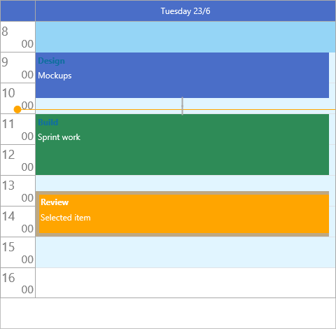
procedure TForm1.LinkDependentItems;
var
  first, second: TTMSFNCPlannerItem;
begin
  Planner1.BeginUpdate;
  try
    first := Planner1.AddOrUpdateItem(EncodeDateTime(2026, 6, 22, 9, 0, 0, 0),
                                      EncodeDateTime(2026, 6, 22, 10, 0, 0, 0),
                                      'Design', '');
    second := Planner1.AddOrUpdateItem(EncodeDateTime(2026, 6, 22, 10, 30, 0, 0),
                                       EncodeDateTime(2026, 6, 22, 12, 0, 0, 0),
                                       'Build', '');

    // LinkItems takes an array of items plus a link type.
    // iltStartEnd connects the start of one item to the end of the other.
    Planner1.LinkItems([first, second], False, iltStartEnd);
  finally
    Planner1.EndUpdate;
  end;
end;
Iterating and finding items
Planner1.Items is a TTMSFNCPlannerItems collection; iterate it by index:
{ Count completed items: }
var
  i, n: Integer;
begin
  n := 0;
  for i := 0 to Planner1.Items.Count - 1 do
    if Planner1.Items[i].DataBoolean then
      Inc(n);
end;
When items are persisted, FindItemWithDBKey locates an item by its database key
without scanning the collection yourself.
Putting it together
This example combines several item features: two resource lanes, shared
DefaultItem styling, a non-movable fixed item, per-item state colors, and an
end-to-start dependency link between the two tasks:
procedure TForm1.BuildResourceSchedule;
var
  prep, ship: TTMSFNCPlannerItem;
begin
  Planner1.BeginUpdate;
  try
    // Two resource lanes.
    Planner1.Positions.Count := 2;
    Planner1.Positions.Format := 'Line %d';

    // Shared defaults for every new item.
    Planner1.DefaultItem.FontColor := gcWhite;
    Planner1.DefaultItem.Movable := True;
    Planner1.DefaultItem.Sizeable := True;

    // Resource 0: a preparation task that must not move.
    prep := Planner1.AddOrUpdateItem(0,
                                     EncodeDateTime(2026, 6, 22, 8, 0, 0, 0),
                                     EncodeDateTime(2026, 6, 22, 9, 30, 0, 0),
                                     'Prep', 'Stage materials');
    prep.Color := gcCornflowerblue;
    prep.FixedResource := True;
    prep.Movable := False;

    // Resource 1: a shipping task with its own state colors.
    ship := Planner1.AddOrUpdateItem(1,
                                     EncodeDateTime(2026, 6, 22, 10, 0, 0, 0),
                                     EncodeDateTime(2026, 6, 22, 11, 0, 0, 0),
                                     'Ship', 'Dispatch order');
    ship.Color := gcSeagreen;
    ship.SelectedColor := gcDarkgreen;

    // Prep must finish before Ship starts: link end-to-start.
    Planner1.LinkItems([prep, ship], False, iltEndStart);
  finally
    Planner1.EndUpdate;
  end;
end;
Pitfalls
AddItemrequires a time range. It isAddItem(AStartTime, AEndTime)— there is no parameterless overload. UseAddOrUpdateItemwhen you also want to set the title and text in the same call.Movable, notMoveable. The drag permission is spelledMovable; the resize permission isSizeable.LinkItemstakes an array. Pass[itemA, itemB], not two separate arguments, and supply a link type other thaniltNonefor a connector to draw.- Set defaults before adding items.
DefaultItemseeds items at creation time; changing it later does not restyle items that already exist. - Batch bulk inserts. Wrap loops that add many items in
BeginUpdate/EndUpdateto avoid a repaint per item.
Related API
TTMSFNCPlanner—AddItem,AddOrUpdateItem,AddItemAtSelection,EditItem,LinkItems,Items,DefaultItem,ActiveItem,FindItemWithDBKey,PositionsTTMSFNCPlannerData—TTMSFNCPlannerItem,TTMSFNCPlannerItems,TTMSFNCPlannerItemLinkType
See also
- Timeline — the time range items are placed on
- Appearance — item colors, fonts, and marks
- Interaction — how users create, move, and edit items
- Database adapter — persisting items to a dataset
- Recurrence — repeating items with RRULE