QAT, Caption, and Groups
Quick Access Toolbar (QAT)
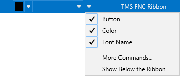
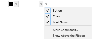
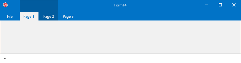
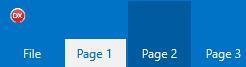
The QAT (TTMSFNCRibbonQAT) hosts frequently-used controls that are always visible regardless of the selected page. It can appear in two positions controlled by TTMSFNCRibbon.QATMode:
| Value | Position |
|---|---|
rqmToolBar |
Inline with the ribbon title bar (default). |
rqmBelowRibbon |
Beneath the page control. |
TMSFNCRibbon1.QATMode := rqmBelowRibbon;
Add controls the same way as a regular toolbar:
TMSFNCRibbon1.QAT.AddButton;
TMSFNCRibbon1.QAT.AddSeparator;
TMSFNCRibbon1.QAT.AddBitmapPicker;
The right-most options menu button lets users show/hide controls and toggle the QAT position at runtime. The OnOptionsMenuMoreCommands event fires when the user chooses More Commands….
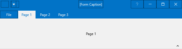
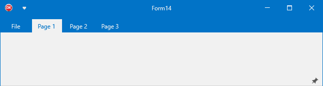
Caption
The caption area (TTMSFNCRibbonCaption) displays the form's Caption property with HTML formatting support. Assign a BitmapContainer to display inline images:
procedure TForm1.FormCreate(Sender: TObject);
begin
  Caption := '<img src="calendar.png" /> My Application';
  TMSFNCRibbon1Caption.BitmapContainer := TMSFNCBitmapContainer1;
end;

The caption auto-sizes to the remaining width, accounting for the QAT and system menu.
System menu
TTMSFNCRibbonSystemMenu holds the minimize, maximize, and close buttons. It reflects the form's BorderIcons property automatically and updates when BorderIcons changes.

Add any control to the system menu area:
procedure TForm1.FormCreate(Sender: TObject);
begin
  Button1.Margins.Rect := RectF(3, 3, 3, 3);
  TMSFNCRibbon1SystemMenu.AddCustomControl(Button1, 0);
end;

Handle system menu button clicks via events on the system menu component:
TMSFNCRibbon1SystemMenu.OnCloseClicked := DoClose;
TMSFNCRibbon1SystemMenu.OnMinimizeClicked := DoMinimize;
TMSFNCRibbon1SystemMenu.OnMaximizeClicked := DoMaximize;
Pages and collapsible mode
Add pages at design time via the page control's context menu (New Page) or in code:
TMSFNCRibbon1.PageControl.AddPage('Home');
TMSFNCRibbon1.PageControl.AddPage('Insert');
Set TTMSFNCRibbonPageControl.Collapsable to True to enable a collapse/expand pin icon on each page. When collapsed, clicking a tab shows the page content floating above the workspace. Clicking the pin returns to the docked layout.
Groups
Groups (TTMSFNCRibbonGroup) are decorative spans that appear above the page tab strip. They visually associate a range of tabs under a common label, similar to contextual tab groups in Microsoft Office.
// Groups — decorative spans across page tabs
procedure TForm1.FormCreate(Sender: TObject);
var
  g: TTMSFNCRibbonGroup;
begin
  // Place QAT below the ribbon so groups are visible above the tab strip
  TMSFNCRibbon1.QATMode := rqmBelowRibbon;

  // Add pages
  TMSFNCRibbon1.PageControl.Pages.Clear;
  for var I := 0 to 6 do
    TMSFNCRibbon1.PageControl.AddPage('Page ' + IntToStr(I + 1));

  // Simple group spanning page index 2
  g := TMSFNCRibbon1.Groups.Add;
  g.StartPageIndex := 2;
  g.EndPageIndex := 2;
  g.Text := 'Group 1';

  // HTML group spanning pages 4–5 with a bitmap from BitmapContainer
  g := TMSFNCRibbon1.Groups.Add;
  g.StartPageIndex := 4;
  g.EndPageIndex := 5;
  g.Text := '<img src="Home.png"/><i>Group 2</i>';

  // Custom color — disables the theme-driven appearance
  g := TMSFNCRibbon1.Groups.Add;
  g.StartPageIndex := 6;
  g.EndPageIndex := 6;
  g.Text := 'Custom';
  g.UseDefaultAppearance := False;
  g.Color := gcLimegreen;
  g.TextColor := gcWhite;
  g.BorderColor := gcGreen;

  TMSFNCRibbon1.BitmapContainer := TMSFNCBitmapContainer1;
end;
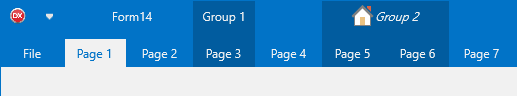
Key group properties:
| Property | Description |
|---|---|
StartPageIndex |
First page (zero-based) the group spans. |
EndPageIndex |
Last page the group spans. |
Text |
HTML-capable label shown in the group area. |
UseDefaultAppearance |
When False, use Color, TextColor, and BorderColor instead of the theme. |
Color / TextColor / BorderColor |
Custom fill, text, and border colours when UseDefaultAppearance = False. |
Visible |
Hide the group without removing it. |
Note
When QATMode = rqmToolBar, groups share horizontal space with the QAT. Placing the QAT below the ribbon (rqmBelowRibbon) gives groups the full width.
Combining QAT, caption, and group configuration
Position the QAT below the ribbon, add controls to it, display an HTML caption, and mark a contextual group that spans two pages:
procedure TForm1.FormCreate(Sender: TObject);
var
  grp: TTMSFNCRibbonGroup;
begin
  // QAT below the ribbon instead of inline
  TMSFNCRibbon1.QATMode := rqmBelowRibbon;
  TMSFNCRibbon1.QAT.AddButton;
  TMSFNCRibbon1.QAT.AddSeparator;
  TMSFNCRibbon1.QAT.AddButton;

  // HTML-formatted caption with an inline icon
  Caption := '<img src="app_icon"/> My Application';
  TMSFNCRibbon1Caption.BitmapContainer := TMSFNCBitmapContainer1;

  // Contextual group spanning pages 2 and 3 (zero-based)
  grp := TMSFNCRibbon1.Groups.Add;
  grp.Text := '<b>Drawing Tools</b>';
  grp.StartPageIndex := 2;
  grp.EndPageIndex := 3;
  grp.UseDefaultAppearance := False;
  grp.Color := gcSteelBlue;
  grp.TextColor := gcWhite;
  grp.BorderColor := gcSkyBlue;
end;