Theming
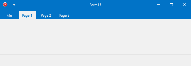
TTMSFNCRibbon ships with 11 predefined themes that colour the entire ribbon — page control, toolbars, QAT, groups, caption, and system menu — in one line of code.
Predefined themes
| Value | Name |
|---|---|
rbtLightBlue |
Default light blue |
rbtBlue |
Deeper blue |
rbtCrimson |
Red accent |
rbtGreen |
Green accent |
rbtSeaGreen |
Teal |
rbtOrange |
Orange accent |
rbtPurple |
Purple |
rbtDarkGray |
Dark grey with accent |
rbtBlack |
Near-black |
rbtWhite |
Light with accent colour |
rbtCustom |
Fully custom |
TMSFNCRibbon1.Theme := rbtLightBlue;
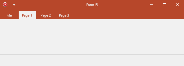
Custom accent colour
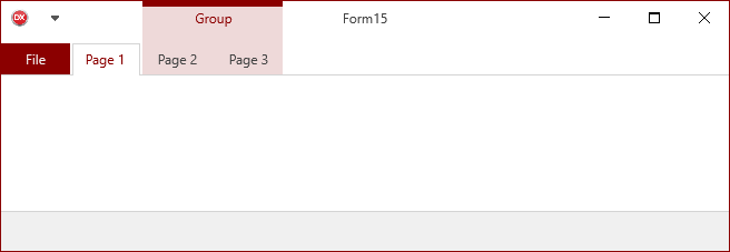
rbtWhite, rbtDarkGray, and rbtCustom use CustomThemeColor to tint the file button, groups, and other accent elements:
// Apply a predefined theme
TMSFNCRibbon1.Theme := rbtLightBlue;
// White theme with custom accent color for the file button and groups
TMSFNCRibbon1.Theme := rbtWhite;
TMSFNCRibbon1.CustomThemeColor := gcDarkred;
// Override theming on one group specifically
with TMSFNCRibbon1.Groups.Add do
begin
Text := 'Group';
StartPageIndex := 1;
EndPageIndex := 2;
UseDefaultAppearance := False; // opt out of theme-driven fill
Color := gcLimegreen;
TextColor := gcWhite;
BorderColor := gcGreen;
end;
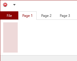
// Implement ITMSFNCRibbonTheme on a custom control
// so it adapts automatically when Theme changes.
type
TTMSFNCRibbonRectangle = class(TRectangle, ITMSFNCRibbonTheme)
public
procedure SetTheme(ATheme: TTMSFNCRibbonTheme;
ACustomThemeColor: TTMSFNCGraphicsColor);
end;
procedure TTMSFNCRibbonRectangle.SetTheme(ATheme: TTMSFNCRibbonTheme;
ACustomThemeColor: TTMSFNCGraphicsColor);
begin
Fill.Color := GetThemeTabHoverColor(ATheme, ACustomThemeColor);
Stroke.Color := Fill.Color;
end;
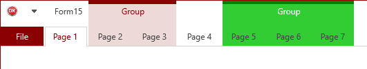
Overriding group colours
Set UseDefaultAppearance := False on a TTMSFNCRibbonGroup to override the theme-driven appearance for that group:
with TMSFNCRibbon1.Groups.Add do
begin
  StartPageIndex := 4;
  EndPageIndex := 6;
  UseDefaultAppearance := False;
  Color := gcLimegreen;
  TextColor := gcWhite;
  BorderColor := gcGreen;
end;
Theme events
| Event | Description |
|---|---|
OnBeforeApplyTheme |
Raised before theming is applied to a control; set AAllow := False to prevent it. |
OnAppliedTheme |
Raised after theming is applied; modify colours further here. |
ITMSFNCRibbonTheme interface
Custom controls hosted inside the ribbon can participate in theming by implementing ITMSFNCRibbonTheme:
type
  TMyRibbonControl = class(TRectangle, ITMSFNCRibbonTheme)
  public
    procedure SetTheme(ATheme: TTMSFNCRibbonTheme;
      ACustomThemeColor: TTMSFNCGraphicsColor);
  end;

procedure TMyRibbonControl.SetTheme(ATheme: TTMSFNCRibbonTheme;
  ACustomThemeColor: TTMSFNCGraphicsColor);
begin
  // Use theme helper functions from FMX.TMSFNCRibbon
  Fill.Color := GetThemeTabHoverColor(ATheme, ACustomThemeColor);
  Stroke.Color := Fill.Color;
end;
Available theme helper functions:
| Function | Returns |
|---|---|
GetThemeColor |
Primary theme colour. |
GetThemeHoverColor |
Hover state colour. |
GetThemeDownColor |
Pressed state colour. |
GetThemeActiveFontColor |
Active item font colour. |
GetThemeFontColor |
Default font colour. |
GetThemeTabColor |
Page tab background colour. |
GetThemeTabHoverColor |
Page tab hover colour. |
GetThemeTabDownColor |
Page tab pressed colour. |
GetThemeTabFontColor |
Page tab text colour. |
Combining predefined theme with custom accent and per-group override
Apply a named theme, set a custom accent colour, and override one contextual group to make it stand out from the rest:
procedure TForm1.FormCreate(Sender: TObject);
var
  grp: TTMSFNCRibbonGroup;
begin
  // Base theme: white with a dark-red accent on the file button and groups
  TMSFNCRibbon1.Theme := rbtWhite;
  TMSFNCRibbon1.CustomThemeColor := gcDarkRed;

  // After-theme event for fine-tuning the file button
  TMSFNCRibbon1.OnAppliedTheme := DoAfterTheme;

  // One contextual group styled independently from the theme
  grp := TMSFNCRibbon1.Groups.Add;
  grp.StartPageIndex := 2;
  grp.EndPageIndex   := 3;
  grp.Text := 'Drawing Tools';
  grp.UseDefaultAppearance := False;
  grp.Color       := gcLimeGreen;
  grp.TextColor   := gcWhite;
  grp.BorderColor := gcGreen;
end;

procedure TForm1.DoAfterTheme(Sender: TObject);
begin
  // Optionally tighten the accent after the theme engine has run
  TMSFNCRibbon1.FileButton.Appearance.Fill.Color := gcDarkRed;
end;