Columns and groups
Columns
Configuration
Columns are managed through the Columns collection on TTMSFNCTreeView. Each TTMSFNCTreeViewColumn item controls the display and editing behaviour for one data column.
uses
  FMX.TMSFNCTreeView;

procedure TForm1.ConfigureColumns;
begin
  TreeView1.BeginUpdate;
  TreeView1.Columns.Clear;
  TreeView1.Columns.Add.Text := 'Name';
  TreeView1.Columns.Add.Text := 'Year';
  TreeView1.EndUpdate;
end;
Key column properties:
| Property | Description |
|---|---|
Text |
Column header text |
Width |
Column width in pixels (applies when Stretch = False) |
Visible |
Show or hide the column |
HorizontalTextAlign |
Node text alignment: left, center, right |
VerticalTextAlign |
Node text vertical alignment |
WordWrapping |
Enable word wrap in nodes |
Trimming |
Text trimming mode when text overflows |
UseDefaultAppearance |
When True, uses ColumnsAppearance properties; when False, column-level properties apply |
Font.Color |
Node text color when UseDefaultAppearance = False |
TopFont.Color |
Header text color when UseDefaultAppearance = False |
Filtering.Enabled |
Adds a filter dropdown button to the column header |
Sorting |
tcsNone, tcsDefault, or tcsRecursive — click-to-sort behaviour |
EditorType |
Inplace editor: tcetNone, tcetEdit, tcetComboBox, tcetMemo |
EditorItems |
Items for the TComboBox editor |
CustomEditor |
True to supply a custom editor class via OnGetInplaceEditor |
Appearance
The ColumnsAppearance property sets the default style for all column headers. Individual columns override this when UseDefaultAppearance = False.
// Default appearance applied to all columns via ColumnsAppearance
procedure TForm1.SetupDefaultColumnAppearance;
var
n: TTMSFNCTreeViewNode;
begin
TreeView1.BeginUpdate;
TreeView1.Nodes.Clear;
TreeView1.Columns.Clear;
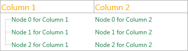
TreeView1.Columns.Add.Text := 'Column 1';
TreeView1.Columns.Add.Text := 'Column 2';
n := TreeView1.AddNode;
n.Text[0] := 'Node 0 Col 1';
n.Text[1] := 'Node 0 Col 2';
TreeView1.ColumnsAppearance.TopFont.Size := 16;
TreeView1.ColumnsAppearance.TopFont.Color := gcOrange;
TreeView1.NodesAppearance.Font.Color := gcSeagreen;
TreeView1.EndUpdate;
end;
// Per-column appearance override with UseDefaultAppearance := False
procedure TForm1.SetupColumnOverride;
begin
TreeView1.BeginUpdate;
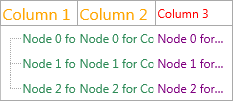
TreeView1.Columns.Add.Text := 'Column 3';
TreeView1.Columns[2].UseDefaultAppearance := False;
TreeView1.Columns[2].TopFont.Color := gcRed;
To override appearance for a specific column:
  TreeView1.EndUpdate;
end;

// Column stretching control
procedure TForm1.SetupStretching;
begin
  // Stretch all columns except column 1, which absorbs leftover width
  TreeView1.ColumnsAppearance.StretchAll := False;
  TreeView1.ColumnsAppearance.StretchColumn := 1;
Autosizing and stretching
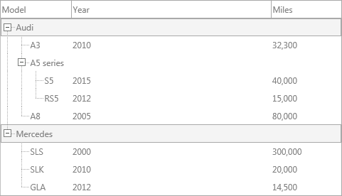
By default, all columns stretch to fill the control width (ColumnsAppearance.Stretch = True and ColumnsAppearance.StretchAll = True).
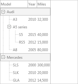
To stretch only one column and give the rest a fixed width, or to disable stretching entirely and use fixed Width values:
uses
  FMX.TMSFNCTreeView;

// Stretch only one column; the rest keep their Width.
procedure TForm1.StretchOneColumn;
begin
  TreeView1.ColumnsAppearance.StretchAll := False;
  TreeView1.ColumnsAppearance.StretchColumn := 1; // column 1 absorbs leftover width
end;

// Disable stretching entirely — every column uses its Width property.
procedure TForm1.FixedColumnWidths;
begin
  TreeView1.ColumnsAppearance.Stretch := False;
end;
To autosize columns to their content:
// Autosize all columns to fit their content
procedure TForm1.AutosizeAllColumns;
var
  I: Integer;
begin
  TreeView1.ColumnsAppearance.Stretch := False;
  for I := 0 to TreeView1.Columns.Count - 1 do
Note
Autosizing is calculated from currently visible nodes only. Nodes outside the visible area, and collapsed child nodes, are not included. To react to content changes, call AutoSizeColumn again in response to expand/collapse or scroll events.
Double-clicking the column header splitter line also triggers autosizing when the Interaction.ColumnAutoSizeOnDblClick property is True.
ColumnsAppearance reference
| Property | Description |
|---|---|
Stretch |
Enable column stretching globally |
StretchAll |
Stretch all columns proportionally |
StretchColumn |
Index of the single column that absorbs remaining width |
TopFont |
Default header font |
TopFont.Color |
Default header text color |
TopFill |
Default header fill |
FillEmptySpaces |
Fill the space to the right of the last column |
Layouts |
Top and/or bottom header layout |
Groups
Groups add an additional header row that can span multiple columns. Use them to visually group related columns.
uses
  FMX.TMSFNCTreeView;

procedure TForm1.BuildGroupedColumns;
var
  grp: TTMSFNCTreeViewGroup;
begin
  TreeView1.BeginUpdate;
  TreeView1.Columns.Clear;
  TreeView1.Columns.Add.Text := 'Name';
  TreeView1.Columns.Add.Text := 'Year';
  TreeView1.Columns.Add.Text := 'Genre';
  TreeView1.Columns.Add.Text := 'Rating';

  // Group the first two and last two columns
  grp := TreeView1.Groups.Add;
  grp.StartColumn := 0;
  grp.EndColumn := 1;
  grp.Text := 'Identity';

  grp := TreeView1.Groups.Add;
  grp.StartColumn := 2;
  grp.EndColumn := 3;
  grp.Text := 'Classification';
  TreeView1.EndUpdate;
end;
Adding groups
uses
FMX.TMSFNCTreeView;
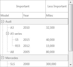
procedure TForm1.AddGroups;
var
grp: TTMSFNCTreeViewGroup;
begin
grp := TreeView1.Groups.Add;
grp.StartColumn := 0;
grp.EndColumn := 1;
grp.Text := 'Important';
grp := TreeView1.Groups.Add;
grp.StartColumn := 2;
grp.EndColumn := 3;
grp.Text := 'Less Important';
end;
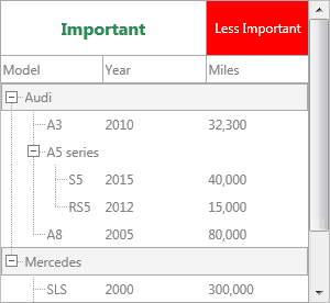
Group appearance
The GroupsAppearance property controls the default group style. Individual groups override it with UseDefaultAppearance = False:
uses
  System.UITypes, FMX.TMSFNCGraphicsTypes, FMX.TMSFNCTreeView;

procedure TForm1.StyleGroups;
var
  grp: TTMSFNCTreeViewGroup;
begin
  grp := TreeView1.Groups.Add;
  grp.StartColumn := 2;
  grp.EndColumn := 3;
  grp.Text := 'Custom';
  grp.UseDefaultAppearance := False;
  grp.TopFill.Color := gcRed;
  grp.TopFill.Kind := gfkSolid;
  grp.TopFont.Color := gcWhite;

  TreeView1.GroupsAppearance.TopFont.Size := 16;
  TreeView1.GroupsAppearance.TopFont.Style := [TFontStyle.fsBold];
  TreeView1.GroupsAppearance.TopFont.Color := gcSeagreen;
end;
Group collection item properties
| Property | Description |
|---|---|
Text |
Group header text |
StartColumn |
First column the group covers |
EndColumn |
Last column the group covers |
UseDefaultAppearance |
When False, group-level fill/font properties apply |
TopFill, TopStroke, TopFont (incl. TopFont.Color) |
Header styling when UseDefaultAppearance = False |
Override the appearance of a specific group without affecting others:
uses
  FMX.TMSFNCGraphicsTypes, FMX.TMSFNCTreeView;

procedure TForm1.HighlightGroup;
var
  grp: TTMSFNCTreeViewGroup;
begin
  grp := TreeView1.Groups.Add;
  grp.StartColumn := 0;
  grp.EndColumn := 1;
  grp.Text := 'Highlighted';
  grp.UseDefaultAppearance := False;
  grp.TopFill.Color := gcSteelBlue;
  grp.TopFill.Kind := gfkSolid;
  grp.TopFont.Color := gcWhite;
end;
Related API
TTMSFNCTreeView—Columns,Groups,ColumnsAppearance,GroupsAppearanceTTMSFNCTreeViewData—TTMSFNCTreeViewColumn,TTMSFNCTreeViewGroup
See also
- Nodes — node configuration and appearance
- Interaction — filtering and sorting per column