Customization
Custom drawing
TTMSFNCTreeView exposes paired OnBeforeDraw* / OnAfterDraw* events for every visual element: nodes, node text, node icons, checkboxes, expand/collapse icons, column headers, and groups. Use the After variant to draw on top of the default rendering.
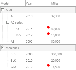
Example: highlight nodes by value
The sample below draws a red indicator circle in the year column for rows built in 2012 or later:
uses
  System.SysUtils, System.Types, FMX.TMSFNCGraphics, FMX.TMSFNCGraphicsTypes,
  FMX.TMSFNCTreeView;

procedure TForm1.TreeView1AfterDrawNodeText(Sender: TObject;
  AGraphics: TTMSFNCGraphics; ARect: TRectF; AColumn: Integer;
  ANode: TTMSFNCTreeViewVirtualNode; AText: string);
var
  v: Integer;
begin
  if TryStrToInt(AText, v) and (AColumn = 1) and (v >= 2012) then
  begin
    AGraphics.Fill.Kind := gfkSolid;
    AGraphics.Fill.Color := gcRed;
    AGraphics.DrawEllipse(
      RectF(ARect.Right - 12, ARect.Top + 2, ARect.Right - 2, ARect.Top + 12), gcrmNone);
  end;
end;
Available drawing events
| Event group | Description |
|---|---|
OnBeforeDrawNode / OnAfterDrawNode |
Full node background |
OnBeforeDrawNodeText / OnAfterDrawNodeText |
Node cell text |
OnBeforeDrawNodeIcon / OnAfterDrawNodeIcon |
Node icon |
OnBeforeDrawNodeCheck / OnAfterDrawNodeCheck |
Checkbox/radiobutton |
OnBeforeDrawNodeExpand / OnAfterDrawNodeExpand |
Expand/collapse icon |
OnBeforeDrawColumn / OnAfterDrawColumn |
Column header area |
OnBeforeDrawColumnHeader / OnAfterDrawColumnHeader |
Column header text area |
OnBeforeDrawGroup / OnAfterDrawGroup |
Group header |
JSON viewer
Use ViewJSON to load and display any JSON document as a navigable tree. Key names appear in one column and values in another.
uses
  FMX.TMSFNCTreeView;

procedure TForm1.LoadJSON;
var
  o: TTMSFNCTreeViewViewJSONOptions;
begin
  o := TTMSFNCTreeViewViewJSONOptions.Create;
  try
    o.ArrayItemPrefix := 'Item ';
    o.NameHTMLTemplate := '<B><#NAME></B>';
    o.ValueHTMLTemplate := '<FONT color="gcRed"><#VALUE></FONT>';
    TreeView1.ViewJSON('mydata.json', o);
  finally
    o.Free;
  end;
end;
#NAME and #VALUE are mandatory placeholders in the HTML templates. Omit TTMSFNCTreeViewViewJSONOptions to use defaults.
TMS Mini HTML rendering
The tree renders HTML-formatted text natively in any node column. No property needs to be enabled — the component switches to HTML mode automatically when node text starts with <.
Supported tags:
| Tag | Effect |
|---|---|
<B>, </B> |
Bold |
<I>, </I> |
Italic |
<U>, </U> |
Underline |
<S>, </S> |
Strikethrough |
<FONT face="..." size="..." color="..."> |
Font face, size, color |
<A href="url_or_value"> |
Hyperlink or anchor |
<IMG src="name"> |
Image from BitmapContainer |
<P align="..."> |
Paragraph with alignment |
<BR> |
Line break |
<UL> / <LI> |
Unordered list |
<SUB>, <SUP> |
Subscript/superscript |
<IND x="N"> |
Indent N pixels |
<SHAD> |
Text shadow |
<Z> |
Hidden text |
Example:
uses
  FMX.TMSFNCTreeView;

procedure TForm1.SetHTMLNodeText(ANode: TTMSFNCTreeViewVirtualNode);
begin
  ANode.Text[0] := '<B>Embarcadero</B> <FONT color="gcRed">Delphi</FONT>';
end;
Anchor click handling
When a user clicks an <A href="value"> element where value is not a URL:
uses
  FMX.Dialogs, FMX.TMSFNCTreeView;

procedure TForm1.TreeView1NodeAnchorClick(Sender: TObject;
  ANode: TTMSFNCTreeViewVirtualNode; AColumn: Integer; AAnchor: string);
begin
  ShowMessage('Anchor clicked: ' + AAnchor);
end;
Set Interaction.AutoOpenURL := True to open http://, https://, and mailto: links automatically via the system browser.
TTMSFNCCheckedTreeView
TTMSFNCCheckedTreeView is a preconfigured subclass that adds a checkbox to every node automatically. Its API is identical to TTMSFNCTreeView; there is no need to set CheckTypes per node.
Related API
TTMSFNCTreeView— drawing events,ViewJSON,BitmapContainer
See also
- Nodes — checkbox and extended nodes
- Interaction — anchor click and interaction properties