Conditional formatting: visual rules
Color scales, data bars, and icon sets are the three rule types that put a graphic in the cell rather than only recoloring it. They answer a different question than a threshold rule: instead of "is this value bad?", they show "how does this value compare to the others?" — which is what makes a column of numbers scannable without reading each figure. All three derive their bounds from the rule's scope, so they keep working as data changes, and all three reserve the space they need through the cell's own layout rather than painting over the text.
Reach for a color scale when the whole distribution matters, a data bar when readers compare magnitudes row to row, and an icon set when a coarse good / neutral / bad signal is enough.
Color scales
Use a color scale to show relative magnitude across a numeric column at a glance —
for example a heat-map from low (red) to high (green) sales figures — without
picking discrete thresholds yourself. AddColorScale creates a grtColorScale
rule and configures its ColorScale
(TTMSFNCDataGridColorScaleSettings).
ThreeColor is True by default, so a scale blends MinColor, MidColor
and MaxColor; set it to False for a plain two-color low-to-high gradient.
AddColorScale always takes all three colors — pass the same value for the mid
and max color if you want a two-stop look without changing ThreeColor.
How the bounds are computed is the part worth configuring. Each end has a kind and a value:
TTMSFNCDataGridScaleBoundKind |
The bound is | MinValue / MidValue / MaxValue |
|---|---|---|
sbkLowestHighest |
The lowest (or highest) value found in the scope | Ignored |
sbkNumber |
A literal number | The number |
sbkPercent |
A percentage of the scope's range | 0–100 |
sbkPercentile |
The value at that percentile of the scope | 0–100 |
Defaults are sbkLowestHighest for MinKind/MaxKind and sbkPercent (50) for
MidKind — a gradient that always spans the data it is given.
procedure TForm1.FormCreate(Sender: TObject);
begin
  { Inside your form's OnCreate, after populating the grid: }

  // Lowest value -> red, midpoint -> yellow, highest value -> green.
  // Give the scale a low priority so more specific highlight rules (added
  // later, e.g. a top-N row highlight) can still overlay it.
  Grid.ConditionalFormatting.AddColorScale(COL_SALES, gcRed, gcYellow, gcLimegreen).Priority := 100;
end;
void __fastcall TForm1::FormCreate(TObject *Sender)
{
  /* Inside your form's OnCreate, after populating the grid: */

  // Lowest value -> red, midpoint -> yellow, highest value -> green.
  // Give the scale a low priority so more specific highlight rules (added
  // later, e.g. a top-N row highlight) can still overlay it.
  Grid->ConditionalFormatting->AddColorScale(COL_SALES, gcRed, gcYellow, gcLimegreen)->Priority = 100;
}
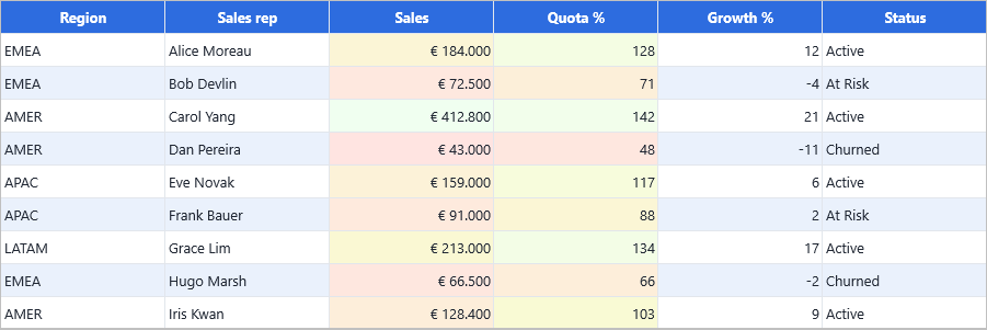
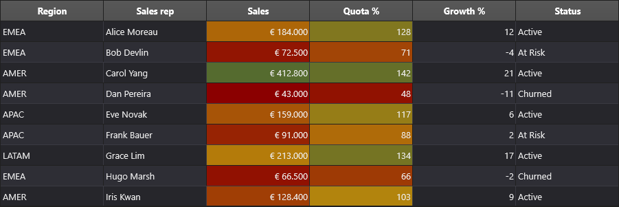
Anchoring the bounds to literal numbers is what makes a scale comparable over
time. In the capture below, Sales keeps the default lowest/highest bounds, so
its gradient re-spreads whenever the data changes; Quota % is pinned to
40 / 100 / 150, so the midpoint colour always means "on target" no matter which
rows are loaded.
Tip
A color scale always claims exactly the fill aspect. If you also want bold text
or a border on the same cells, add a separate rule for it — and give that rule a
lower Priority value so it is evaluated first. See
Scope and priority.
Data bars
A data bar draws a proportional in-cell bar behind (or instead of) the value, so
readers compare magnitudes across rows without reading every number — useful for
quota attainment, pipeline size, or any bounded numeric range. AddDataBar
creates a grtDataBar rule and configures DataBar
(TTMSFNCDataGridDataBarSettings).
Fill and NegativeFill are TTMSFNCGraphicsFill objects, not plain colors,
so set DataBar.NegativeFill.Color rather than assigning a color to the property
itself. AddDataBar's color argument fills in Fill for you.
| Property | Default | Controls |
|---|---|---|
Fill |
Set by AddDataBar |
The bar for non-negative values |
NegativeFill |
— | The bar for negative values, drawn the other side of the axis |
Border |
— | An optional stroke around the bar |
ShowValue |
True |
Whether the numeric text stays visible next to the bar |
ShowBarOnly |
False |
Draws only the bar; the text is not drawn or measured |
Direction |
bdLeftToRight |
Which edge the bar grows from (bdRightToLeft for the other) |
MinKind / MaxKind |
bbkAuto |
How the bar's range is derived (bbkAuto, bbkNumber, bbkPercent, bbkPercentile) |
MinValue / MaxValue |
— | The literal bound when the kind requires one |
procedure TForm1.FormCreate(Sender: TObject);
begin
  { Inside your form's OnCreate, after populating the grid: }

  // Draws a proportional blue bar behind the cell value, automatically
  // scaled between the column's minimum and maximum value.
  Grid.ConditionalFormatting.AddDataBar(COL_QUOTA, gcDodgerblue);

  // Data bar settings (min/max bounds, direction, negative fill, ...) can be
  // tuned further through the rule's DataBar property, e.g.:
  with Grid.ConditionalFormatting.AddDataBar(COL_PIPELINE, gcLimegreen) do
  begin
    DataBar.ShowValue := True;
    DataBar.MinKind := bbkAuto;
    DataBar.MaxKind := bbkAuto;
  end;
end;
void __fastcall TForm1::FormCreate(TObject *Sender)
{
  /* Inside your form's OnCreate, after populating the grid: */

  // Draws a proportional blue bar behind the cell value, automatically
  // scaled between the column's minimum and maximum value.
  Grid->ConditionalFormatting->AddDataBar(COL_QUOTA, gcDodgerblue);

  // Data bar settings (min/max bounds, direction, negative fill, ...) can be
  // tuned further through the rule's DataBar property, e.g.:
  TTMSFNCDataGridFormatRuleItem *Rule = Grid->ConditionalFormatting->AddDataBar(COL_PIPELINE, gcLimegreen);
  Rule->DataBar->ShowValue = true;
  Rule->DataBar->MinKind = bbkAuto;
  Rule->DataBar->MaxKind = bbkAuto;
}
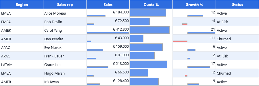
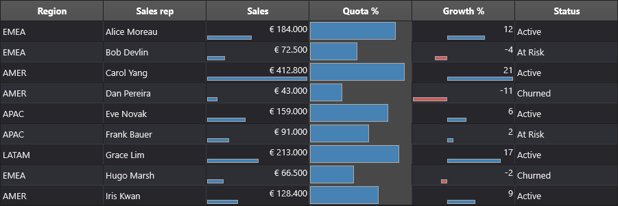
Three variants side by side: Sales keeps its value beside the bar, Quota %
uses ShowBarOnly with explicit 0–150 bounds so the bars are comparable rather
than self-scaled, and Growth % has a NegativeFill so the loss-making rows run
the other way from the axis.
Data bars are overlay rules: the grid draws them on top of the normal cell
layout rather than contributing to it, so a data-bar rule's Appearance is not
used. To combine a bar with a fill or a font change, add a second, non-overlay
rule on the same column.
Icon sets
An icon set places a small glyph next to the value based on which threshold band
it falls into — a compact alternative to a data bar when you only need a coarse
"good / neutral / bad" signal. AddIconSet creates a grtIconSet rule and
configures IconSet
(TTMSFNCDataGridIconSetSettings),
which has just three properties: Kind, Reverse, and ShowValue.
Kind (TTMSFNCDataGridIconSetKind) selects the glyph family and, with it, how
many bands the range is divided into:
| Bands | Kinds |
|---|---|
| Three | gisArrows3, gisTrafficLights3, gisFlags3, gisSymbols3, gisStars3 |
| Four | gisArrows4, gisTrafficLights4, gisRating4 |
| Five | gisArrows5, gisStars5, gisRating5 |
| Custom | gisCustom — supply your own glyphs |
Reverse flips which end of the range gets the "good" icon — necessary whenever
low is good, such as defect counts or response times. ShowValue keeps the cell
text next to the glyph; turn it off to let the glyph carry the column alone.
procedure TForm1.FormCreate(Sender: TObject);
begin
  { Inside your form's OnCreate, after populating the grid: }

  // Traffic-light glyph (red/yellow/green) based on the value's position
  // within the column's value range.
  Grid.ConditionalFormatting.AddIconSet(COL_GROWTH, gisTrafficLights3);

  // 4-arrow icon set (down, down-right, up-right, up) for a trend-style column.
  with Grid.ConditionalFormatting.AddIconSet(COL_DEALS, gisArrows4) do
  begin
    IconSet.Reverse := False;
    IconSet.ShowValue := True;
  end;
end;
void __fastcall TForm1::FormCreate(TObject *Sender)
{
  /* Inside your form's OnCreate, after populating the grid: */

  // Traffic-light glyph (red/yellow/green) based on the value's position
  // within the column's value range.
  Grid->ConditionalFormatting->AddIconSet(COL_GROWTH, gisTrafficLights3);

  // 4-arrow icon set (down, down-right, up-right, up) for a trend-style column.
  TTMSFNCDataGridFormatRuleItem *Rule = Grid->ConditionalFormatting->AddIconSet(COL_DEALS, gisArrows4);
  Rule->IconSet->Reverse = false;
  Rule->IconSet->ShowValue = true;
}
Three families at once, which is the fastest way to choose one: arrows on
Growth %, traffic lights on Quota %, and a five-star rating on Sales with
ShowValue off so the glyph replaces the figure entirely.
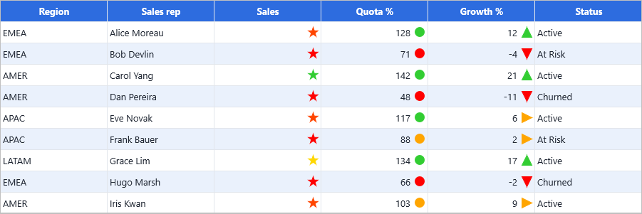
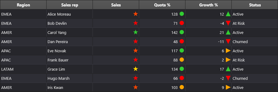
Icon sets are overlay rules, evaluated the same way as data bars — and, like data bars, only one overlay is drawn per cell.
Putting the three together
One grid, all three visual rule types on separate columns, then a single auto-size pass so the space each overlay reserved is measured rather than guessed:
procedure TForm1.FormCreate(Sender: TObject);
const
  COL_MARGIN = 1;
  COL_REVENUE = 2;
  COL_TREND = 3;
var
  Row: Integer;
begin
  { Inside your form's OnCreate, after populating the grid. }

  { Magnitude across the column: a heat map with no thresholds to maintain. }
  Grid.ConditionalFormatting.AddColorScale(COL_MARGIN,
    gcMistyrose, gcLightgoldenrodyellow, gcHoneydew);

  { Row-to-row comparison: a proportional bar beside the value. }
  Grid.ConditionalFormatting.AddDataBar(COL_REVENUE, gcCornflowerblue);

  { A coarse good / neutral / bad signal. }
  Grid.ConditionalFormatting.AddIconSet(COL_TREND, gisArrows3);

  { Right-align the numeric columns. The bar and the glyph reserve their own
    space through the cell layout, so the values stay clear of them. }
  for Row := 1 to Grid.RowCount - 1 do
  begin
    Grid.TextAligns[COL_MARGIN, Row] := gtaTrailing;
    Grid.TextAligns[COL_REVENUE, Row] := gtaTrailing;
    Grid.TextAligns[COL_TREND, Row] := gtaTrailing;
  end;

  { Auto-size AFTER the rules exist, so the reserved overlay space is part of
    the measured width. }
  Grid.AutoSizeColumns(gamAllCells, 10);
end;
void __fastcall TForm1::FormCreate(TObject *Sender)
{
  const int COL_MARGIN = 1;
  const int COL_REVENUE = 2;
  const int COL_TREND = 3;

  /* Inside your form's OnCreate, after populating the grid. */

  /* Magnitude across the column: a heat map with no thresholds to maintain. */
  Grid->ConditionalFormatting->AddColorScale(COL_MARGIN,
    gcMistyrose, gcLightgoldenrodyellow, gcHoneydew);

  /* Row-to-row comparison: a proportional bar beside the value. */
  Grid->ConditionalFormatting->AddDataBar(COL_REVENUE, gcCornflowerblue);

  /* A coarse good / neutral / bad signal. */
  Grid->ConditionalFormatting->AddIconSet(COL_TREND, gisArrows3);

  /* Right-align the numeric columns. The bar and the glyph reserve their own
     space through the cell layout, so the values stay clear of them. */
  for (int Row = 1; Row < Grid->RowCount; Row++)
  {
    Grid->TextAligns[COL_MARGIN][Row] = gtaTrailing;
    Grid->TextAligns[COL_REVENUE][Row] = gtaTrailing;
    Grid->TextAligns[COL_TREND][Row] = gtaTrailing;
  }

  /* Auto-size AFTER the rules exist, so the reserved overlay space is part of
     the measured width. */
  Grid->AutoSizeColumns(gamAllCells, 10);
}
How visual rules reserve their space
All three visual rule types on one grid — a colour scale on Margin %, a data
bar on Revenue, and an arrow icon set on Trend % — with every numeric column
right-aligned and the grid auto-sized.
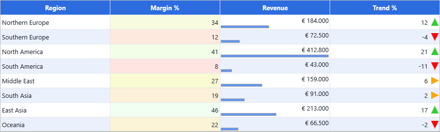
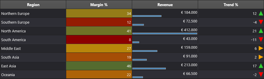
Note where the right-aligned values sit: clear of the arrow glyph and above the
bar, not underneath them. A visual rule that paints inside the cell reserves the
space it needs through the cell's own layout, as extra TextMargins, so the
cell behaves like any other cell:
| Rule | Reserves | Effect |
|---|---|---|
Icon set with ShowValue |
Right margin: the glyph plus its gaps | The text rectangle ends before the glyph at any TextAlign, and AutoSizeColumns makes the column wide enough for both. |
Data bar with ShowValue and no ShowBarOnly |
Bottom margin: the bar's height | The text rectangle ends above the bar, and AutoSizeRows makes the row tall enough for both. |
Icon set without ShowValue, or a data bar with ShowBarOnly |
Nothing | The cell text is not drawn at all, so it is also not measured — auto-size ignores it instead of sizing to a value that never appears. |
Because the reservation is a text margin rather than a special case in the
painter, everything downstream sees it: GetTextRect, GetRequiredSize,
AutoSizeColumns / AutoSizeRows / AutoSizeGrid, word wrapping, and a custom
OnGetCellLayout handler, which runs after the reservation and can still
override it.
Tip
Auto-size after adding the rules. AutoSizeColumns measures the cell as it
will be drawn, so a column sized before an icon-set rule exists will not have
room for the glyph.
See also
- Conditional formatting overview
- Conditions — the non-visual rule types
- Scope and priority — combining a visual rule with a highlight
- API reference: TTMSFNCDataGridFormatRuleItem