Conditional Formatting
Apply color scales, data bars, icon sets, value rules, and ranking highlights to grid cells automatically, without hand-written painting code.
Overview
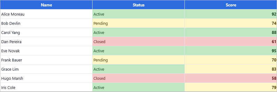
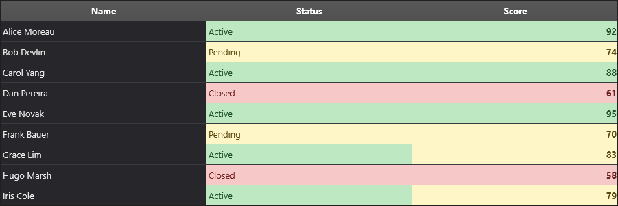
Conditional formatting lets you describe what a cell should look like based on
its value, its rank within a column, or an arbitrary expression over its row — and
have the grid work out when to apply that look as it paints. Rules are declarative:
you add one or more TTMSFNCDataGridFormatRuleItem
entries to Grid.ConditionalFormatting,
and the grid evaluates every enabled rule for every visible data cell before it
paints, merging matching rules into the cell's appearance (fill, font, and border)
or drawing a data-bar / icon-set overlay on top of the cell.
This is a different tool than manual event-based styling through OnGetCellLayout
or OnBeforeDrawCell. Reach for those events when the logic is one-off, depends on
state outside the grid, or needs full control over drawing. Reach for conditional
formatting when the styling is a reusable, declarative condition over cell values —
color scales, top/bottom highlighting, duplicate detection, threshold coloring —
because the rule collection keeps the condition and the visual together, evaluates
it consistently across scroll/filter/sort, and needs no manual paint code at all.
Getting started
The minimum setup is one rule on one column. AddCellValueRule is a convenience
builder on the ConditionalFormatting collection that creates a
grtCellValue rule, scoped to a single column by default, and returns the rule so
you can tune its appearance:
procedure TForm1.FormCreate(Sender: TObject);
begin
  { AddCellValueRule creates a grtCellValue rule scoped to a single column and
    returns it, so the appearance can be tuned on the spot. }
  Grid.ConditionalFormatting.AddCellValueRule(3, gfcLess, '100')
    .Appearance.Font.Color := gcRed;
end;
void __fastcall TForm1::FormCreate(TObject *Sender)
{
  /* AddCellValueRule creates a grtCellValue rule scoped to a single column and
     returns it, so the appearance can be tuned on the spot. */
  Grid->ConditionalFormatting->AddCellValueRule(3, gfcLess, "100")
    ->Appearance->Font->Color = gcRed;
}
This colors the font red in column 3 for every data row whose value compares
less than 100. ConditionalFormatting.Enabled is True by default, so rules
take effect as soon as they are added — no extra call is needed to turn the
feature on, only Grid.Invalidate if you want to force an immediate repaint
outside the normal update cycle.
Rules do not have to be written by hand: the same collection can be built visually in the IDE, with a live preview of each rule — see Designing rules in the IDE.
A worked example: a sales dashboard
The chapters below each cover one part of the feature, but they build the same grid, so it is worth seeing the destination first. A sales table becomes a dashboard in four passes, and each pass is one chapter of this guide:
- Show magnitude at a glance. A color scale across
Salesand data bars onQuota %turn two numeric columns into something readable without reading every figure — Visual rules. - Call out the states that matter. Text rules give
Statusa color per state, and a value rule flags negative growth — Conditions. - Rank against the data, not a constant. A top-3 rule highlights the best performers without a hard-coded threshold that goes stale — Conditions.
- Decide who wins where rules overlap. The ranking highlight and the color
scale both target
Sales;Prioritysettles it — Scope and priority.
The finished layering is shown in full under Combining rules, and the whole thing can be built without code in the design-time editor.
Chapters
| Chapter | Covers |
|---|---|
| Visual rules | Color scales, data bars, and icon sets — the rule types that render a graphic in the cell, and how they reserve their own layout space. |
| Conditions | Text and value comparisons, typed values, date buckets, top/bottom ranking, averages, duplicates, and custom expressions. |
| The fluent API | Chaining scope and appearance helpers, the one-call Add*Highlight builders, and which appearance aspects a rule claims. |
| Scope and priority | Which cells a rule is considered for, how overlapping rules merge, StopIfTrue, and a layered dashboard example. |
| Designing rules in the IDE | The design-time editor: the rule list, the four-step designer, the live preview, and how designed rules interact with coded ones. |
Rule types at a glance
Every rule is a TTMSFNCDataGridFormatRuleItem, discriminated by its RuleType
(TTMSFNCDataGridFormatRuleType). The ConditionalFormatting collection exposes a
convenience Add* builder for each common case; you can also call Add directly
and set RuleType and the related properties yourself for less common combinations.
RuleType |
Compares | Builder | Chapter |
|---|---|---|---|
grtCellValue |
The cell against one or two literal values | AddCellValueRule |
Conditions |
grtText |
The cell as a string, with substring/prefix/suffix matching | AddTextRule |
Conditions |
grtDate |
The cell against a relative or explicit date window | AddDateHighlight |
Conditions |
grtTopBottom |
The cell's rank within its scope | AddTopBottomRule |
Conditions |
grtAverage |
The cell against the scope's mean | AddAverageRule |
Conditions |
grtUniqueDuplicate |
Whether the value repeats within the scope | AddDuplicateHighlight |
Conditions |
grtColorScale |
The cell's position between the scope's bounds | AddColorScale |
Visual rules |
grtDataBar |
The cell's magnitude, drawn as a bar | AddDataBar |
Visual rules |
grtIconSet |
The cell's threshold band, drawn as a glyph | AddIconSet |
Visual rules |
grtExpression |
An expression over the whole row | AddExpressionRule |
Conditions |
Common pitfalls
- The first matching rule wins, not the last. Rules are evaluated in
ascending
Priorityorder, and each one can only set appearance aspects that no earlier rule already claimed. A rule that should override another needs a lowerPriorityvalue, not a higher one. See How overlapping rules merge. gfcBetweenincludes both endpoints. A cell equal toValue1orValue2matches, andgfcNotBetweenexcludes both. The same holds for adiCustomRangedate rule'sDateFromandDateTo. There is no exclusive variant — stack agfcGreaterand agfcLessrule for a strictly-open range.StopIfTrueskips later rules for that cell, not earlier ones. It only affects rules with a higherPriorityvalue than the one that matched; a rule with a lower priority number has already run and claimed its aspects.- Only one overlay wins per cell. If a column has both a data bar rule and an icon set rule targeting the same cells, only the first match by priority is drawn — they do not stack. Put data bars and icon sets on different columns.
- Aggregate rules need fresh statistics. Color scales, top/bottom, average, and
unique/duplicate rules cache their computed min/max/mean/rank per scope. If you
change cell values outside the normal grid update path in a way the grid does
not detect, call
Grid.ConditionalFormatting.InvalidateStatsso the next paint recomputes them — stale cached statistics show highlights that no longer match the data. - Don't rebuild the rule collection on every paint or every cell edit. Adding
or removing rules invalidates cached statistics and forces re-evaluation; treat
ConditionalFormattingas configured once (or on structural changes) rather than inside a per-cell or per-frame code path. - Designed rules and coded rules add up. The editor streams its rules into the
form file; code that adds more at run time appends to them. Call
Clearfirst if the code is meant to replace the designed set. - A rule cannot reset an aspect to its default.
AppearanceAspectsonly claims aspects that differ from a pristine rule, so setting a property back to its default value is the same as not setting it. Use a non-default value, or handle it inOnGetCellLayout. - Expression rules cost more per cell than value/text rules.
grtExpressiondelegates to the row-expression evaluator for every candidate cell; prefer agrtCellValue/grtTextrule when a simple comparison is enough, and reserve expressions for logic that genuinely needs to combine multiple columns. - Pass a font color, not just a fill. When the grid adapts to a dark style
(
AdaptToStyle), a rule that sets onlyFillkeeps the theme's light font color, so a light highlight ends up with near-invisible text.Highlighttakes the font color as its second argument for exactly this reason.
See also
- TMS FNC DataGrid overview
- TMS FNC DataGrid API reference: TTMSFNCDataGridConditionalFormatting
- Advanced filtering — the expression syntax conditional formatting shares
- TMS FNC UI Pack Product Guides
- TMS FNC UI Pack components